Sole designer: from an 8-person startup to a P&G shelf
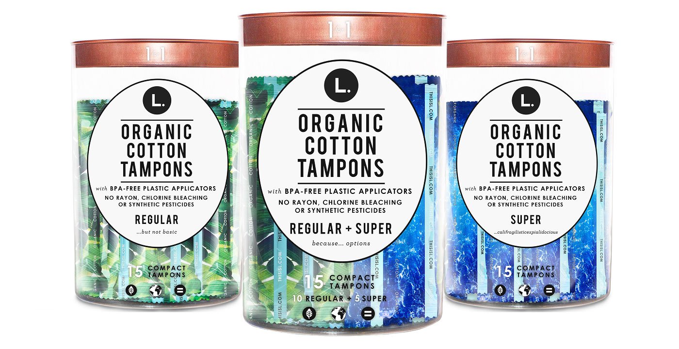
Clear Tampon tube
With a vision for building something meaningful, our founder brings a blend of big-picture thinking and hands-on experience. They set the tone for everything we do.
Clear tubes, not opaque ones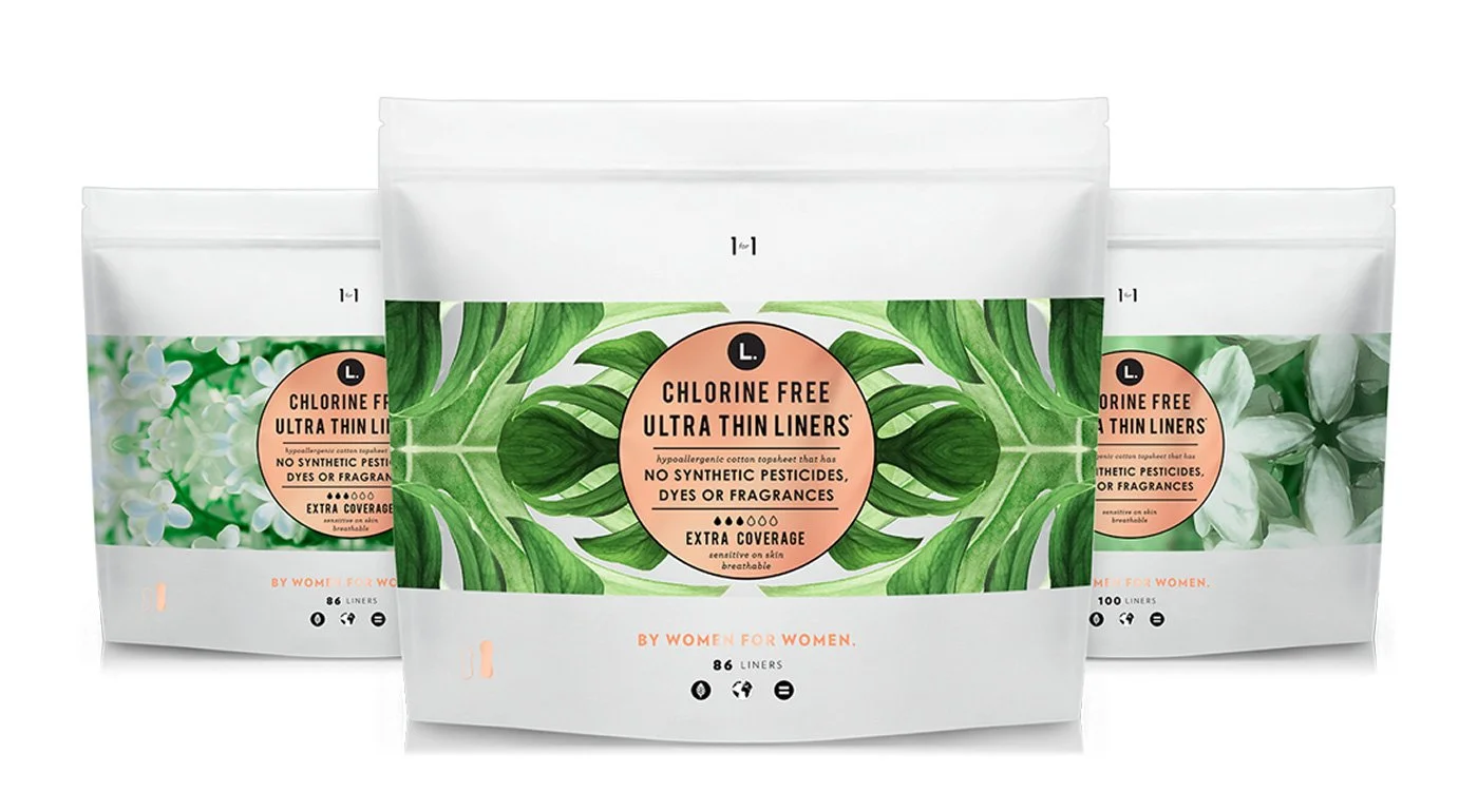
Resealable pad pouch
Traded the clinical box for a resealable pouch built for bold pattern.
Botanical pattern pouch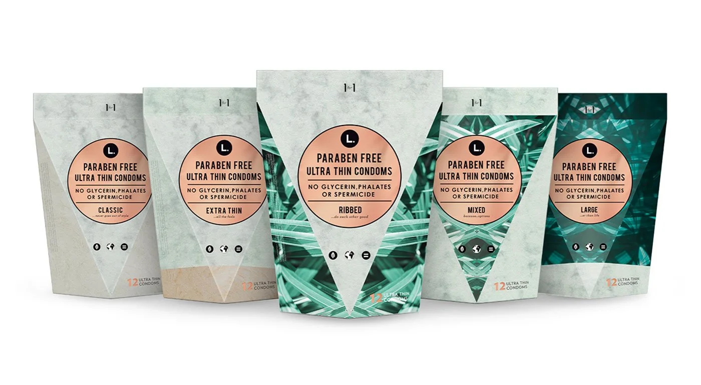
Triangular structural boxTriangular Condom Box
A shape competitors weren't using — recognizable from across the store.
Role:Design Lead (sole designer)
Duration:2018 – 2019, continuing post-acquisition
Scope:Branding, packaging systems, product & digital design
Collaborators:CEO/founder & team, then brand director post-acquisition; global manufacturing partners
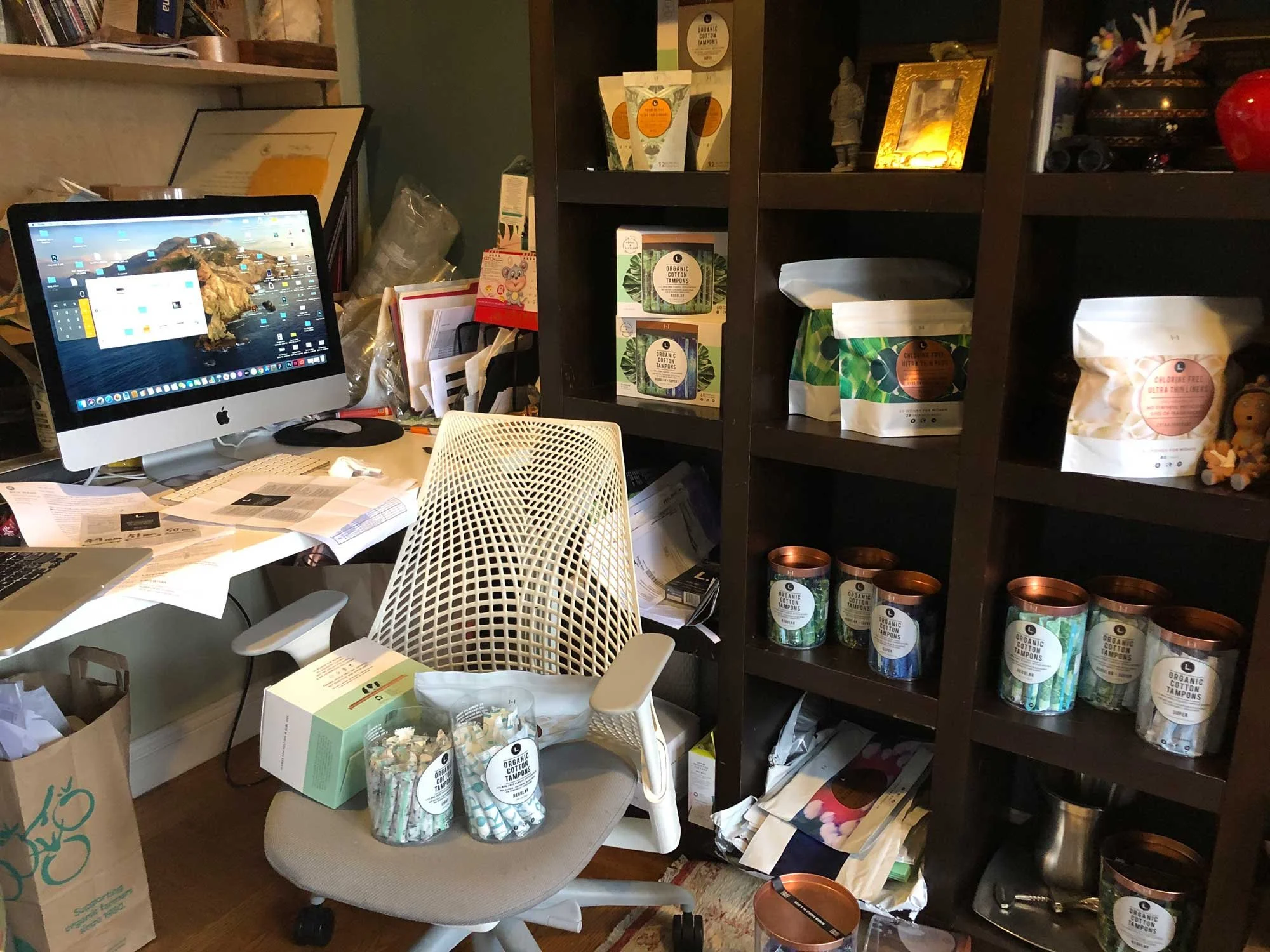
I was part of This Is L.'s 8-person startup team as the only designer. At the time, feminine care packaging was clinical and kept the product hidden — we used bold botanical patterns and a healthy, no-shame message to deliver that clearly to customers on the shelf, and it worked: the brand stood out in a category where every brand looked the same. After Procter & Gamble's acquisition, I remained the sole designer, working with the brand director to extend the product family and develop new lines for retail at scale.
Feminine care packaging used to look apologetic. We wanted to change that.
Most period and sexual-wellness packaging used the same pastel colors and clinical language. It didn't say clearly what the product actually did, and it made the whole category feel a little embarrassing to shop. We didn't want to follow those norms. We wanted to break them.
This Is L.'s approach
Bold botanical prints in strong, saturated color
Direct, clear product language
Transparent packaging that shows the product
A shape you can recognize from across the store
Category convention
Soft pastel colors, meant to look discreet
Clinical, indirect language
Opaque packaging that hides the product
Most brands look almost the same on the shelf
The positioning behind the design
The brand's own guidelines define the purpose in one line: making beautifully-designed, organic products accessible to people everywhere. Everything downstream — packaging, tone, photography — had to serve that.
Benefit: Making beautifully-designed, organic products accessible to people everywhere.
Purpose:Healthful, beautiful products every body deserves.
Points of difference:Design-led, Accessible, Shame-free
The building blocks
Pulled directly from the brand guidelines: the mark, the color system, and the typographic hierarchy that had to hold together as the product line kept growing.
Pattern
One botanical illustration style, recolored per product line — leaves and flowers for the core range, water for Super absorbency, night sky for Super Plus.
Color
Black and white anchor the system. Forest Green (#006F62) and two mint tones carry the botanical story. Copper (Pantone 876C) shows up on physical hardware — lids, foil, bag trim.
Type
Bebas Neue for product names (shelf impact). Century Gothic Bold for ingredient claims (trust). Archer Book Italic for the small aside underneath (warmth, personality).
Mark
A bold, square-set "L" references the established rules of the category. The circular dot breaks that rigidity on purpose — a small signal of change inside a strict form.
The same system, one more surface: thisisL.com
Packaging wasn't the only thing I owned. As the sole designer, I also set the typographic hierarchy, color tokens, and tone of voice for the website — documented in the same guidelines the manufacturer and buyers worked from, so the brand felt identical whether someone met it on a shelf or on a screen.
One typographic system, five weights of the same voice
Verlag Book carries the same warm, editorial tone as the packaging headlines. The impact counter reuses the bold display treatment from shelf callouts, and the give-back line ties straight back to the one-for-one model printed on every pouch.
H1–H5 hierarchy specified down to exact font weight, for a team that would grow past just me
Mint and off-white tokens carried over from the packaging color system, not reinvented
Same one-for-one message that appears on-pack, repeated as the homepage's proof point
New packaging system, from scratch
I was part of the 8-person team as the only designer, working closely with the CEO, buyers, and manufacturers. Together, we used packaging to communicate that the products were organic and to send a healthy, no-shame message to customers. Two changes made the biggest difference.
A resealable pouch that doesn't hide the product
Most brands used a stiff cardboard box. We switched to a soft resealable pouch, which gave us more surface area for bold patterns and clearer messaging.
Botanical patterns replaced clinical color palettes
Copy changed from clinical to more human and approachable
Designed to stand out on the shelf, not blend in
Clear tubes that show the product instead of hiding it
Most tampon packaging is opaque. We made ours clear, and used color to show the variant and absorbency level.Botanical patterns replaced clinical color palettes
Clear tubes let customers see the product, which builds trust
Minimal, modern labeling reinforced the transparency
Changed the product from something hidden to something displayed openly
What the redesign helped scale
Public numbers from press coverage of the P&G acquisition — these connect the packaging redesign to the business result.
From P&G's official acquisition announcement (Feb 2019) and press coverage from Forbes, Marketing Dive, and Drug Store News. The deal value was never officially announced — the number below is a reported estimate. Add your own numbers (sell-through, reorder rate, SKU count) if you have them; those aren't public.
5,000+
U.S. retail doors at time of acquisition
250M+
Products made accessible via L.'s one-for-one give-back model
~$100M
Reported deal value (terms officially undisclosed)
Feb 2019
Acquired by Procter & Gamble
1. Resealable Pouch for Pads
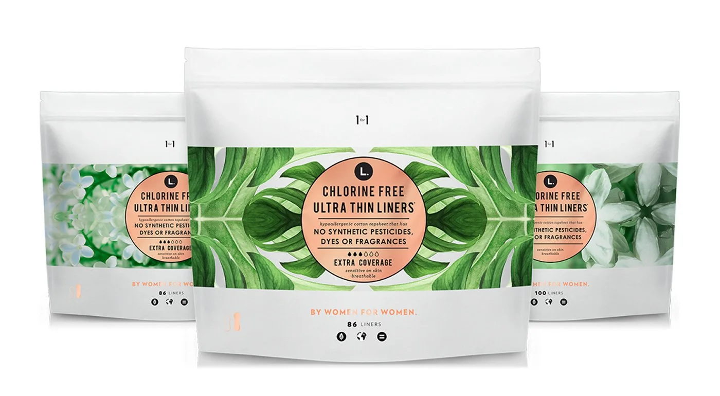
Distinctive Visual Language
Introduced botanical patterns and cleaner color palettes
Replaced clinical cues with a more human, approachable tone
Established a strong, recognizable brand presence
Designed for instant recognition—not subtlety
2. Transparent Tubes for Tampons
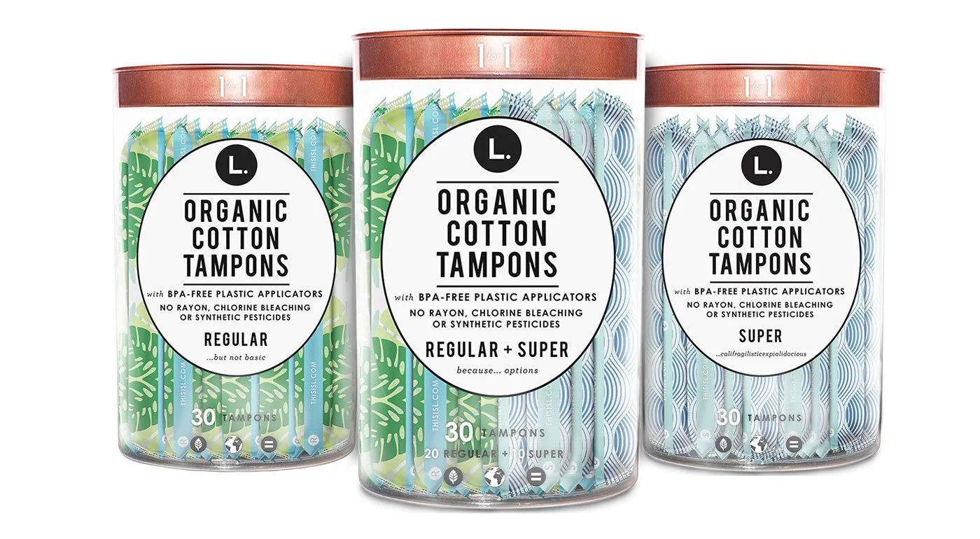
A radical departure from traditional opaque packaging.
Clear tubes exposed the product—removing stigma and building trust
Minimal, modern labeling emphasized transparency
Turned a hidden product into something confidently displayed
Redefined how the product is perceived—honest, clean, and approachable.
3. Recyclable Paper Refill Box
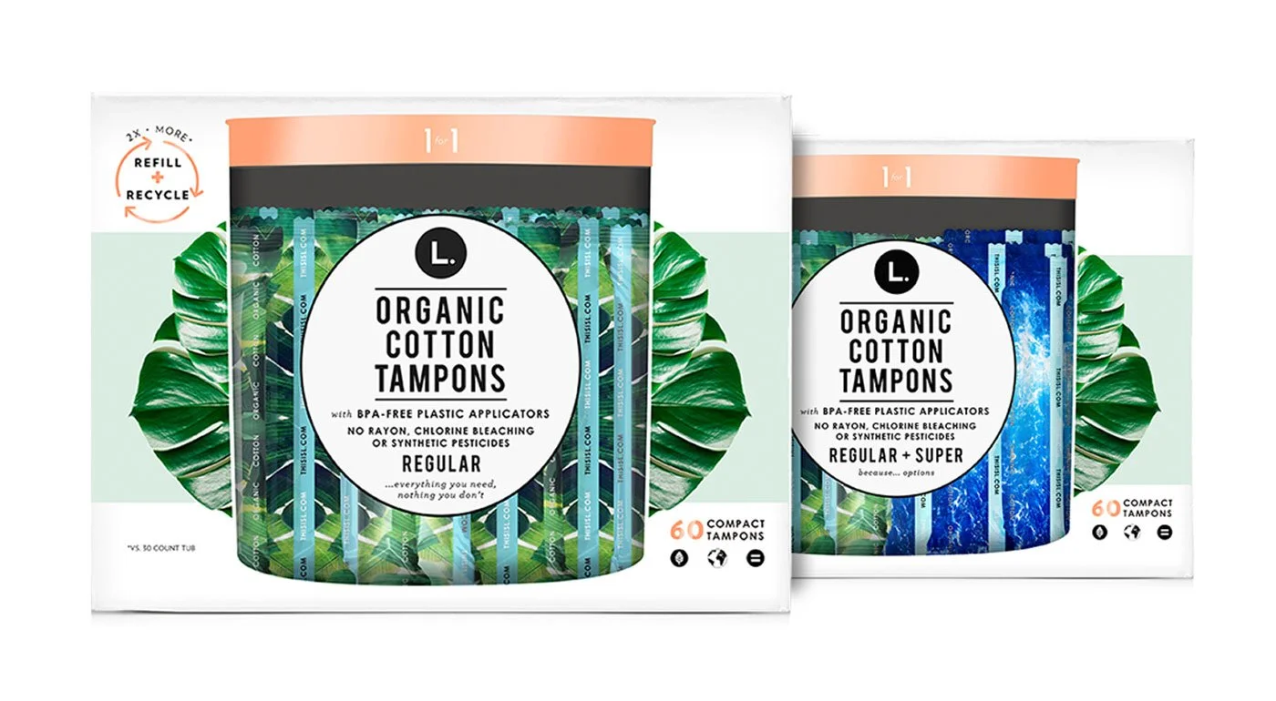
Designed for sustainability and system thinking.
Reduced plastic through refill-based packaging
Maintained visual consistency across formats
Extended the brand into a more eco-conscious direction
Connected product experience with long-term brand values.
From Disruption to Scale
After acquisition by Procter & Gamble, the focus shifted from breaking the category → scaling within it.
I continued as the sole designer, expanding the system across:
New product lines
Retail environments (CVS, Target, nationwide distribution)
Scalable packaging architecture
The challenge became maintaining design integrity while operating at enterprise scale.
1. Clear Tube — Expanding the product family
We expand the product family by introducing new items, including Light and Super Plus.
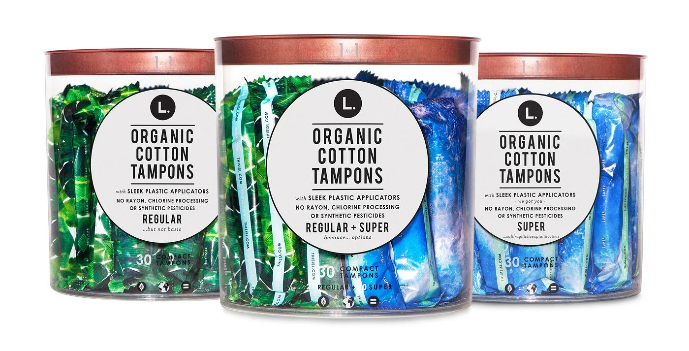
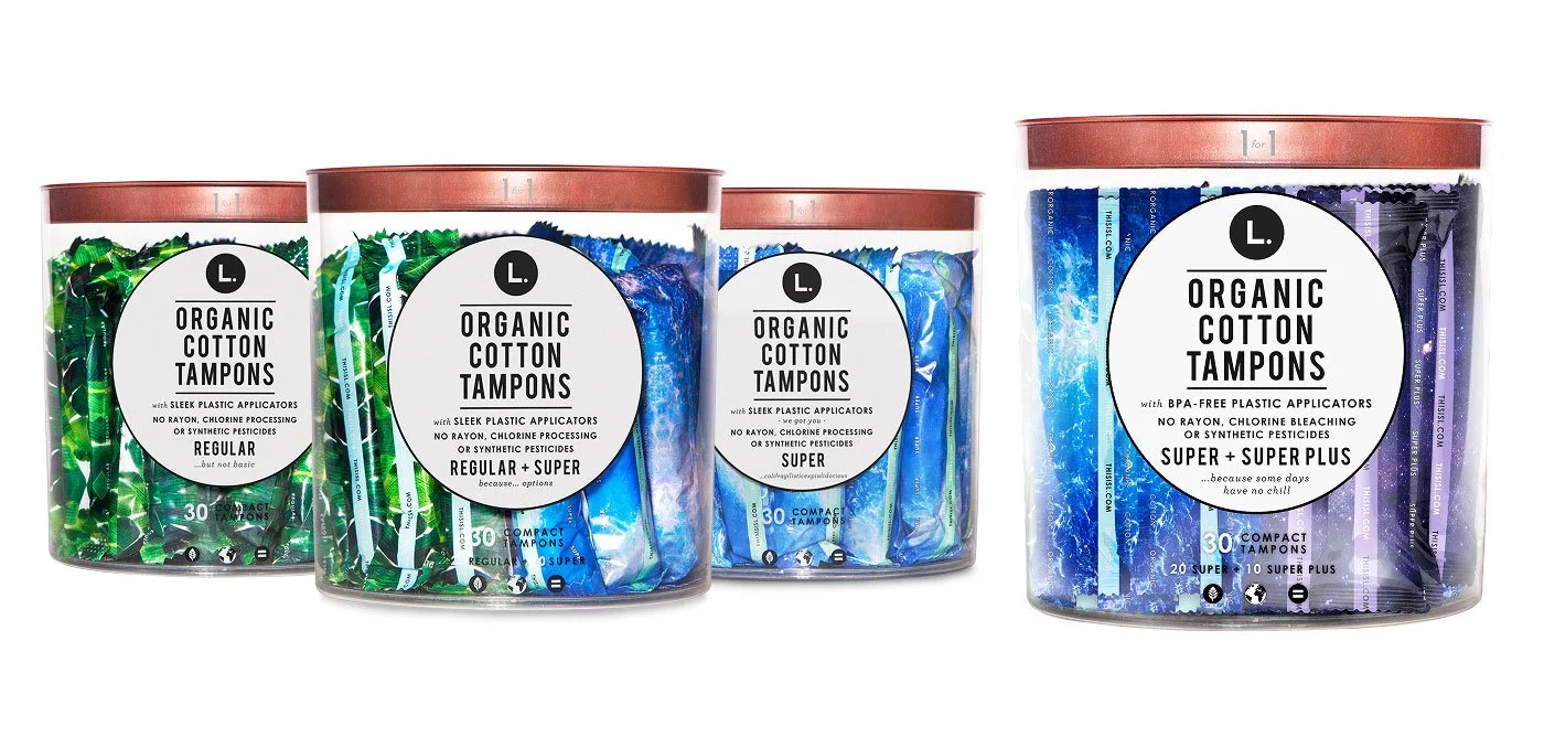
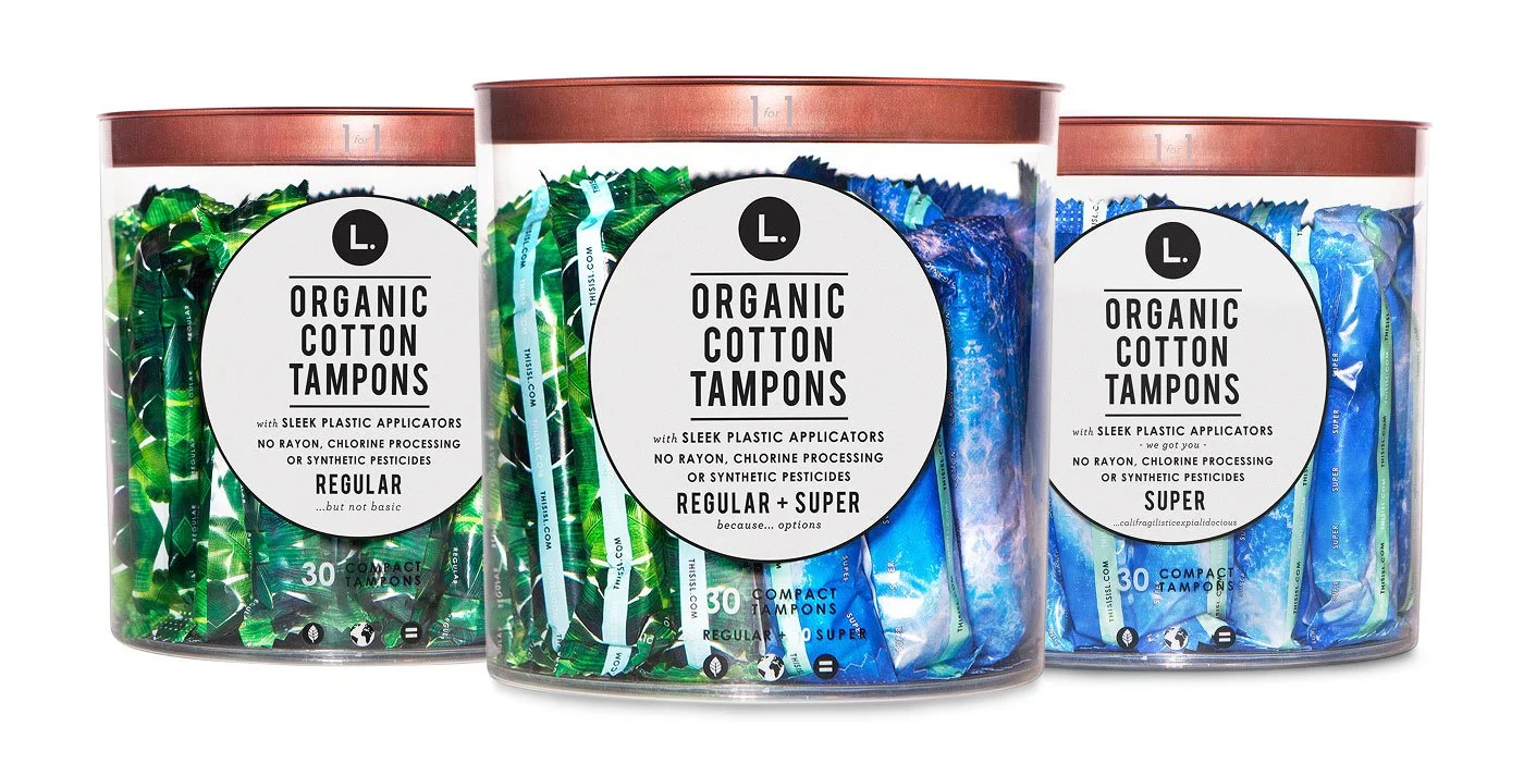
We began with three tampon tube options: Regular, Super, and Mixed.
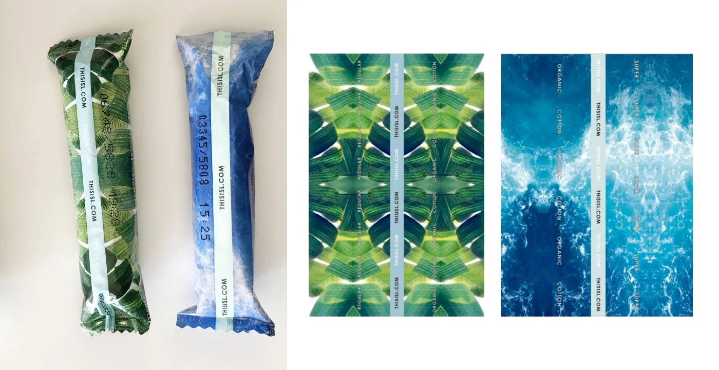
We currently offer two products.
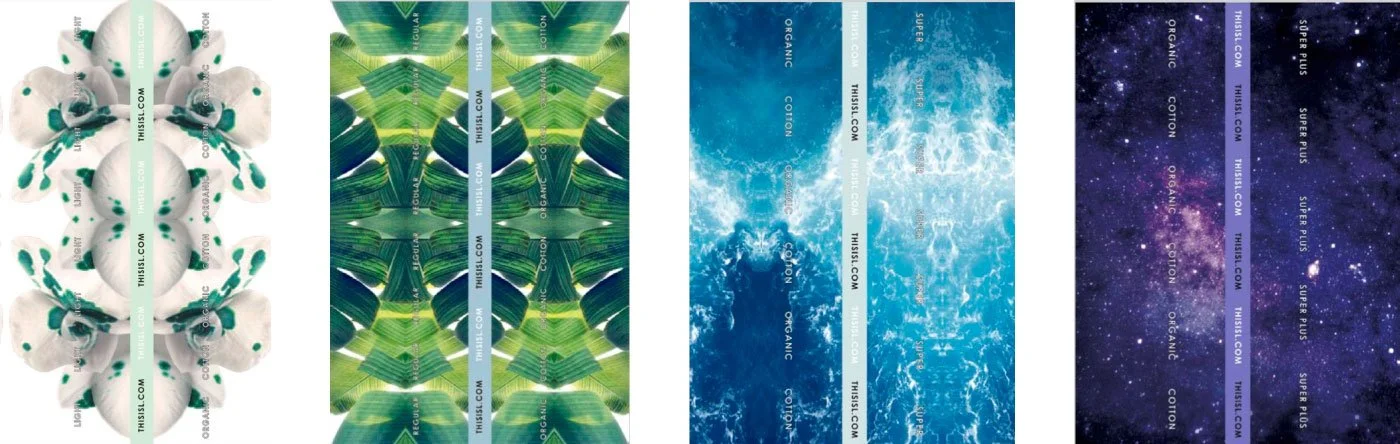
We use color coding to communicate product functionality: White for Regular, Green for standard protection, Blue for Super absorbency, and Dark Purple for our Super Plus option.
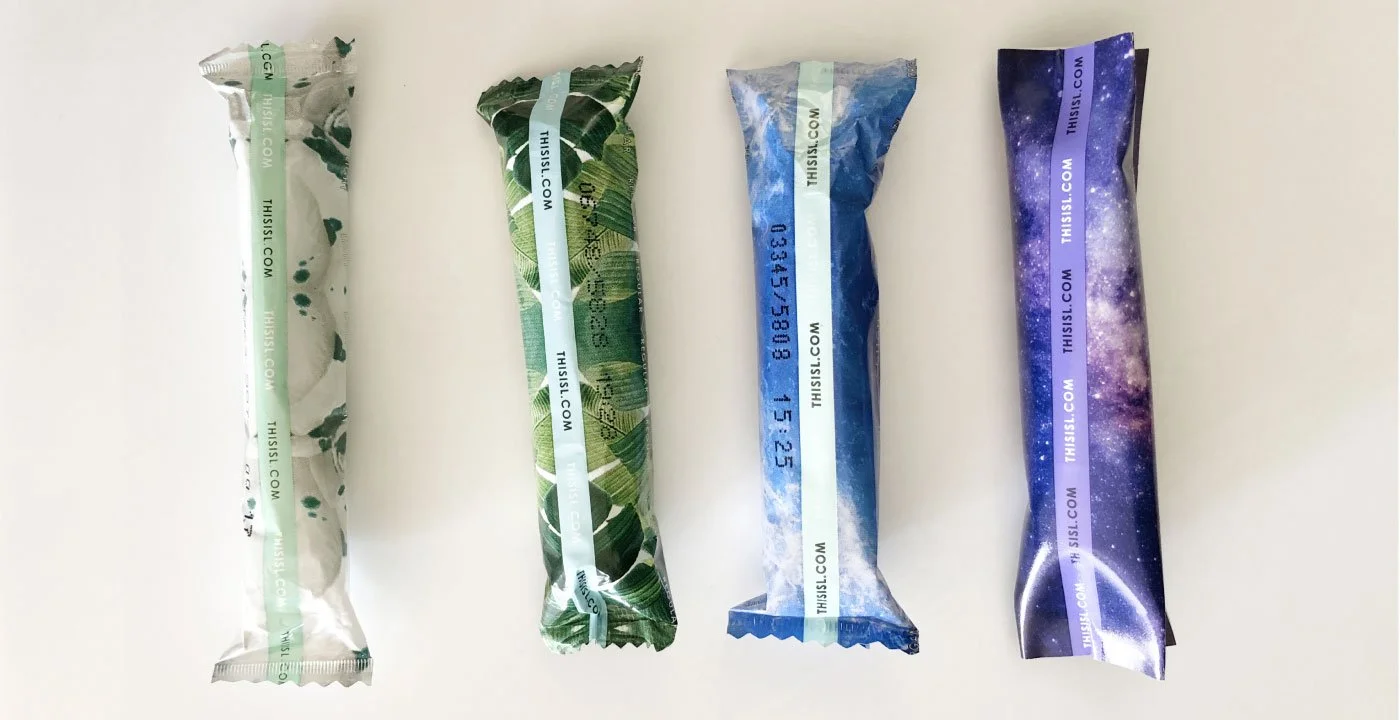
We’ve expanded our range to four products, ordered from left to right: Light, Regular, Super, and Super Plus.
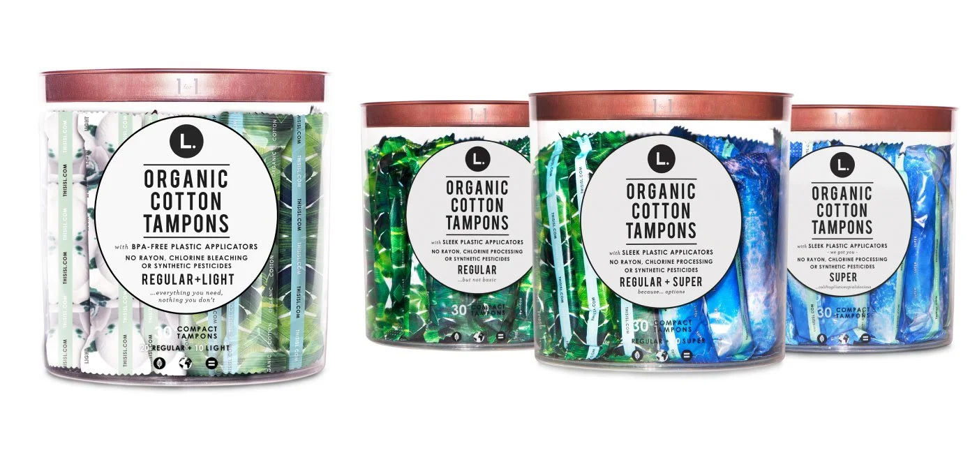
The new tube, Regular + Light Mixed
The new Tube, Super + Super Plus
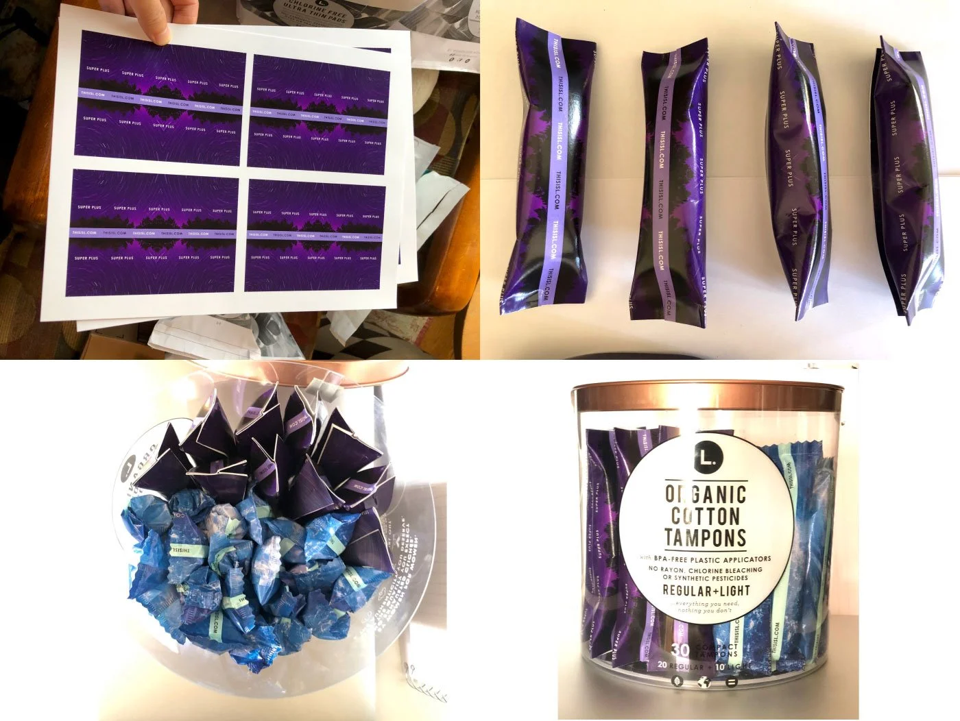
Using Super Plus as an example, we explored different purple directions—from night forests to purple flowers—before landing on the Night Purple Sky. My design process starts by selecting potential concepts, printing them at a print shop, and then creating prototypes at home. I then present everything to the team for discussion and next steps.
2. Clear Tube — Scale up (Retail environments)
We scale products up or down to fit different retail environments such as CVS, Target, and nationwide distribution, ensuring key items are optimized for various store formats.
We use this popular item as the foundation for further development.
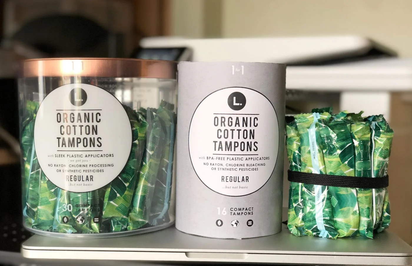
To test smaller tubes for CVS and Walgreens.
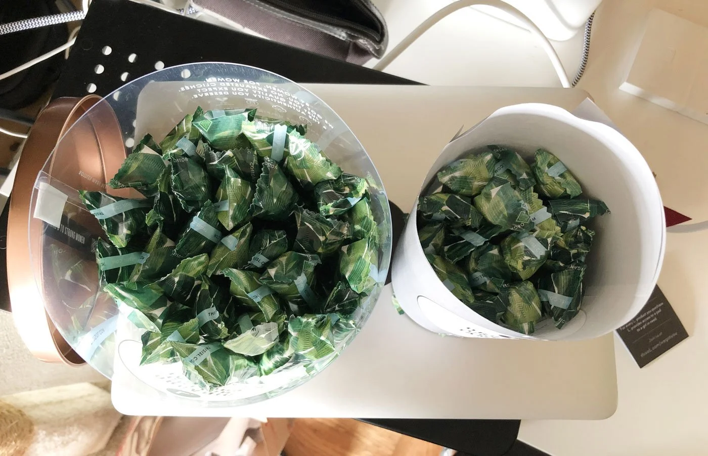
Tube sizes were designed based on the number of ideas.
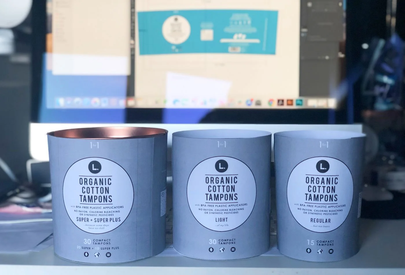
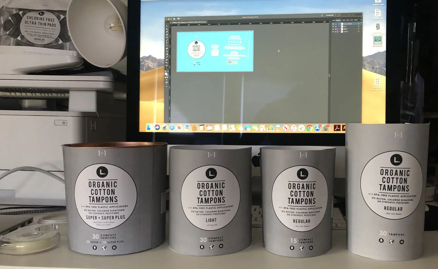
We refined the dieline size and created paper prototypes to test form and structure.
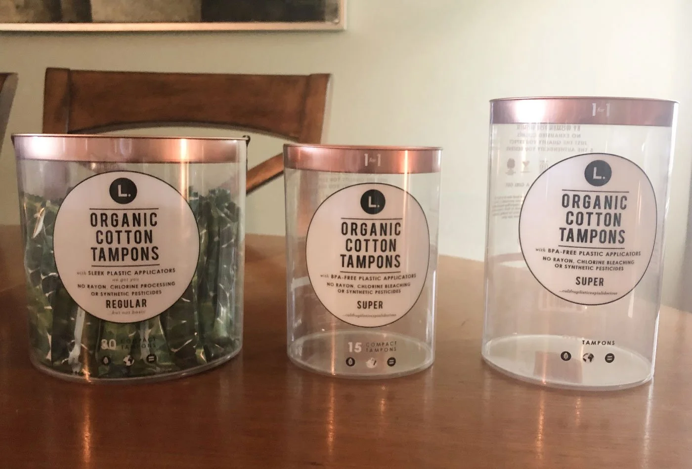
The OG tube and the two new product lines.
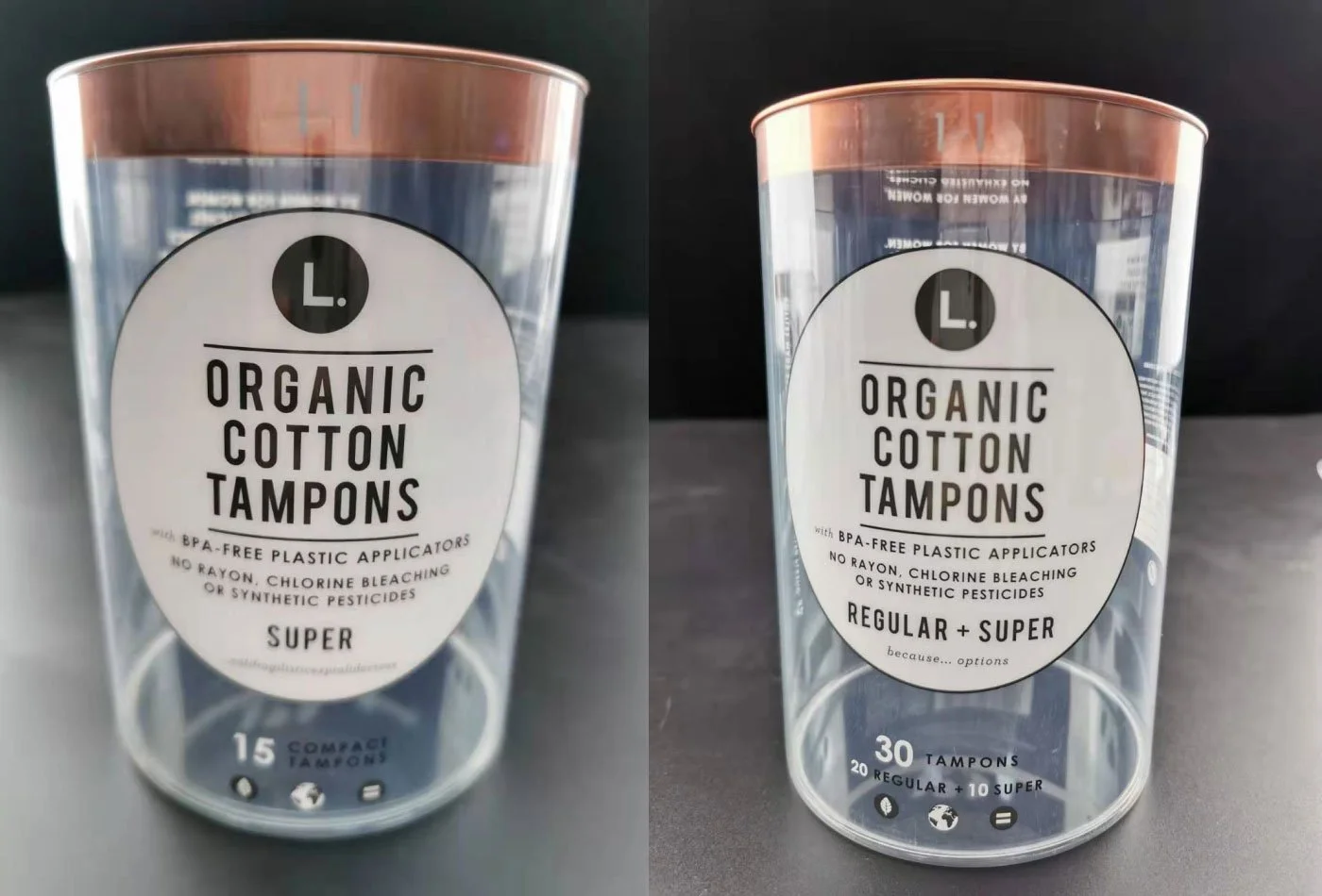
We received production samples from the manufacturer for review and testing.
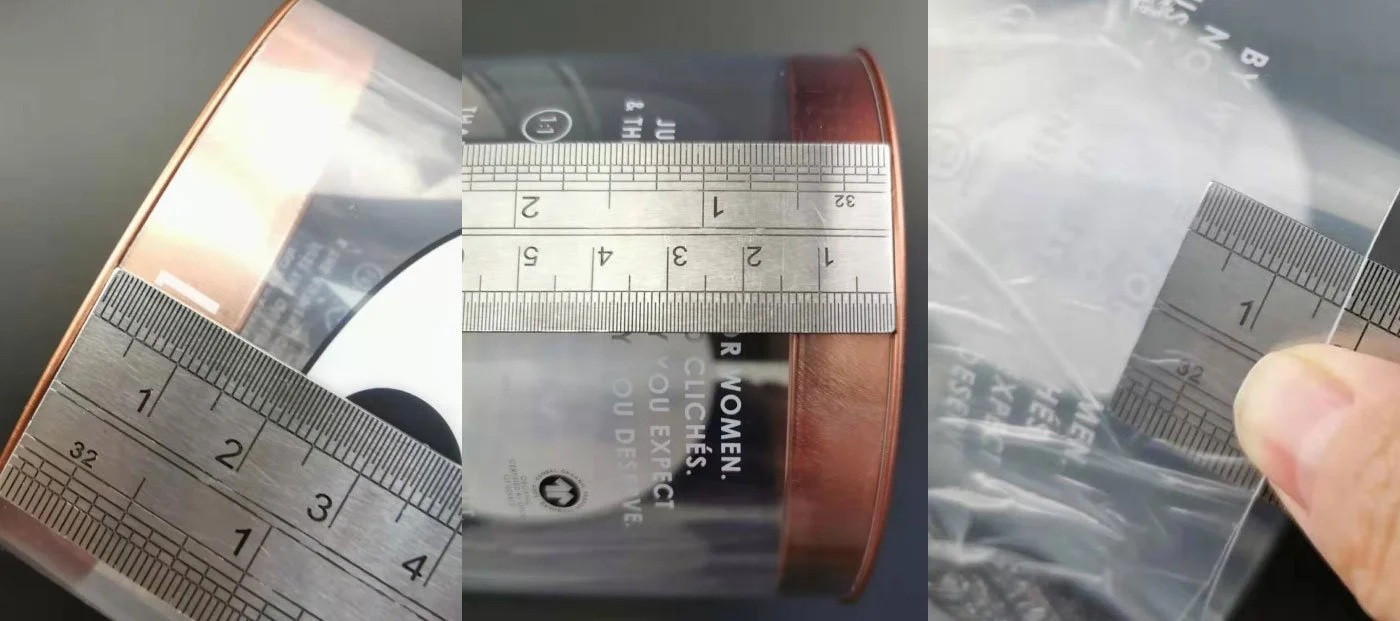
We discussed specifications with manufacturers to ensure accuracy in tube and lid sizing and alignment.
Due to shelf size and capacity limitations, the final CVS version was adjusted to include smaller sizes and reduced counts.
1. Pouch — Expanding the product family
We expand the product family by introducing new items, using color coding to create an “L universe” inspired by nature—from flowers to leaves, ocean, and sky.
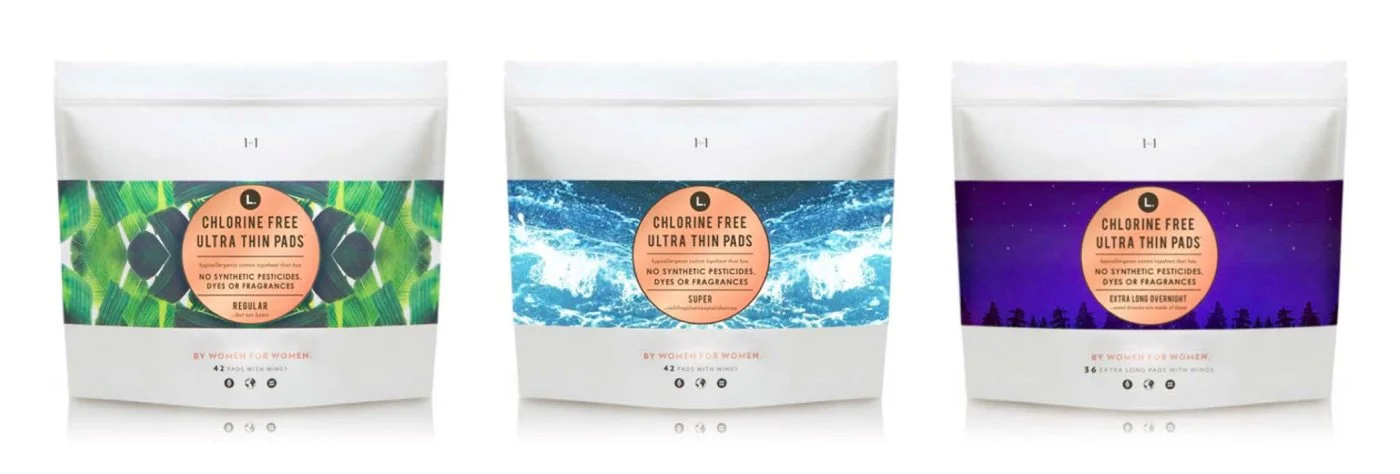
We start from the OG product family.
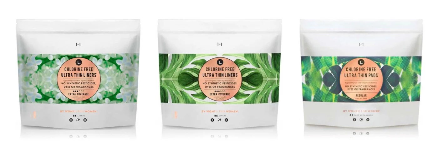
We expanded the product family by adding two new items, using a color progression from white to light green to dark green to communicate functionality, while reinforcing the system through natural references like leaves and flowers.
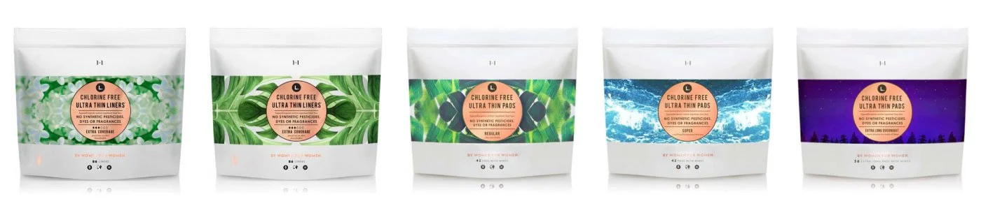
With the addition of the two new items on the left, the product universe is now complete, unified through both its color system and scale hierarchy.
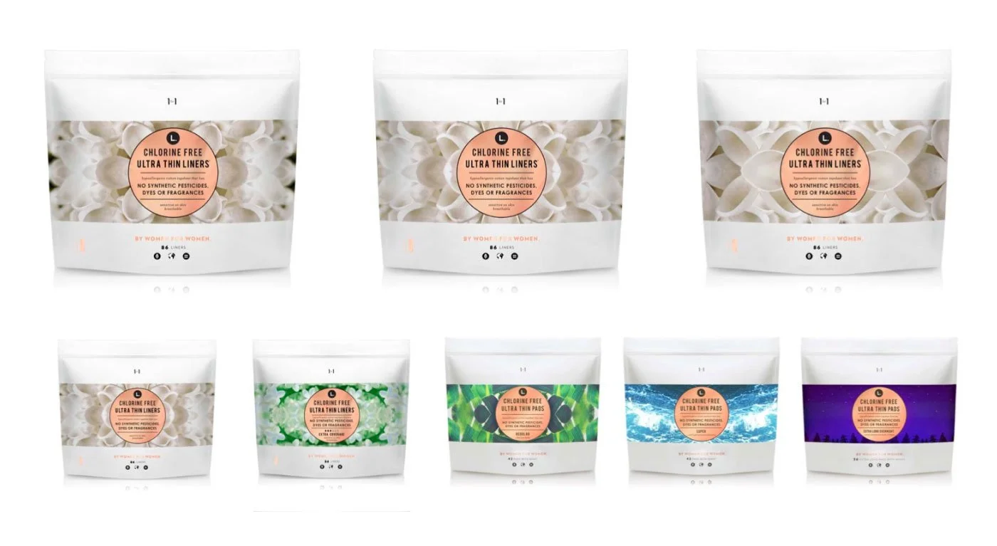
Alternatively, we explored a direction that uses large white flower petals to visually communicate functionality.
2. Pouch — Scale up (Retail environments)
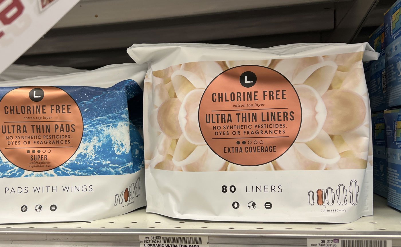
We scale products up or down to fit different retail environments such as CVS, Target, and nationwide distribution, ensuring key items are optimized for various store formats.
We reduced product sizes to meet the requirements of CVS and Walgreens retail environments
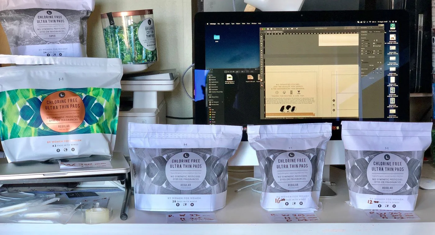
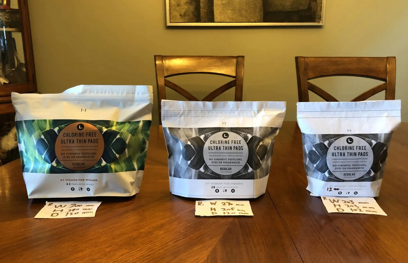
Using this popular item as an example.
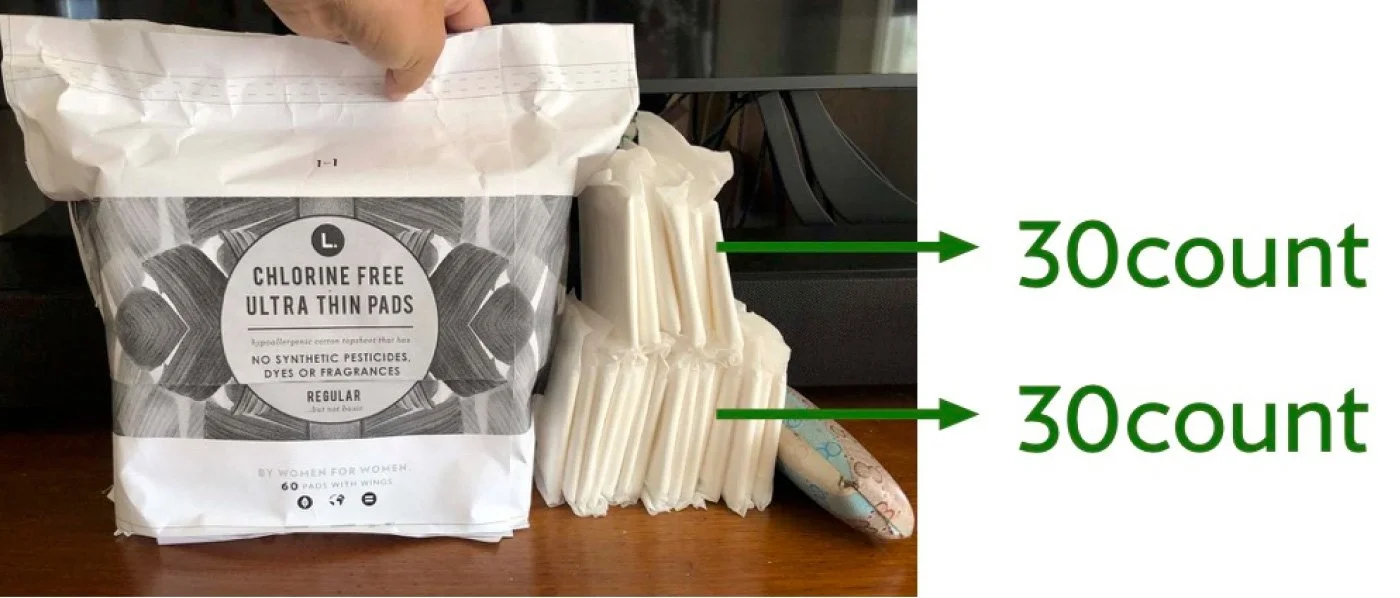
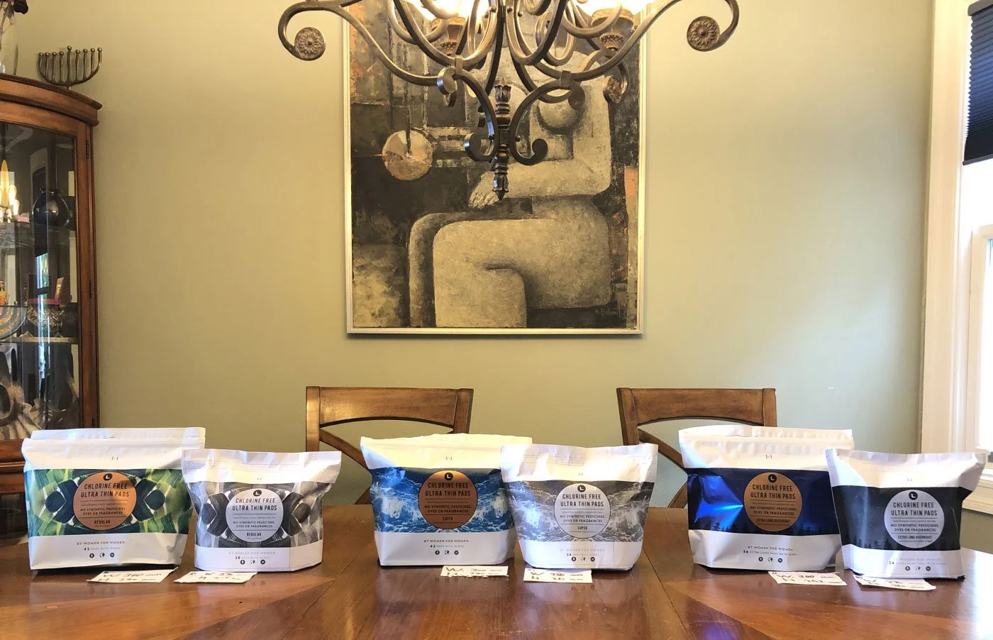
We expanded the product to a 60-count format for Walmart and explored different packing methods to determine the most effective package size. This helped translate the team’s ideas on counts and configuration into clear communication with the buyer, while also aligning with the manufacturer’s production capabilities.