Startup disruption to Enterprise scaling
From 8-Person Startup to Procter & Gamble
Project Overview
Created packaging systems and visual identities that strengthened retail presence and differentiated the brand within a traditionally commoditized category.
Project Type
Branding, Packaging System, Product Design, Retail
Duration
2018 - 2019
My role
Design Lead
Teammate
CEO, Product, Retail, Manufacturing Partners
How an 8-Person Startup Disrupted the Category
When I joined This is L., it was an 8-person team with a clear ambition:
to challenge the norms of traditional feminine care.
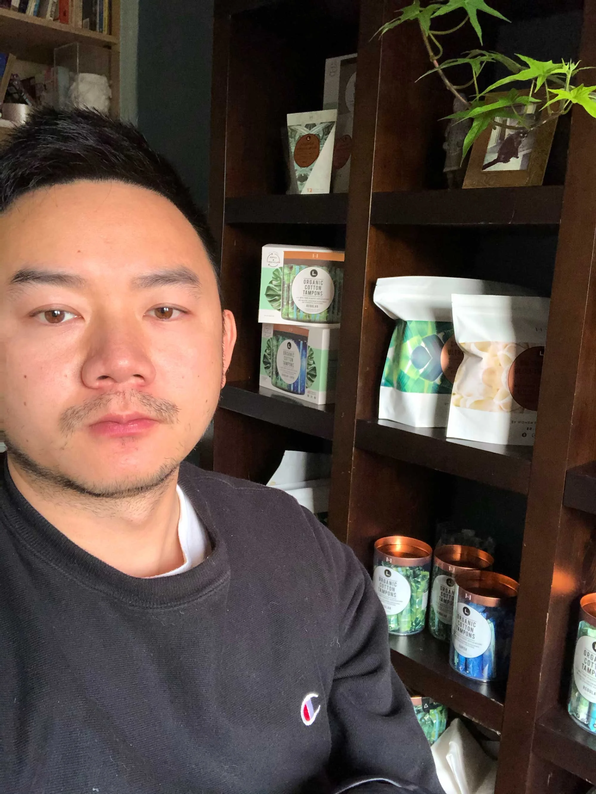
As the sole designer, I worked directly with the CEO, product team, retail buyers, and manufacturers—leading design across brand, packaging, and retail strategy.
We didn’t follow category conventions.
We broke them—intentionally.
The result was a distinctive, modern brand that stood apart in a commoditized aisle.
Overview
Phase 01 — Startup (San Francisco)
Disruption through design + innovation
Phase 02 — Post-Acquisition
Sustaining innovation at scale
Phase 01 — Startup (San Francisco)
Disruption through design + innovation
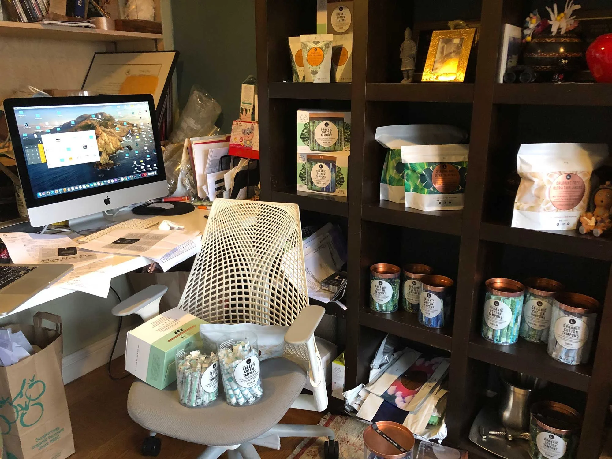
Sole designer on an 8-person team. Led brand and packaging design in close collaboration with leadership, product, and manufacturing—defining a distinct position in a highly standardized category.
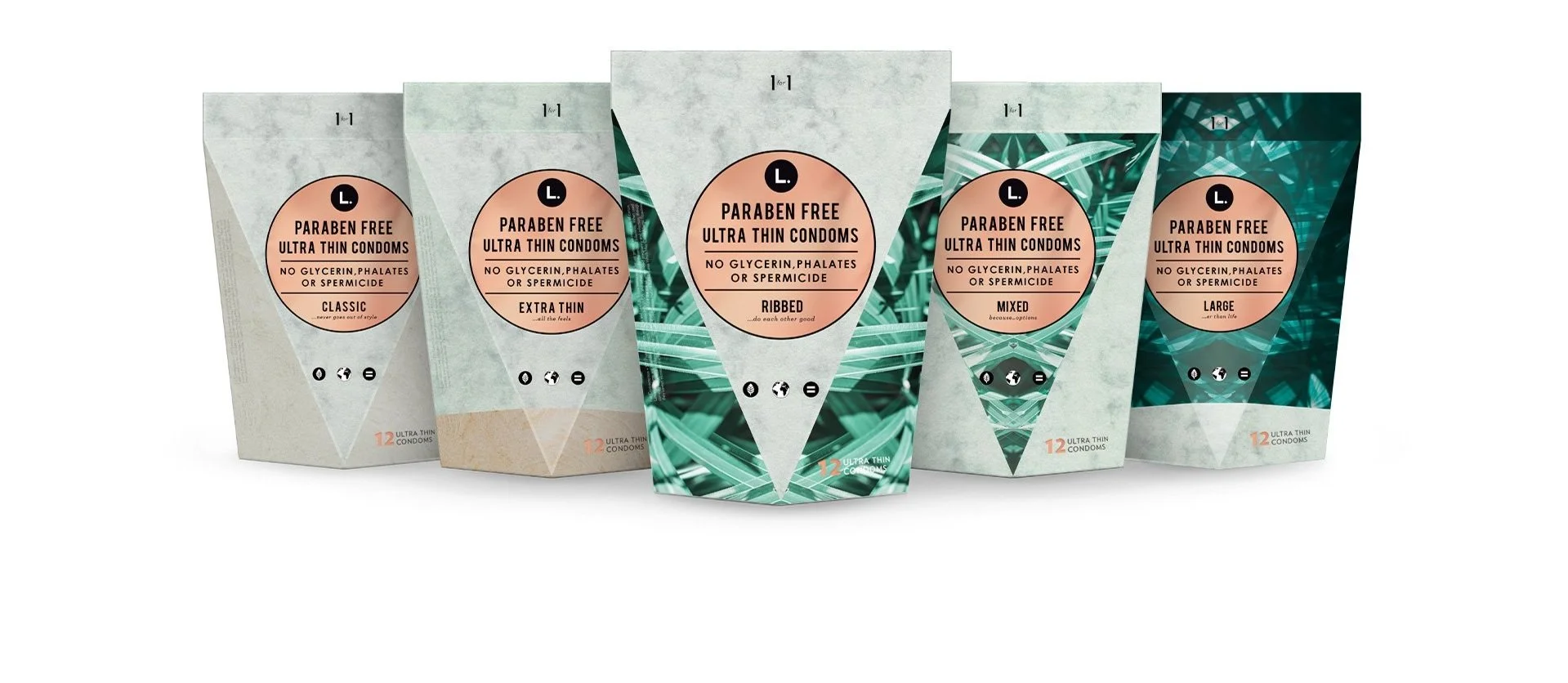
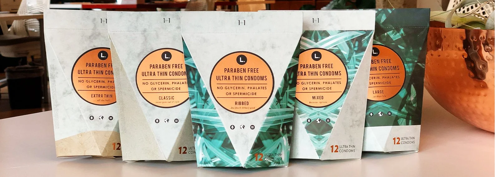
1. Resealable Pouch for Pads
Distinctive Visual Language
Introduced botanical patterns and cleaner color palettes
Replaced clinical cues with a more human, approachable tone
Established a strong, recognizable brand presence
Designed for instant recognition—not subtlety
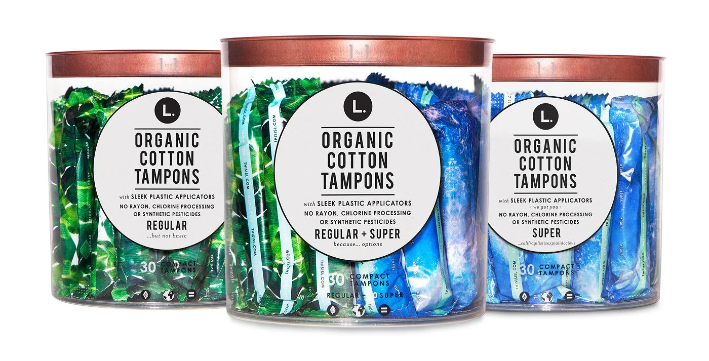
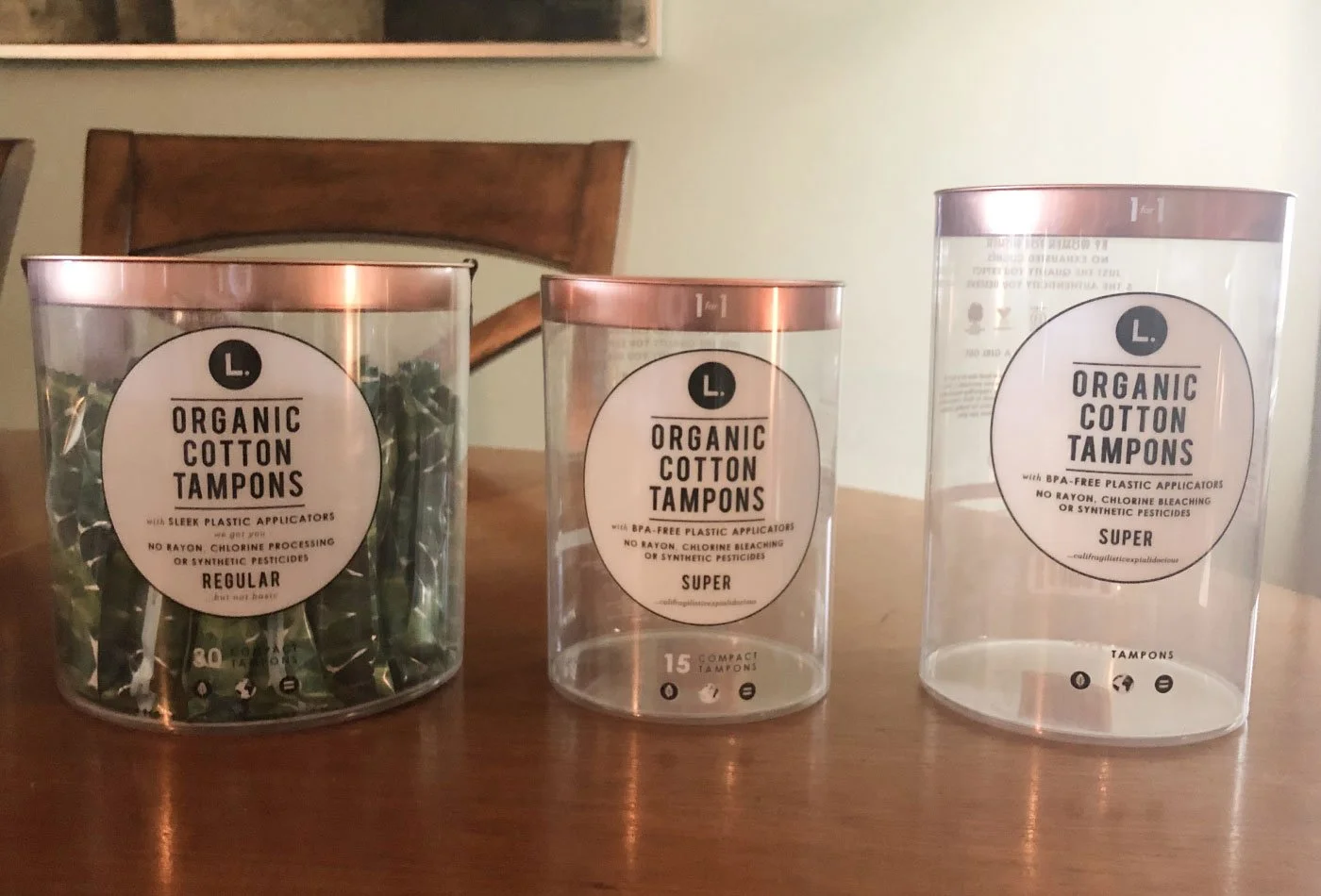
2. Transparent Tubes for Tampons
A radical departure from traditional opaque packaging.
Clear tubes exposed the product—removing stigma and building trust
Minimal, modern labeling emphasized transparency
Turned a hidden product into something confidently displayed
Redefined how the product is perceived—honest, clean, and approachable.
3. Recyclable Paper Refill Box
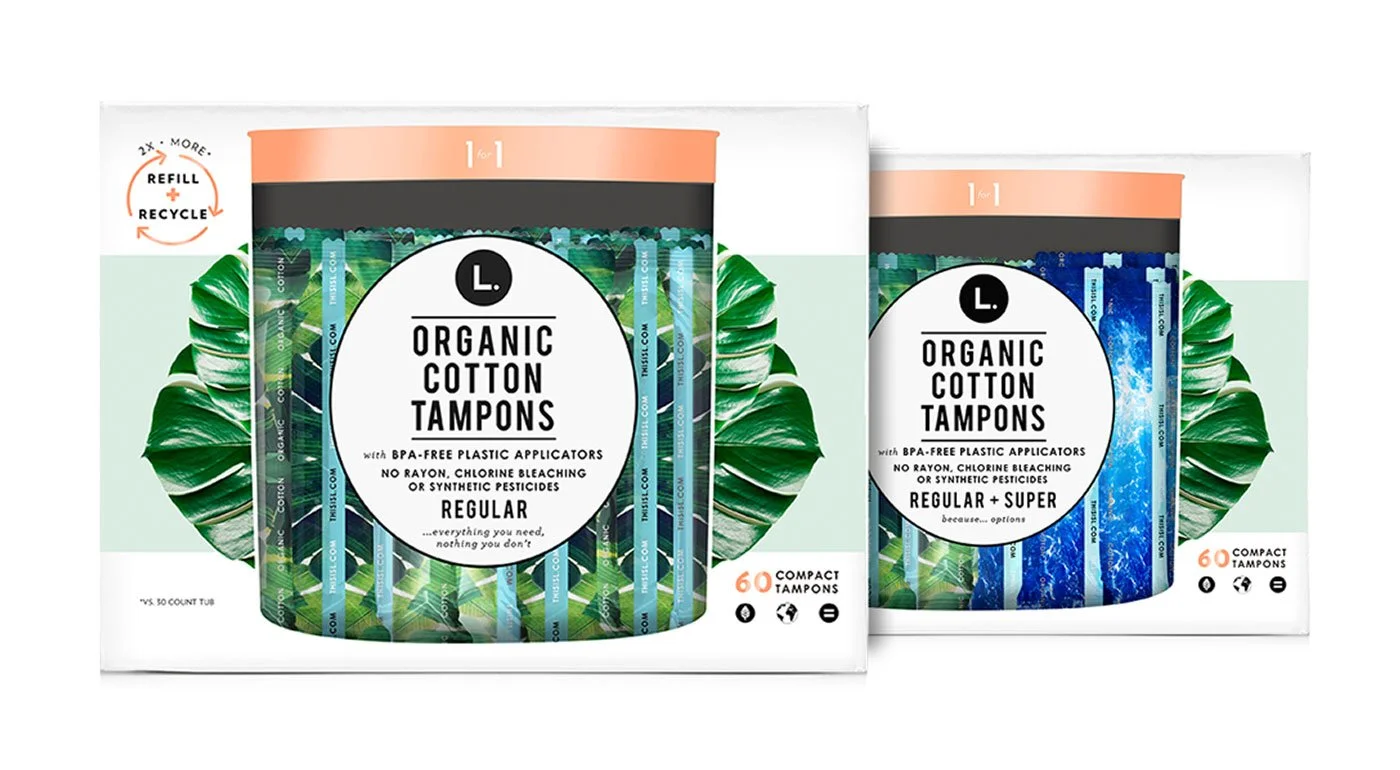
Designed for sustainability and system thinking.
Reduced plastic through refill-based packaging
Maintained visual consistency across formats
Extended the brand into a more eco-conscious direction
Connected product experience with long-term brand values.
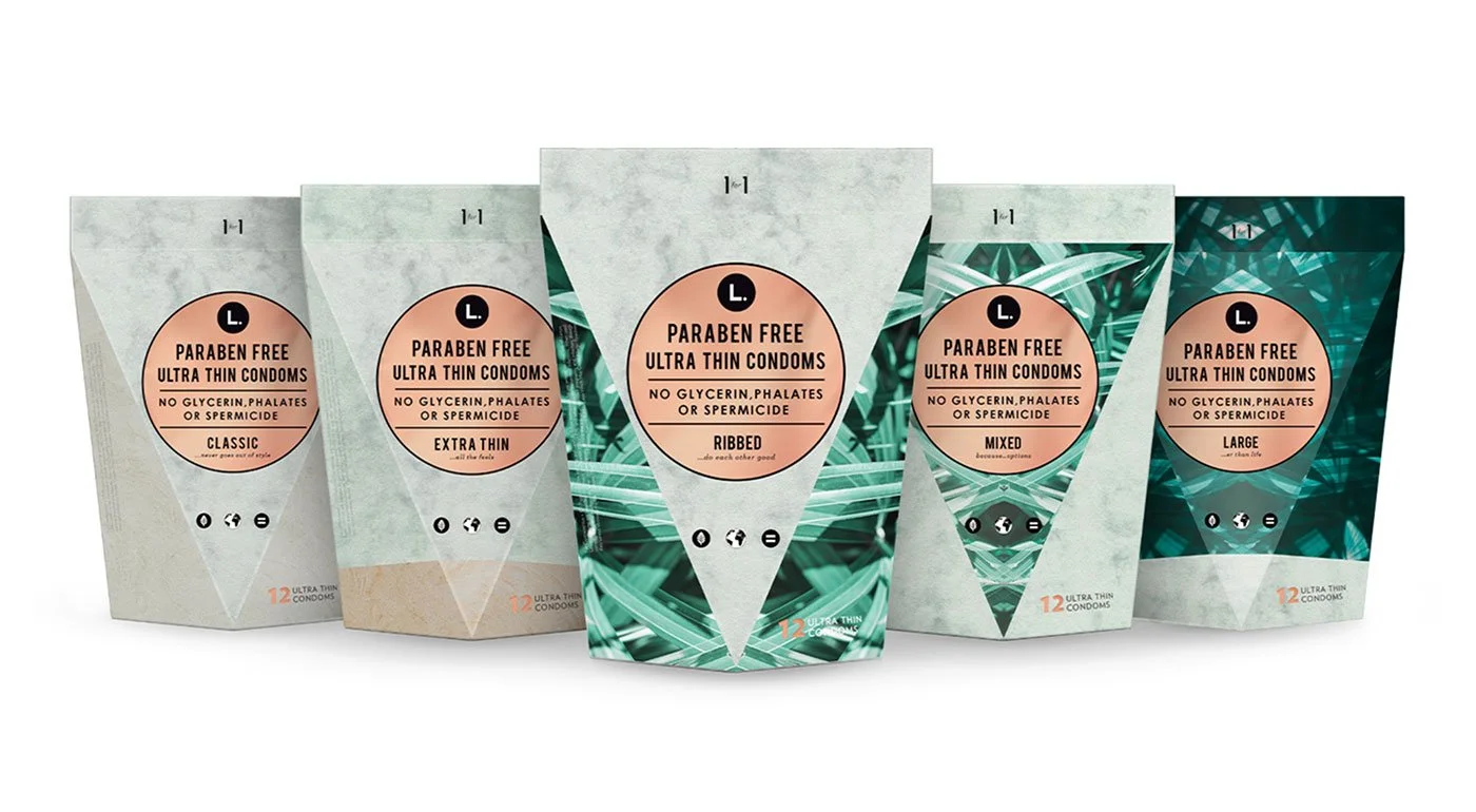
4. Triangular Structural Boxes
A bold structural decision to disrupt shelf uniformity.
Unique triangular form broke the predictable retail pattern
Instantly recognizable from a distance
Created strong visual blocking on shelf
Not just packaging—this was retail strategy through form.
The final round of samples from the manufactures. ⬆Feedback & Iteration
From early prototypes to final production, I worked closely with manufacturers to refine structure, materials, and print execution.
Marked up initial samples for structural adjustments
Iterated on form, color, and material constraints
Delivered production-ready packaging for mass retail
Phase 02 — Post-Acquisition
Sustaining innovation at scale
After acquisition by Procter & Gamble, the focus shifted to scaling the system across retailers, SKUs, and operational constraints—while preserving design integrity and continuous innovation.
From Disruption to Scale
After acquisition by Procter & Gamble, the focus shifted from breaking the category → scaling within it.
I continued as the sole designer, expanding the system across:
New product lines
Retail environments (CVS, Target, nationwide distribution)
Scalable packaging architecture
The challenge became maintaining design integrity while operating at enterprise scale.
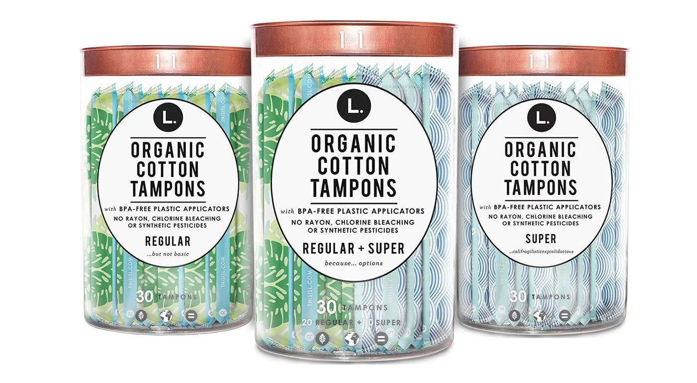
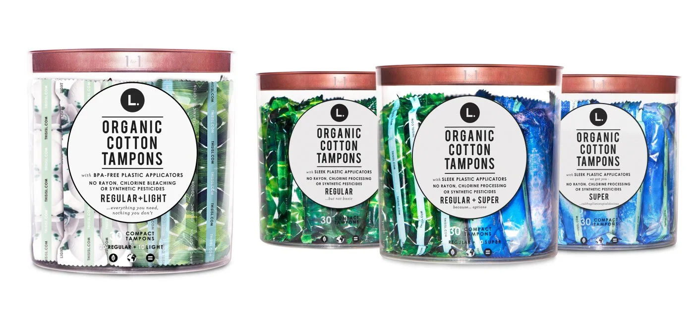
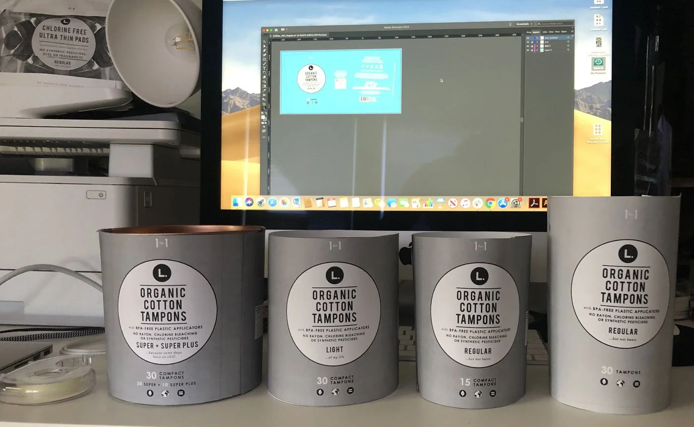
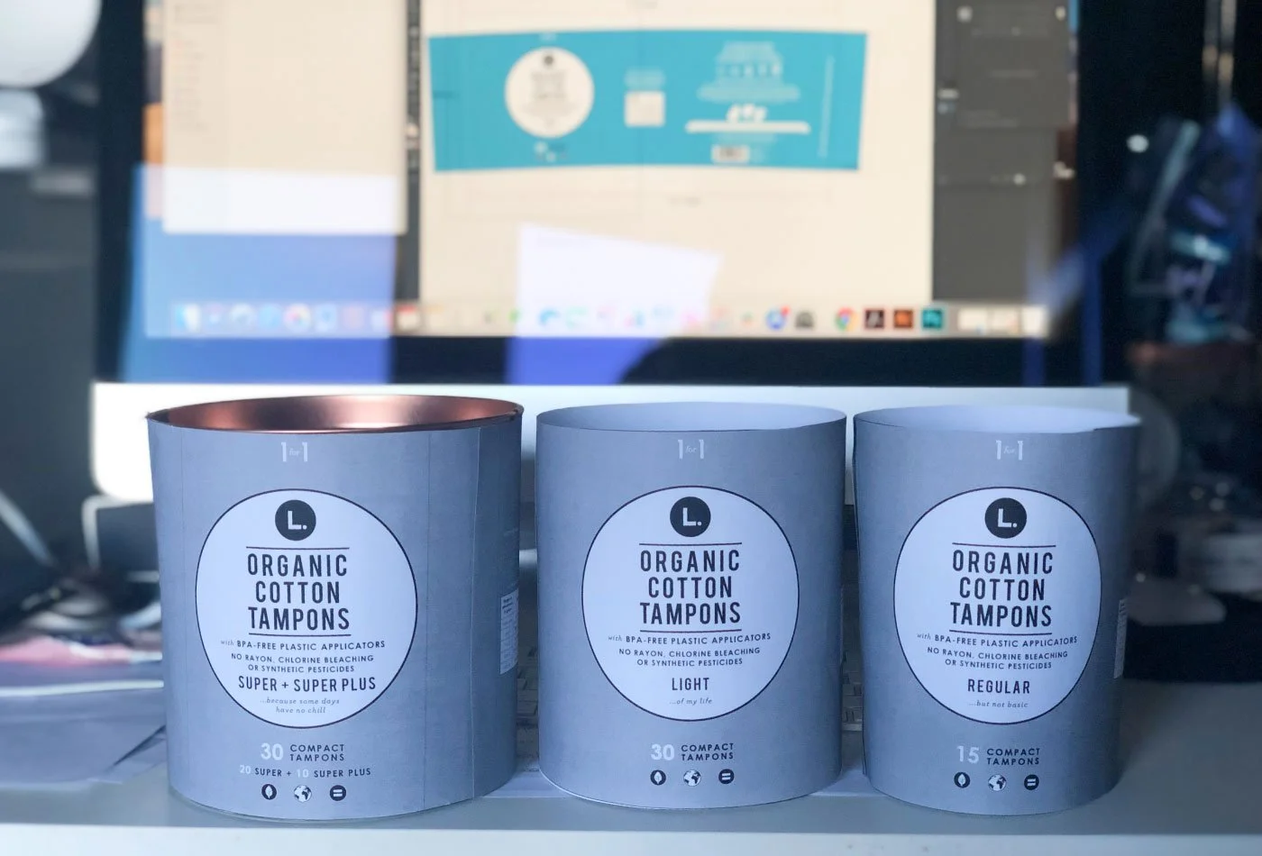
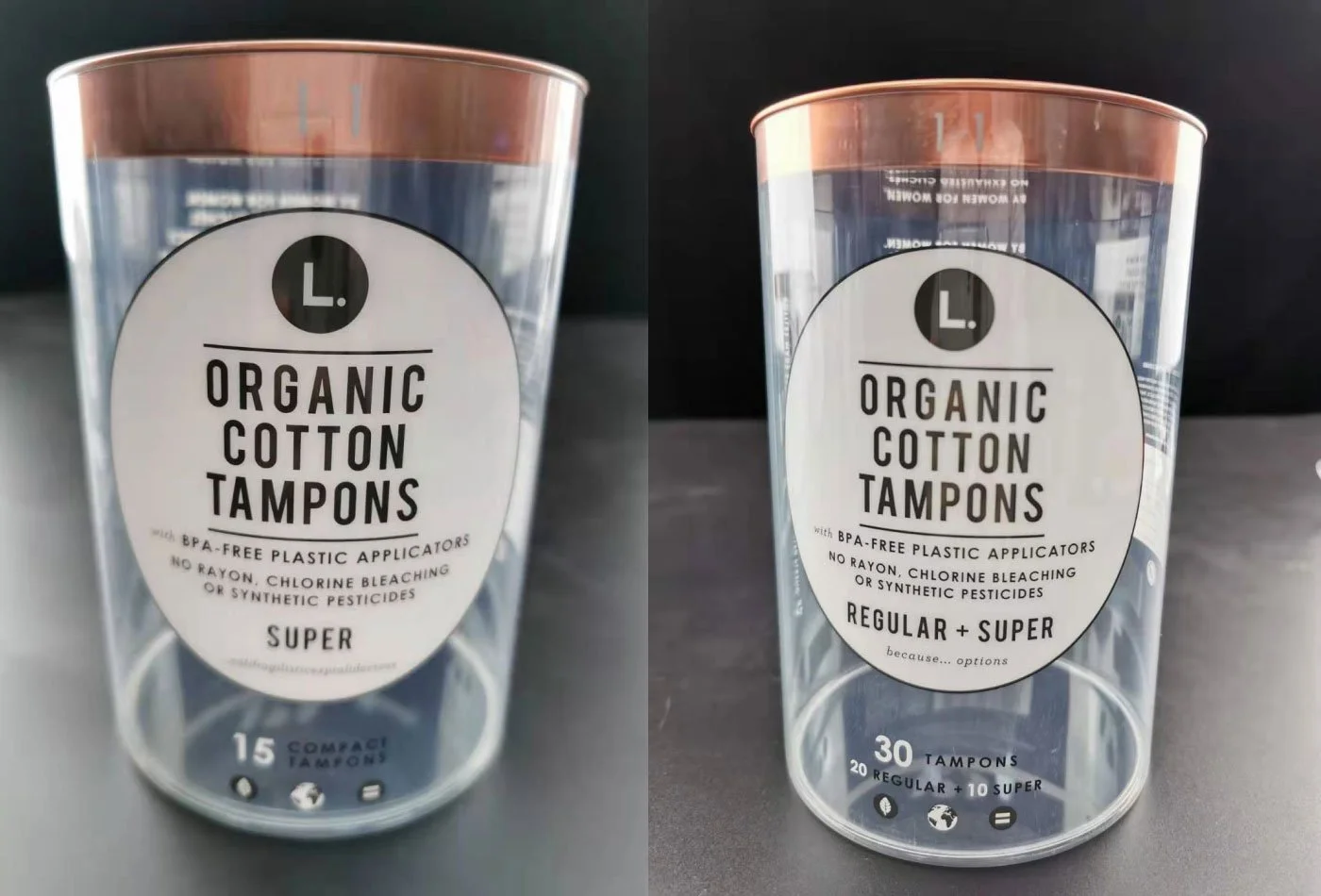
1. Clear Tube — Expanding the product family
We expand the product family by introducing new items, including Light and Super Plus.
We began with three tampon tube options: Regular, Super, and Mixed.
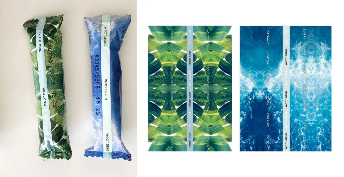
We currently offer two products.
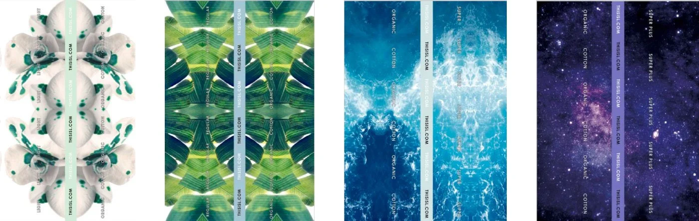
We use color coding to communicate product functionality: White for Regular, Green for standard protection, Blue for Super absorbency, and Dark Purple for our Super Plus option.
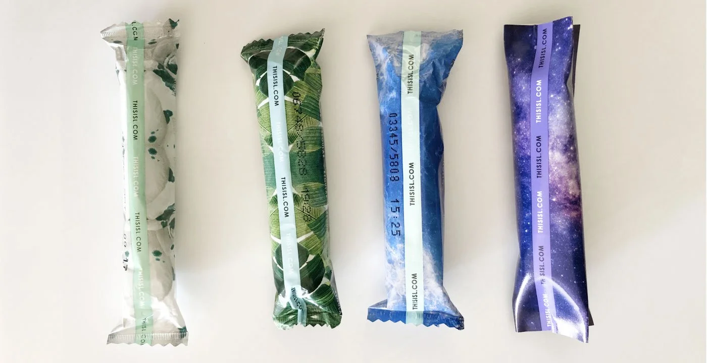
We’ve expanded our range to four products, ordered from left to right: Light, Regular, Super, and Super Plus.
The new tube, Regular + Light Mixed
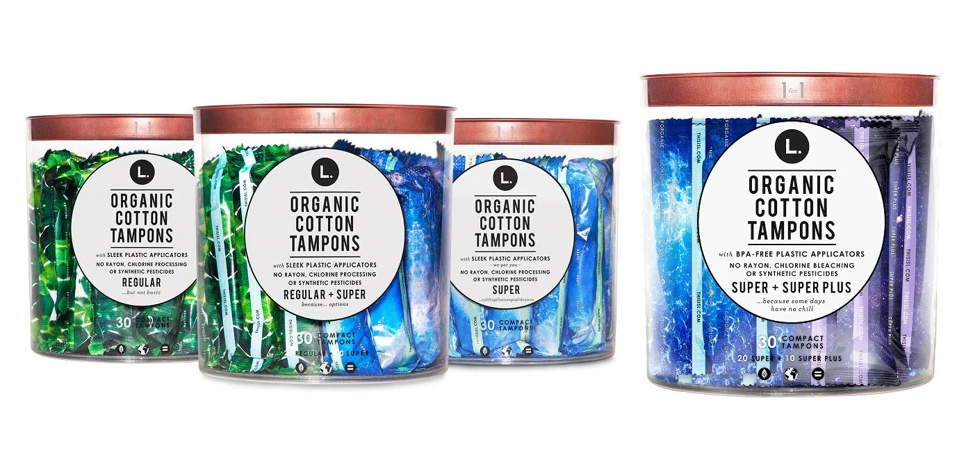
The new Tube, Super + Super Plus
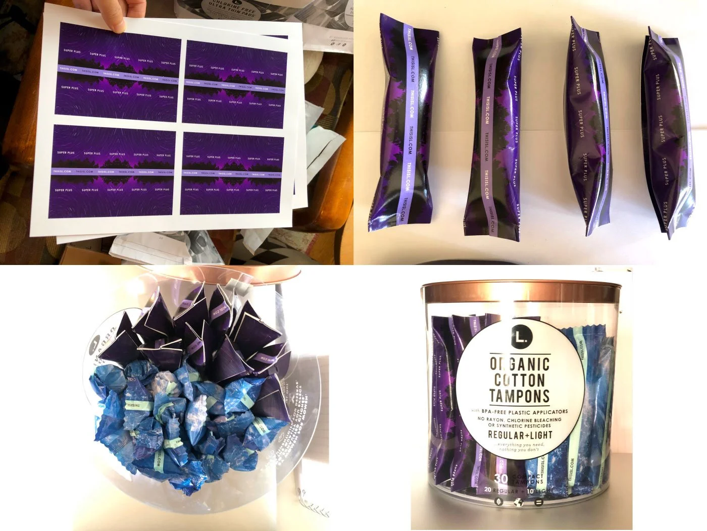
Using Super Plus as an example, we explored different purple directions—from night forests to purple flowers—before landing on the Night Purple Sky. My design process starts by selecting potential concepts, printing them at a print shop, and then creating prototypes at home. I then present everything to the team for discussion and next steps.
2. Clear Tube — Scale up (Retail environments)
We scale products up or down to fit different retail environments such as CVS, Target, and nationwide distribution, ensuring key items are optimized for various store formats.

We use this popular item as the foundation for further development.
To test smaller tubes for CVS and Walgreens.
Tube sizes were designed based on the number of ideas.
We refined the dieline size and created paper prototypes to test form and structure.
The OG tube and the two new product lines.
We received production samples from the manufacturer for review and testing.
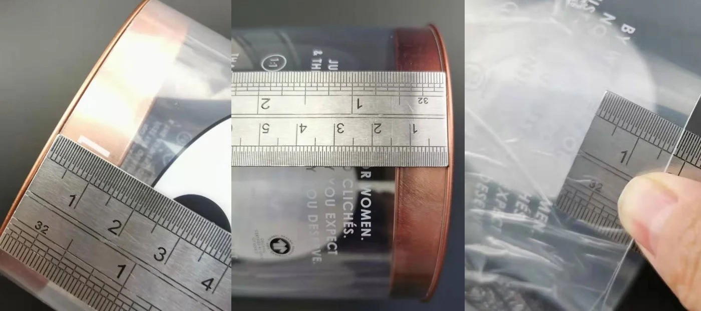
We discussed specifications with manufacturers to ensure accuracy in tube and lid sizing and alignment.
Due to shelf size and capacity limitations, the final CVS version was adjusted to include smaller sizes and reduced counts.
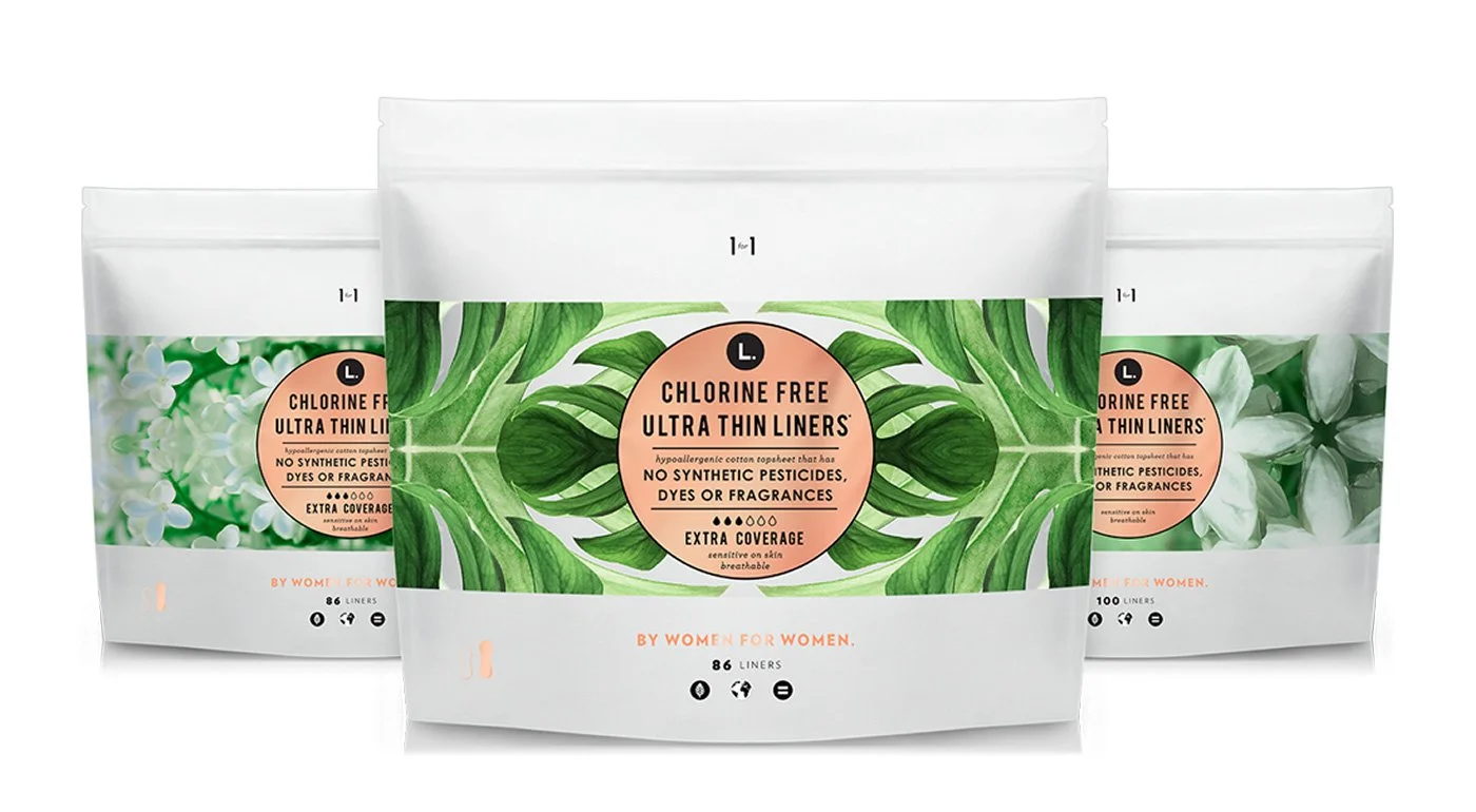
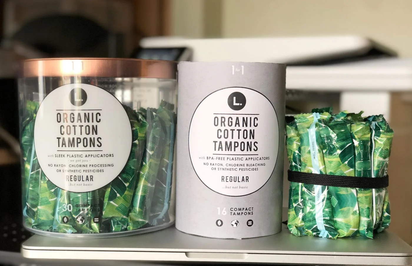
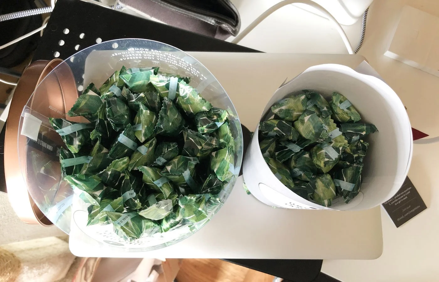
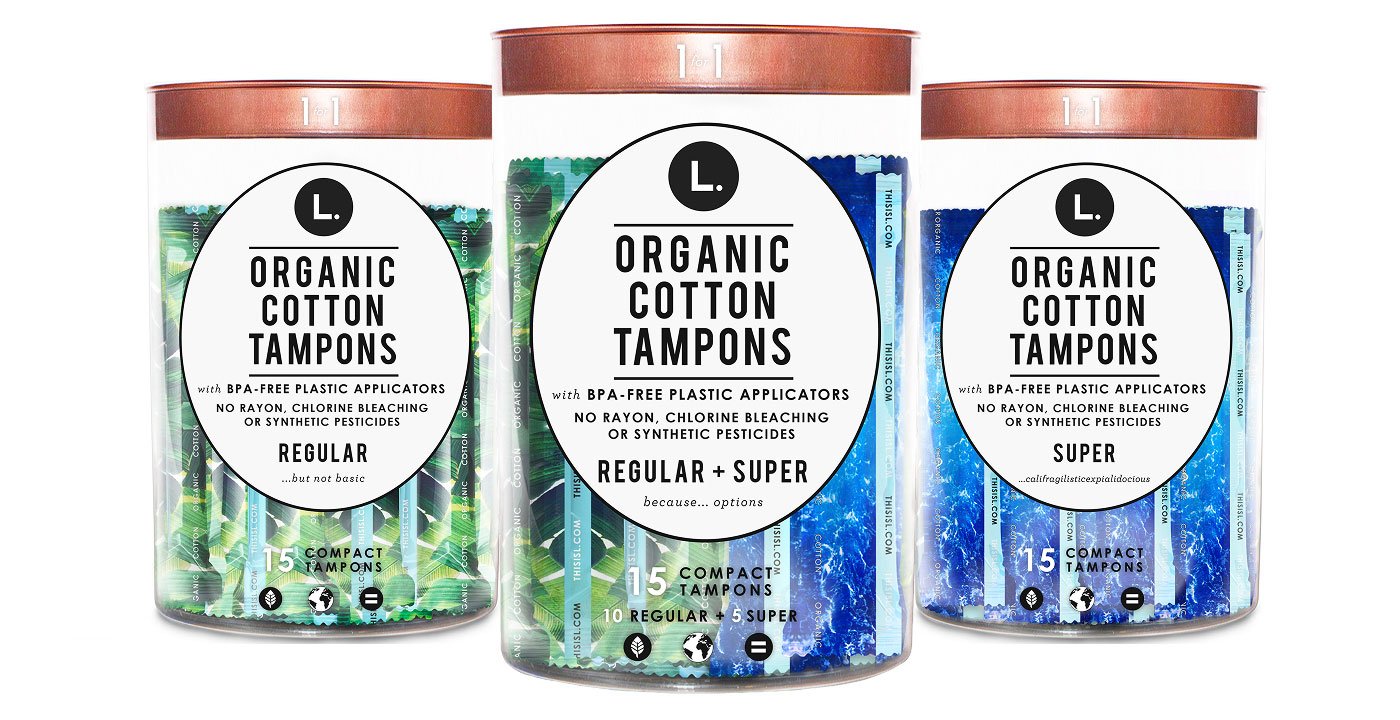
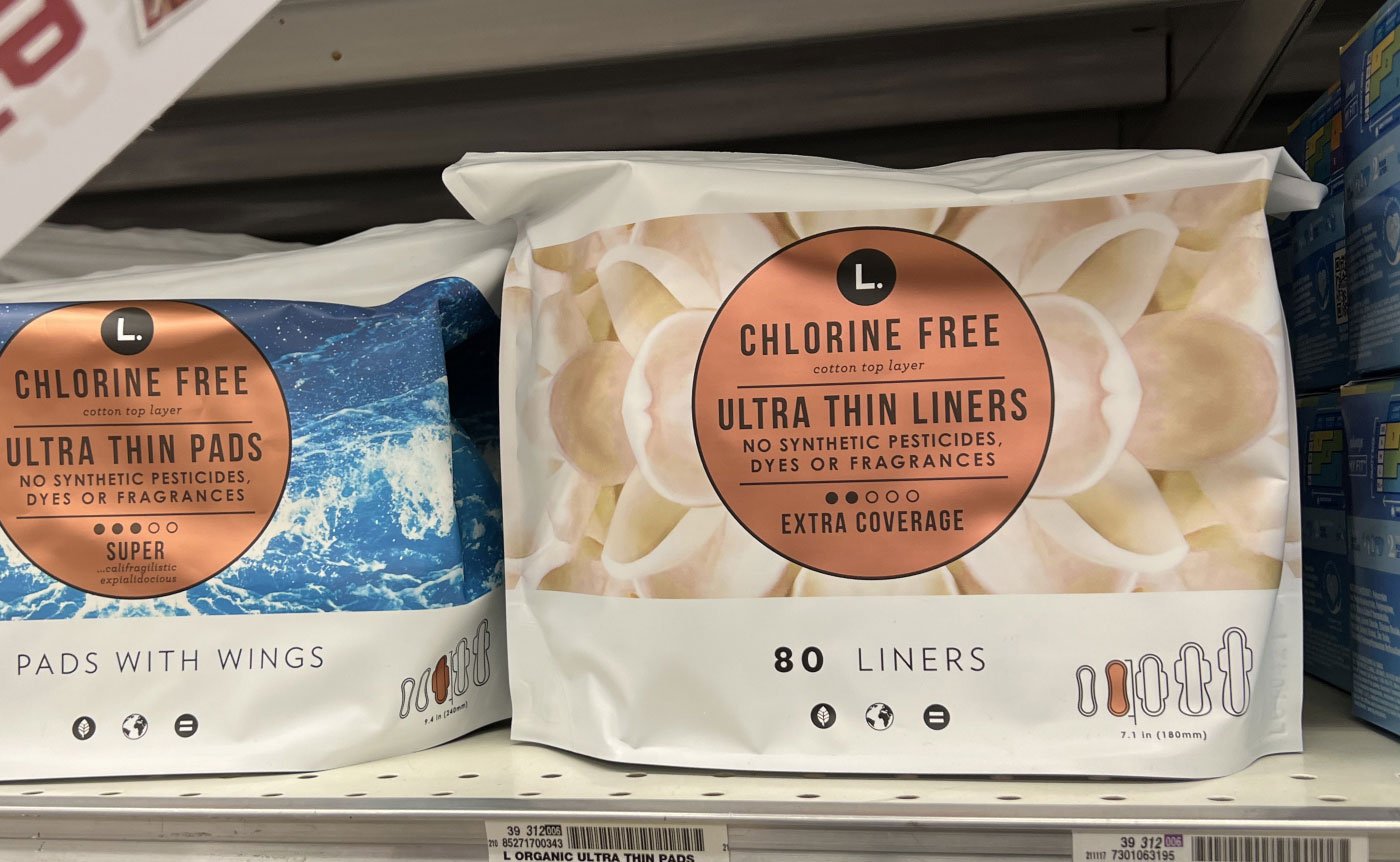
1. Pouch — Expanding the product family
We expand the product family by introducing new items, using color coding to create an “L universe” inspired by nature—from flowers to leaves, ocean, and sky.
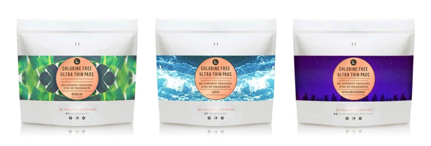
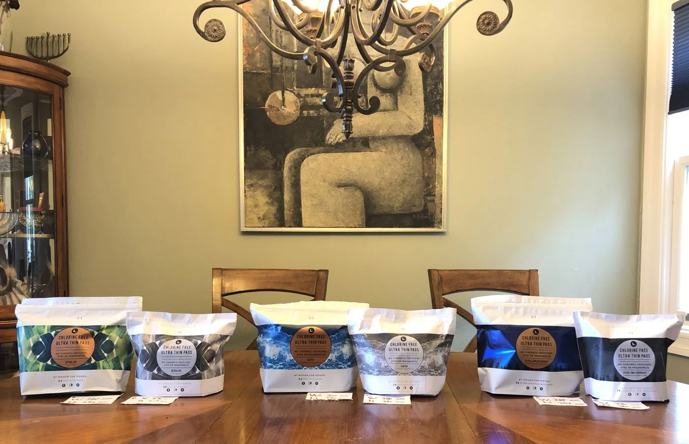
We start from the OG product family.
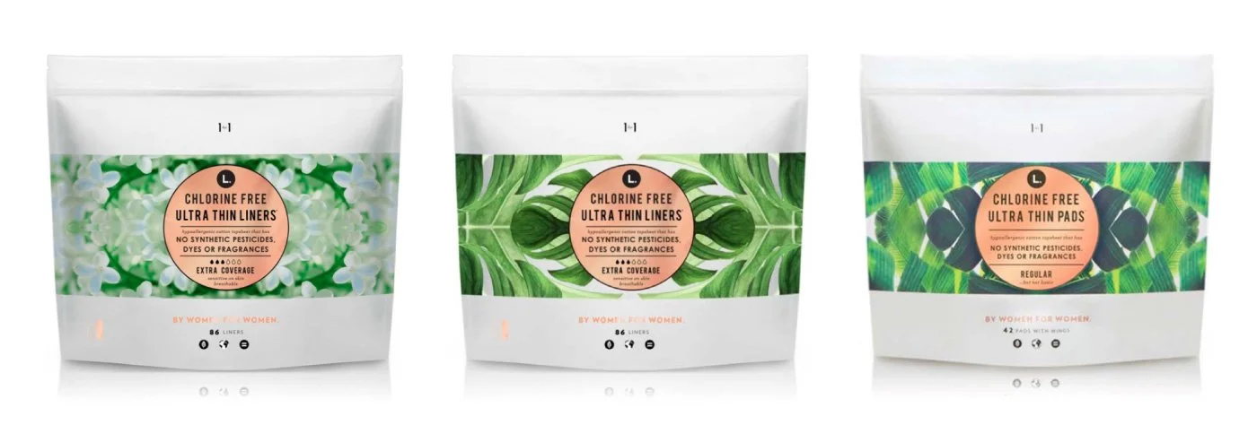
We expanded the product family by adding two new items, using a color progression from white to light green to dark green to communicate functionality, while reinforcing the system through natural references like leaves and flowers.
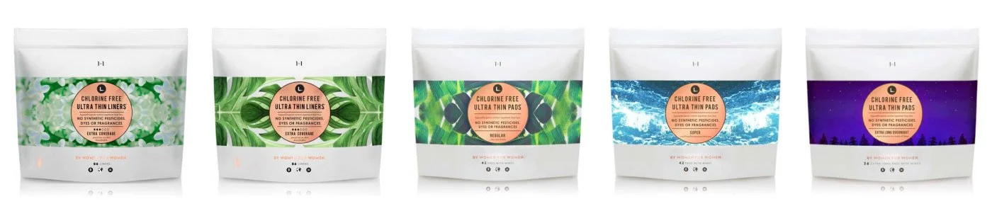
With the addition of the two new items on the left, the product universe is now complete, unified through both its color system and scale hierarchy.
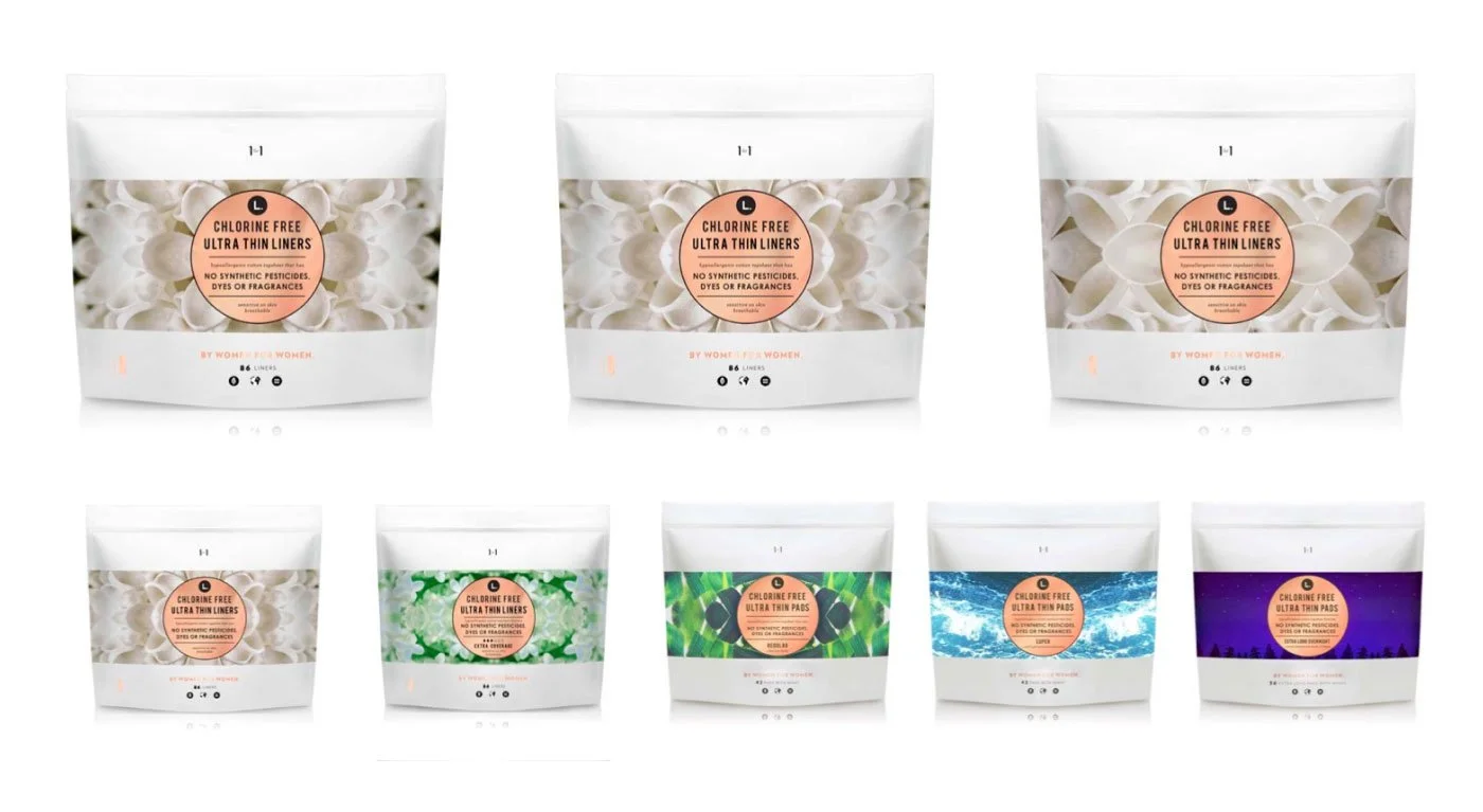
Alternatively, we explored a direction that uses large white flower petals to visually communicate functionality.
2. Pouch — Scale up (Retail environments)
We scale products up or down to fit different retail environments such as CVS, Target, and nationwide distribution, ensuring key items are optimized for various store formats.
We reduced product sizes to meet the requirements of CVS and Walgreens retail environments
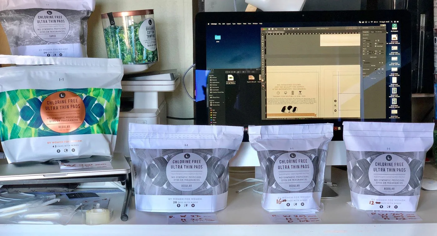
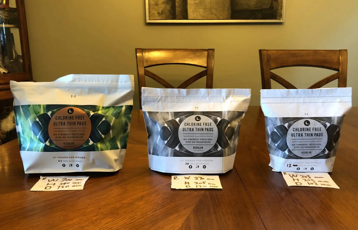
Using this popular item as an example.
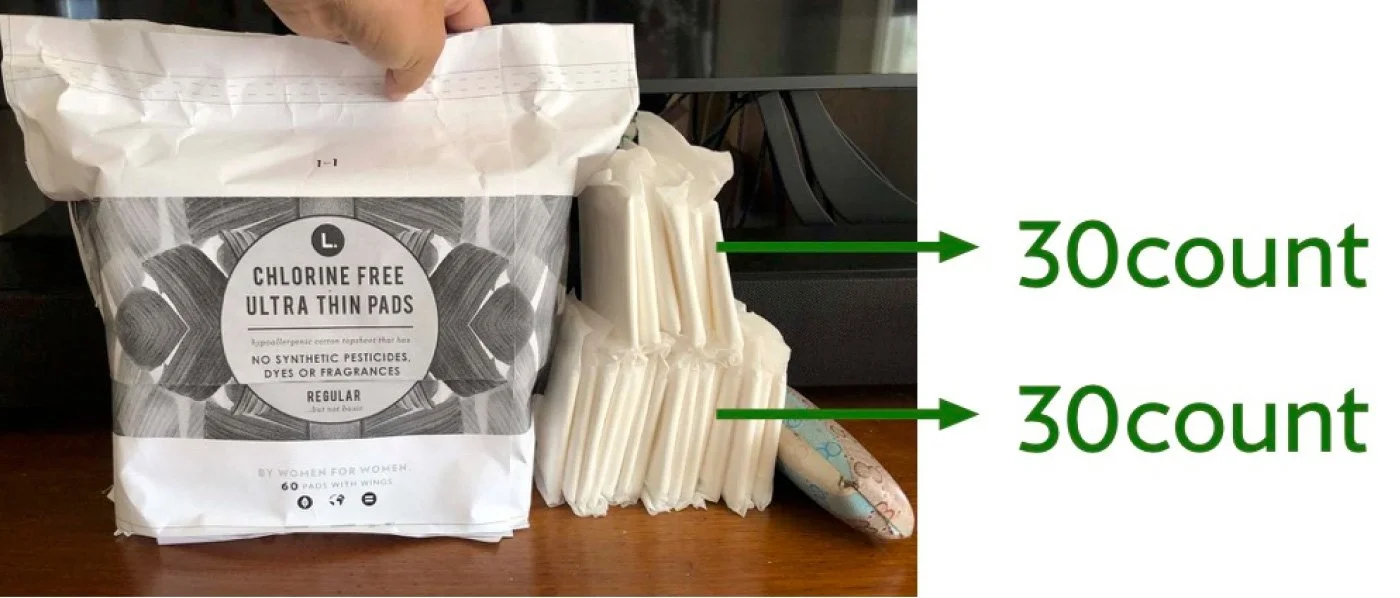
We expanded the product to a 60-count format for Walmart and explored different packing methods to determine the most effective package size. This helped translate the team’s ideas on counts and configuration into clear communication with the buyer, while also aligning with the manufacturer’s production capabilities.