Built in DTC. Proven at CVS, Walmart, Walgreens & Target.
As design lead, I helped build and scale an older adult care brand from 0→1, evolving it from DTC to national retail.
Retail doors across Walmart, Target, CVS, and Walgreens
Offline customer acquisition cost, after creative moved in-house and testing sped up
The business nearly doubled during the expansion
U.S. print publications in the campaign mix
Business results are team outcomes, as shared publicly by Because’s VP of Brand. My contribution was the design work shown on this page.
Win in a crowded DTC market, then carry that momentum onto a physical shelf, where customers think, browse, and buy differently.
The full funnel: brand foundation, acquisition, retention, and retail packaging and in-store.
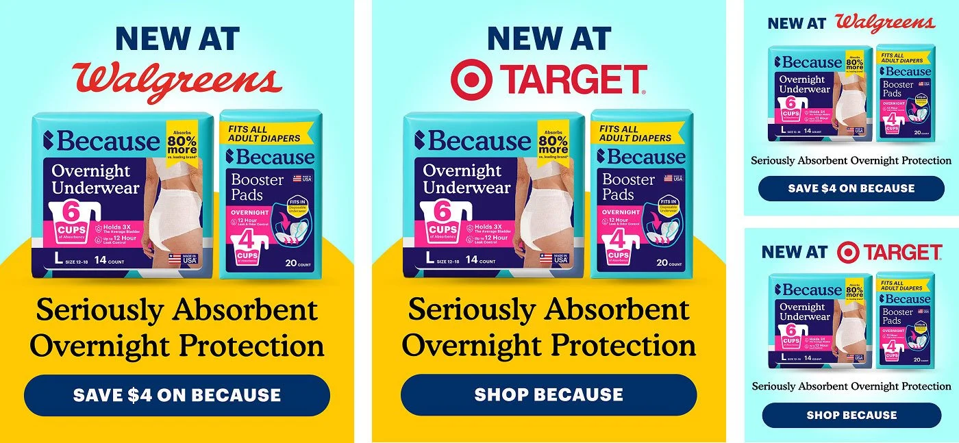
Scaled from DTC to nationwide retail distribution at CVS, Walmart, Walgreens, and Target, with one cohesive brand system across channels.
Two stages of growth.
My role focused on two stages of growth:
Winning in DTC
In a crowded, low-exposure environment, the goal was to stand out, survive, and scale.
Breaking into retail
After proving success online, the challenge became translating that momentum into physical retail—where customers think, browse, and buy differently.
Different environments. Different rules.
How do we evolve a high-performing DTC brand into retail—without losing its edge?
Trust came first.
At the very beginning, the product was DTC-only, with a medical-inspired design direction intended to build trust with customers.
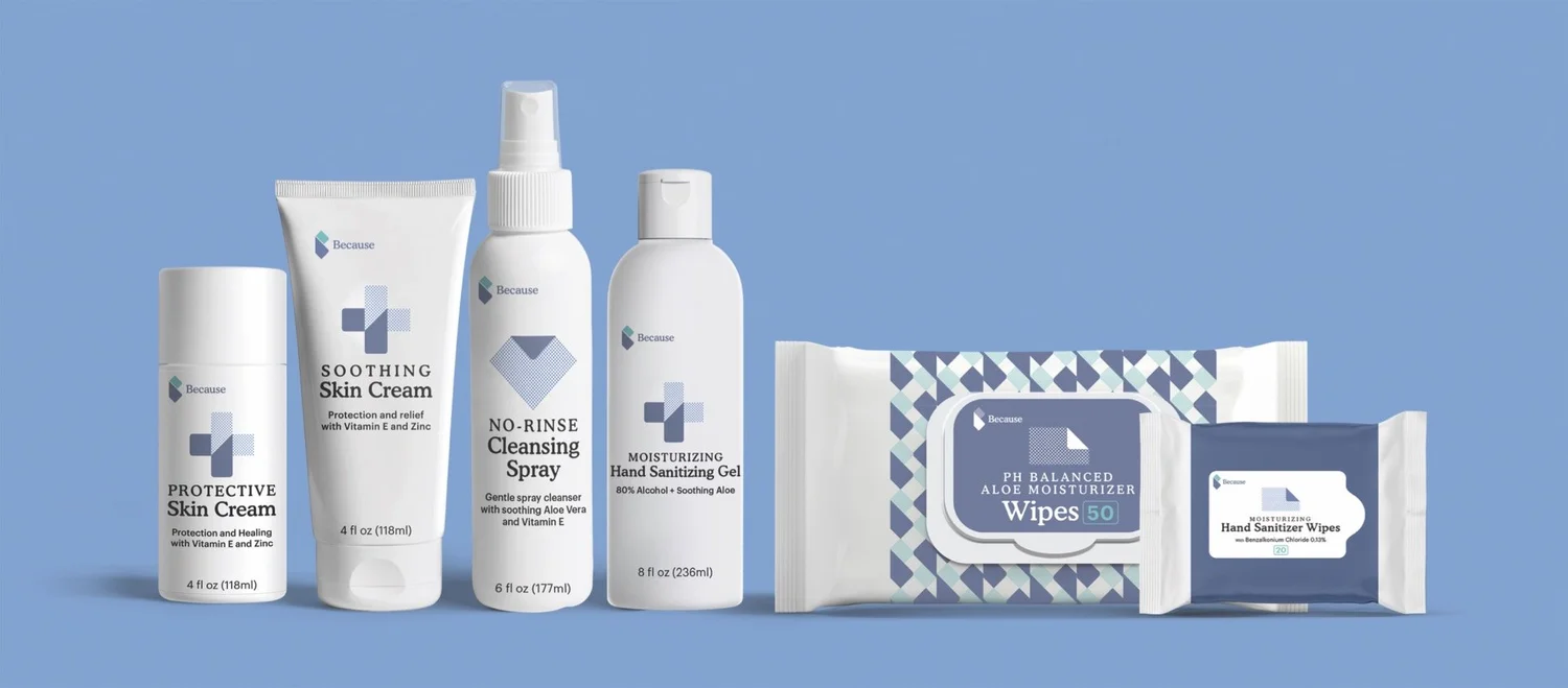
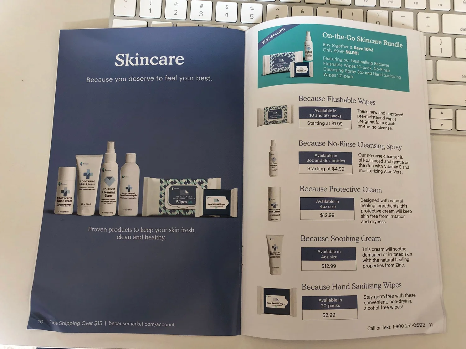
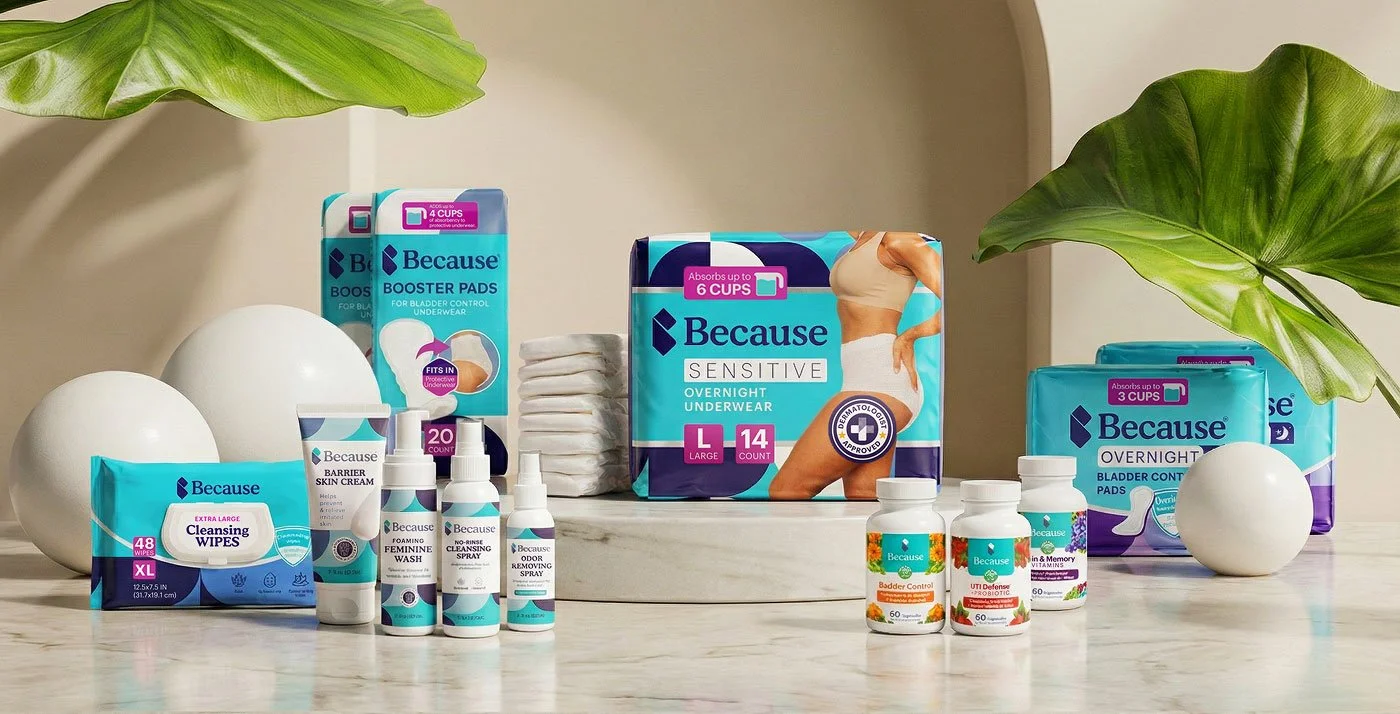
As the brand moved toward retail, the design evolved from medical, trust-inspired DTC work to more shelf-friendly packaging. The rest of this case study shows how, one stage at a time.
Two buyers, one brand.
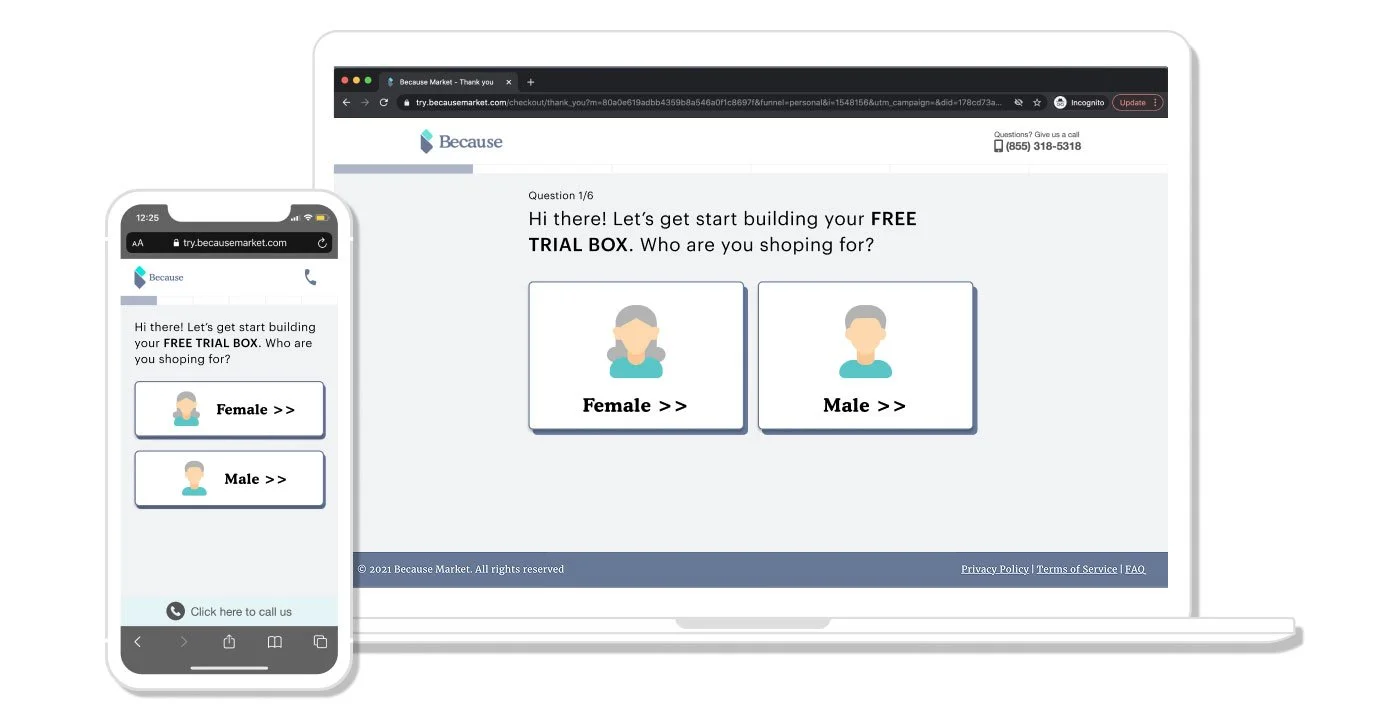
Because serves older adults, and the person placing the order is not always the person using the product. The quiz funnel starts with one question for that reason: “Who are you shopping for?”
Older adults shopping for themselves
They want a product that works and a brand that treats them with respect.
What the design had to do: explain the product clearly, keep the tone warm instead of clinical, and make every step easy to read and easy to finish.
Family members shopping for a parent
They are choosing for someone else, so they need to feel confident fast.
What the design had to do: guide them to the right product, show proof from real customers, and keep reordering simple.
Clarity first
Lead with what the product is and what it does. One message per screen, per ad, per pack.
Relatable, not clinical
The category can feel medical. The brand should feel human, so customers see themselves in it.
One system everywhere
The same colors, type, and voice on a phone, in an inbox, and on a shelf, so trust carries over from one channel to the next.
Four moves, one system.
I approached this as a full-funnel design problem:
Build a strong foundation
Drive acquisition through performance design
Improve retention through lifecycle systems
Translate the brand into retail environments
The customer journey I designed for
“Is this for someone like me?”
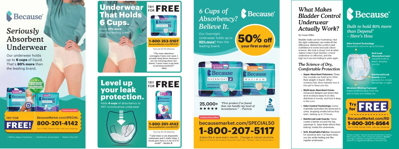
Paid social, video, and print ads
“Which product do I need?”
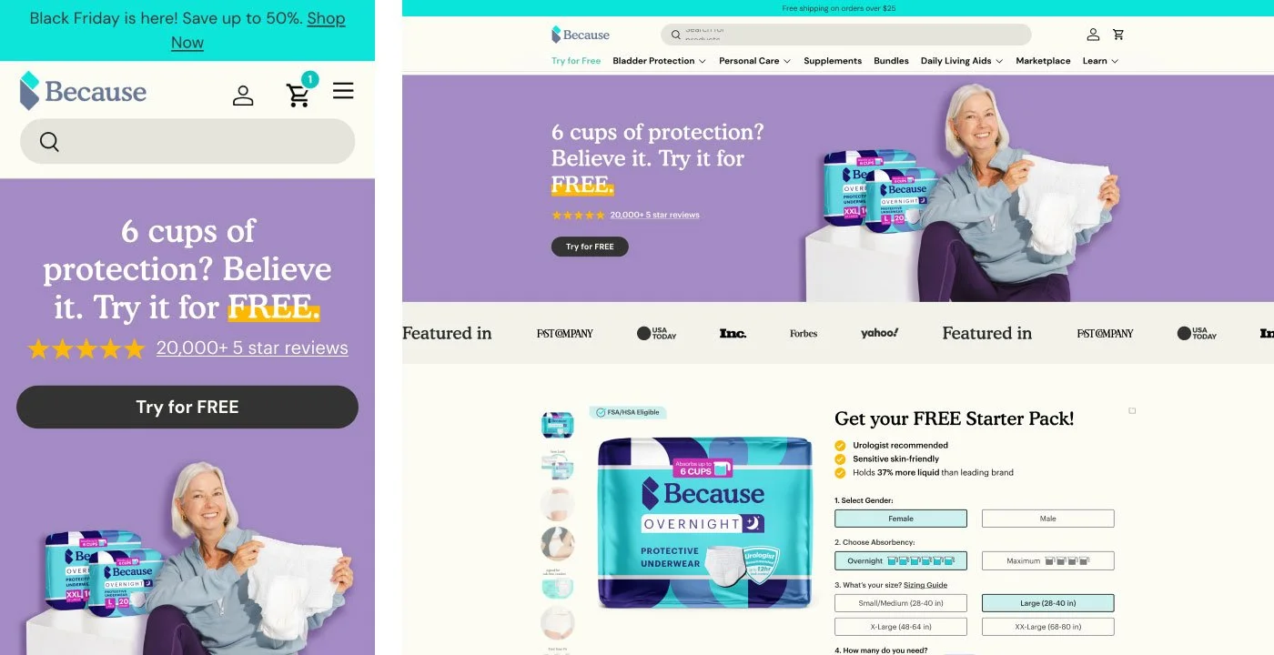
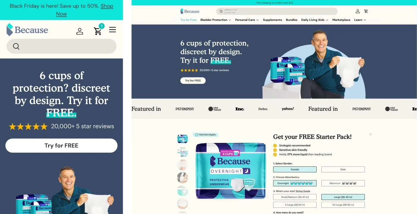
Landing pages and the quiz funnel
“Can I trust this brand?”
DTC website, product pages, and Amazon storefront
“Where is my order? Why reorder?”
Lifecycle emails and the rewards program
“Is this the brand I know?”
Retail packaging and in-store materials
How we worked
Ads, landing pages, the quiz, and even the website template went through this loop. I worked closely with the growth team: we tested several directions, kept what performed, and built the next round on it.
Every stage reinforced the same system, whether customers met the brand on a phone, in an inbox, or on a shelf.
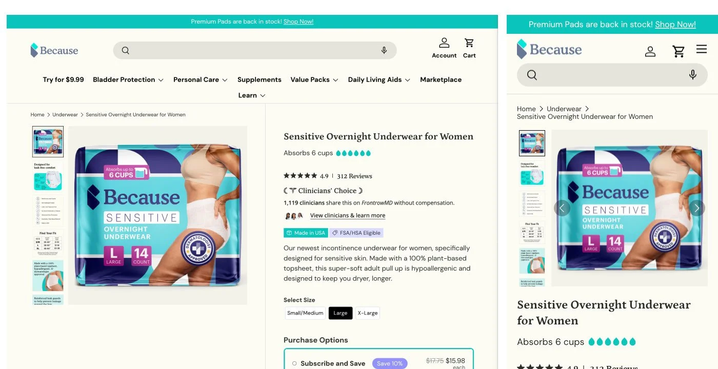
Brand foundation
A new brand in a commoditized category has seconds to explain what it is and why it can be trusted, on every surface where it appears.
Everything after this point borrowed from this system: ads, landing pages, emails, and eventually retail packaging. Building it once meant every later touchpoint reinforced the same brand instead of starting over.
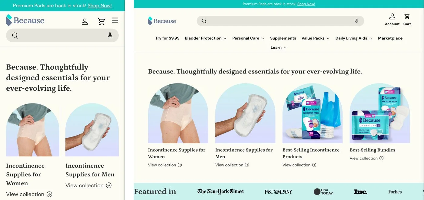
A unified visual system
- DTC website
- Amazon storefront & PDPs
- Packaging system
Focused on
- Clear product education
- Emotional relatability (vs. clinical tone)
- Strong visual differentiation in a commoditized category
User acquisition
Paid traffic only pays off if everything after the click makes the offer instantly clear. Ads, landing pages, and the quiz all led with the same trial offer, so the design job was to make that offer obvious and the path to it short.
A modular system made testing cheap. New variants could be built quickly, and top performers could be scaled instead of redesigned.
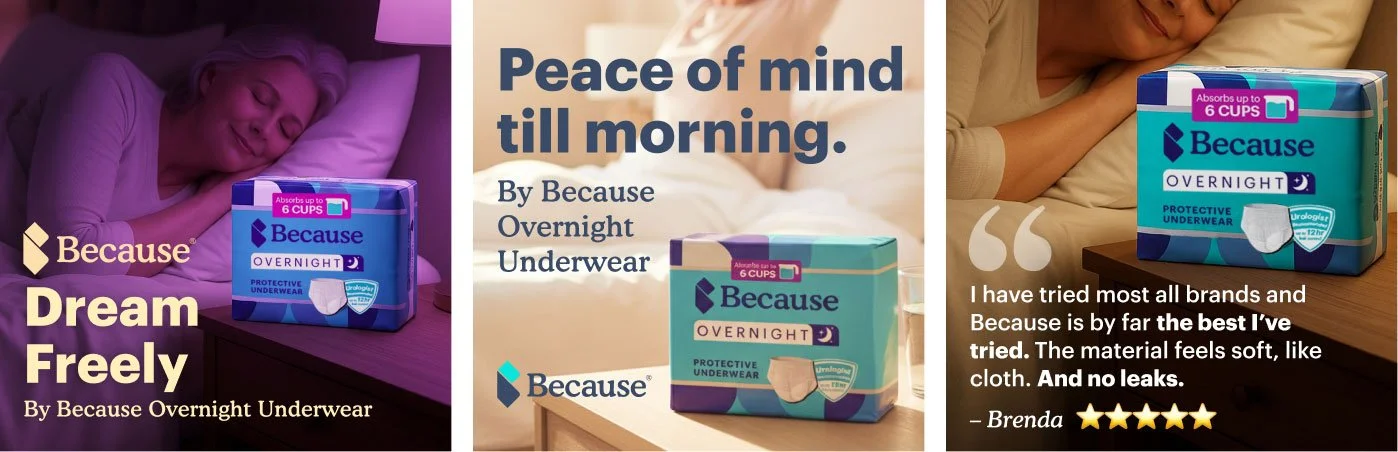
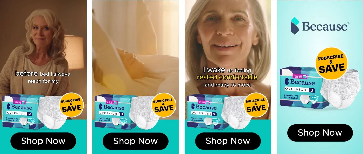
2-A · Performance marketing system
- A scalable library of static ads, video ads, and campaign variations
- Balanced product clarity, emotional storytelling, and scroll-stopping visuals
2-B · Landing pages
- Modular design system for rapid testing
- Clear hierarchy of problem → solution → proof
- Continuous optimization based on performance
2-C · Quiz funnel
- A guided quiz experience to personalize product recommendations
- Built to increase conversion rates and reduce decision friction
A/B testing & optimization
- Worked closely with growth teams to test creative directions, refine messaging, and scale top-performing variants
User retention
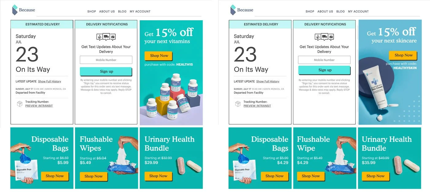
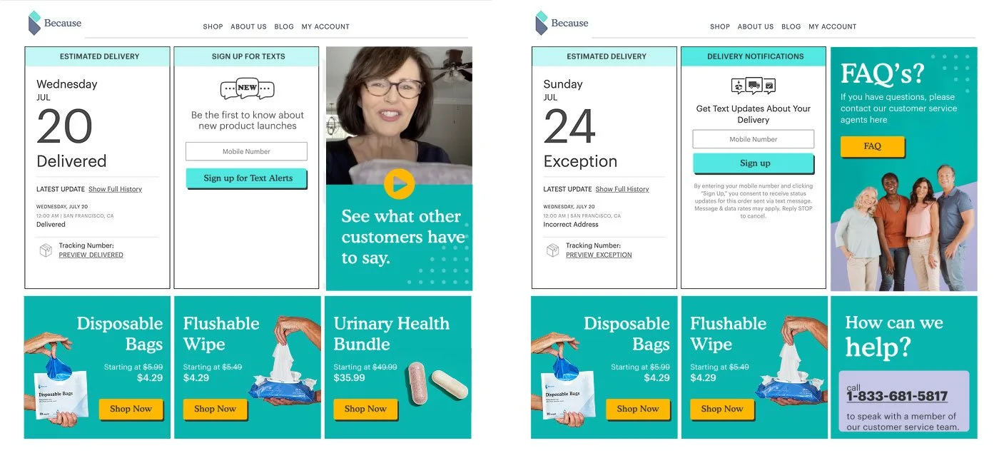
After checkout, customers want one answer: where is my order? I designed those moments to answer that first, then reassure, cross-sell, and offer help.
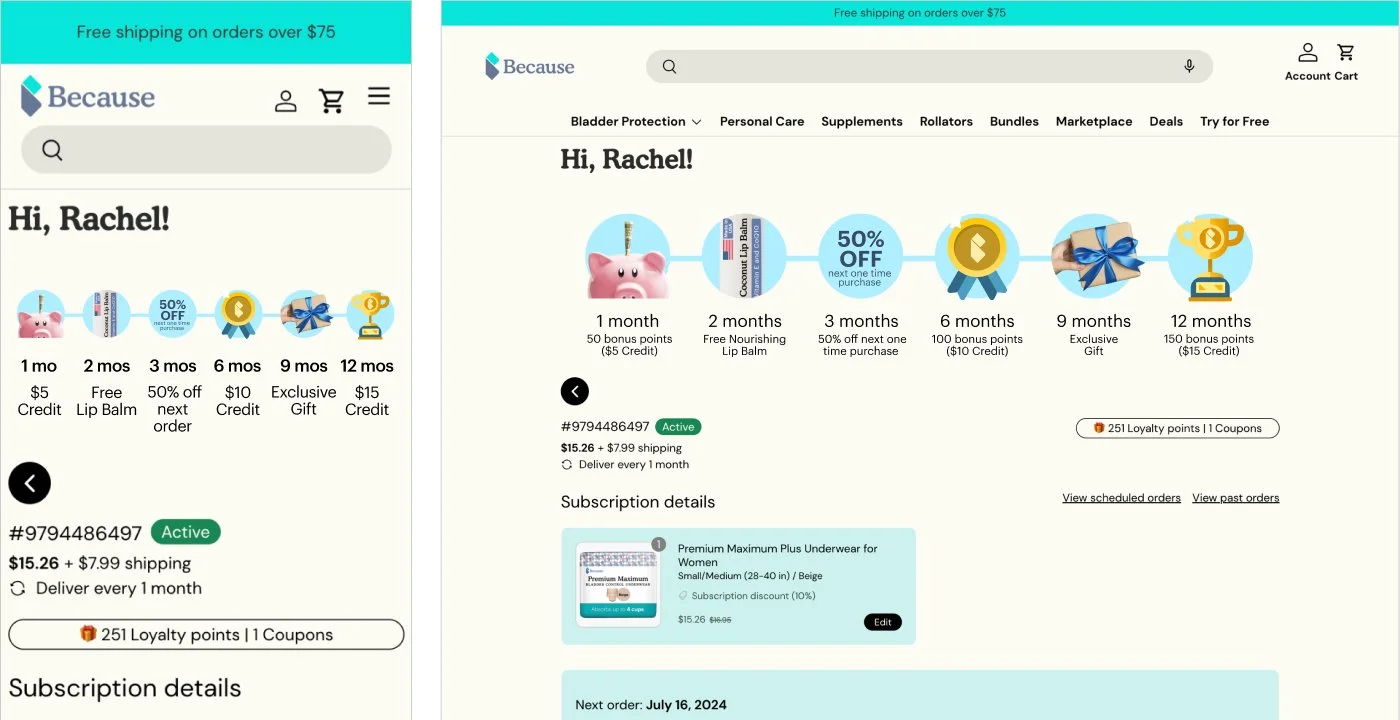
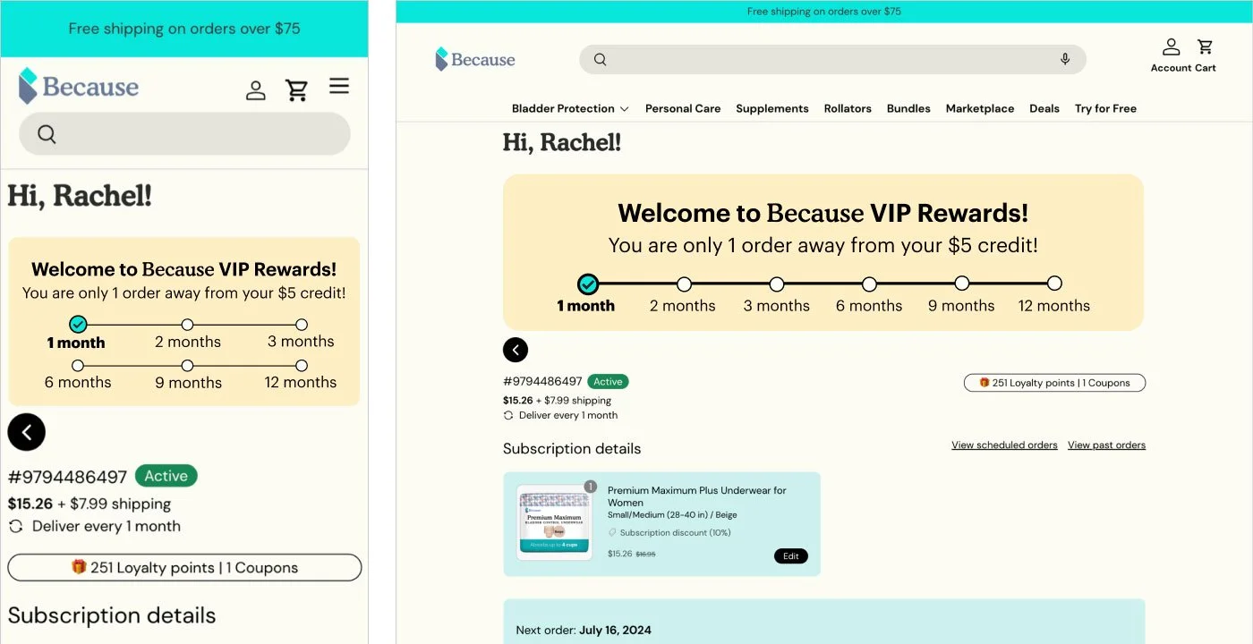
The rewards program ties benefits to subscription milestones (1, 2, 3, 6, 9, and 12 months) and always shows what has been earned and what comes next. Visible progress gives customers a reason to keep ordering.
3-A · Lifecycle design
Designed post-purchase experiences:
- Thank-you pages
- Order confirmation flows
- Email touchpoints
3-B · Loyalty & rewards
Created a retention system that:
- Encouraged repeat purchase
- Built long-term brand affinity
- Reinforced trust through transparency and usability
Breaking into retail
Ensuring brand consistency from digital → physical shelf.
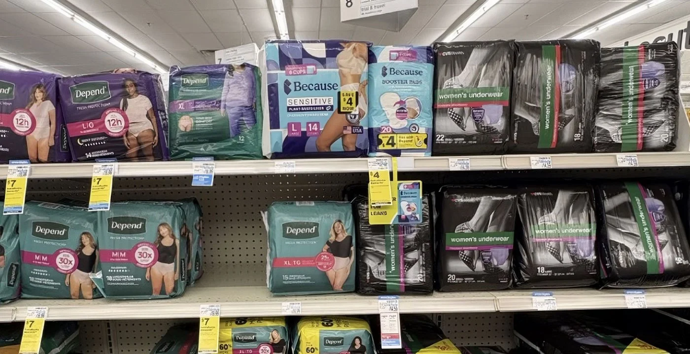
A shelf has no scroll, no reviews, and no video. The package has to do the job of the whole DTC experience in about three seconds, next to established competitors.
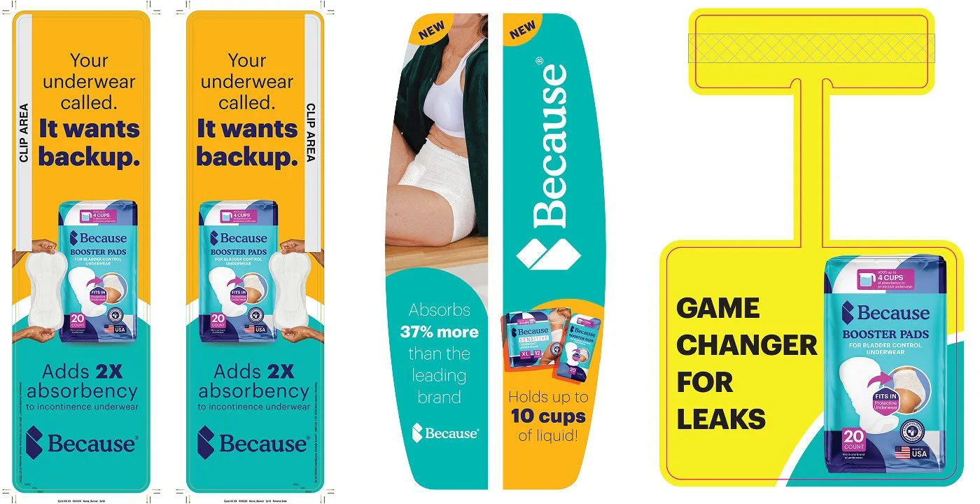
If retail packaging didn’t read as the same brand customers already trusted online, the brand would be starting over in a harder environment. The 3-second rule guided every in-store piece, from shelf talkers to wobblers.
4-A · Packaging system
Adapted DTC packaging for retail:
- Strong shelf visibility
- Clear product differentiation
- Scalable across SKUs
4-B · In-store marketing
Designed retail assets including:
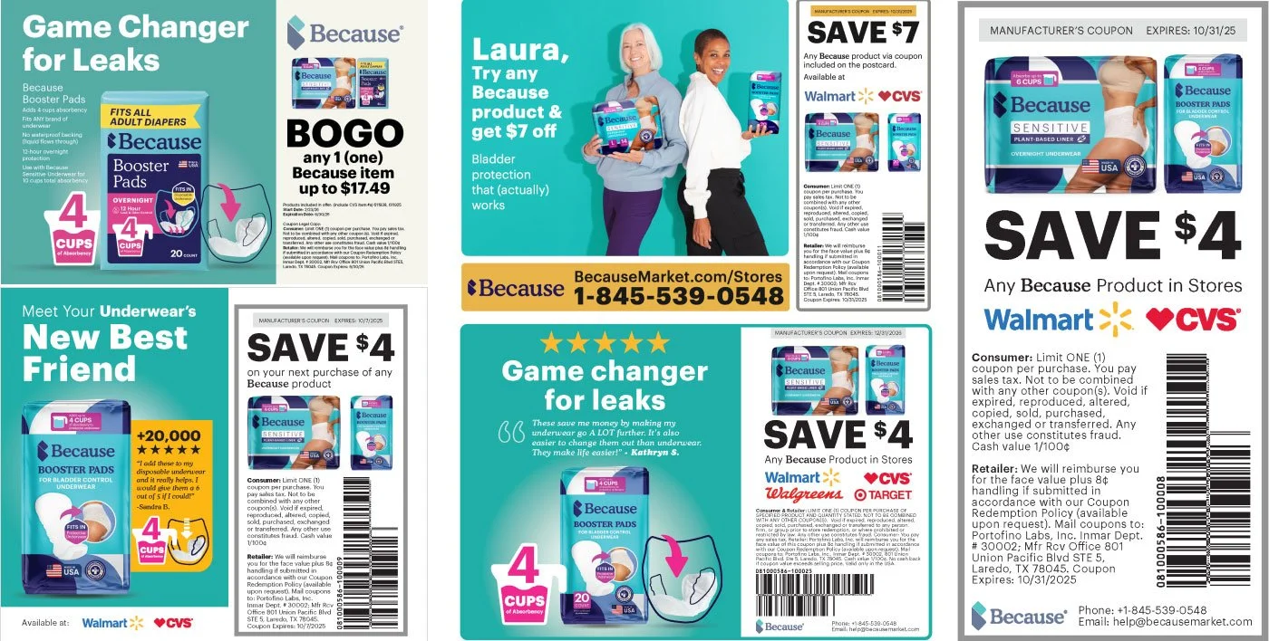
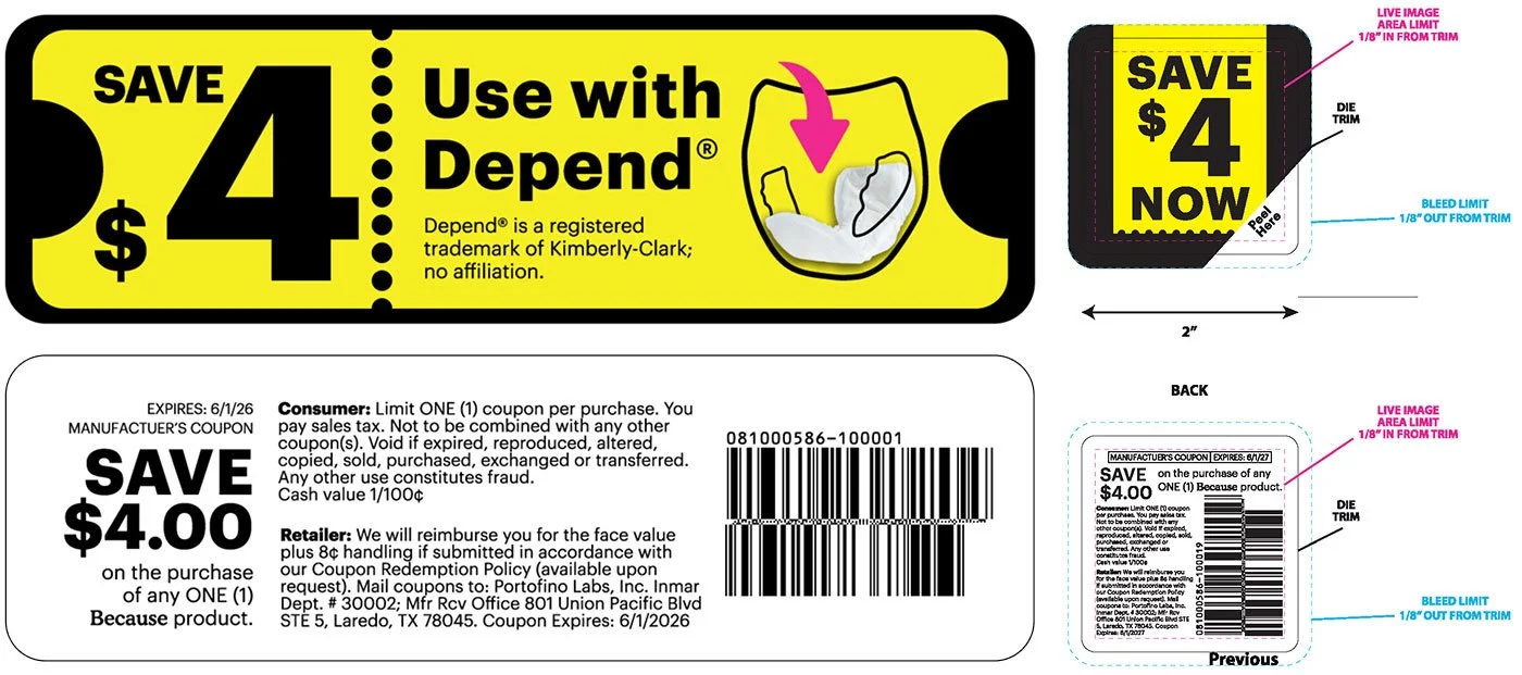
- Shelf talkers, on-pack coupons, wobblers, and promotional signage
- Instant communication (3-second rule)
- Conversion at shelf
- Consistency with DTC brand
4-C · Retail execution
Supported expansion into:
- CVS
- Walmart
- Walgreens
- Target
What it added up to.
The business results below belong to the whole team. Next to each one is the design work that supported it.
Retail doors across Walmart, Target, CVS, and Walgreens
Design’s partRetail packaging, shelf talkers, on-pack coupons, wobblers, and launch campaigns for each retailer.
Offline customer acquisition cost
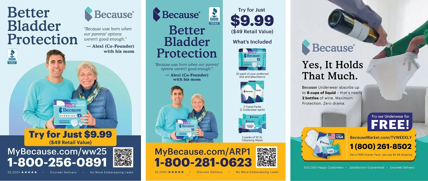
Design’s partCreative moved in-house and testing sped up. I designed and iterated the print campaigns that ran in 20+ U.S. publications.
The business nearly doubled during the expansion
Design’s partOne brand system across the website, Amazon, ads, emails, rewards, and retail.
Figures as shared publicly by Because’s VP of Brand.
Successfully scaled from DTC to nationwide retail distribution
Built a cohesive brand system across channels
Enabled faster iteration across marketing and product launches
Translated performance-driven design into real-world retail success
Design wasn’t just visual—it was a growth system.
By connecting brand, performance marketing, and retail execution, I helped turn a DTC brand into a scalable, omnichannel business.
Catching problems on paper.
A mistake on paper costs almost nothing. The same mistake after a production run costs a lot. Before packaging went to the manufacturer, I checked it in person, on paper.
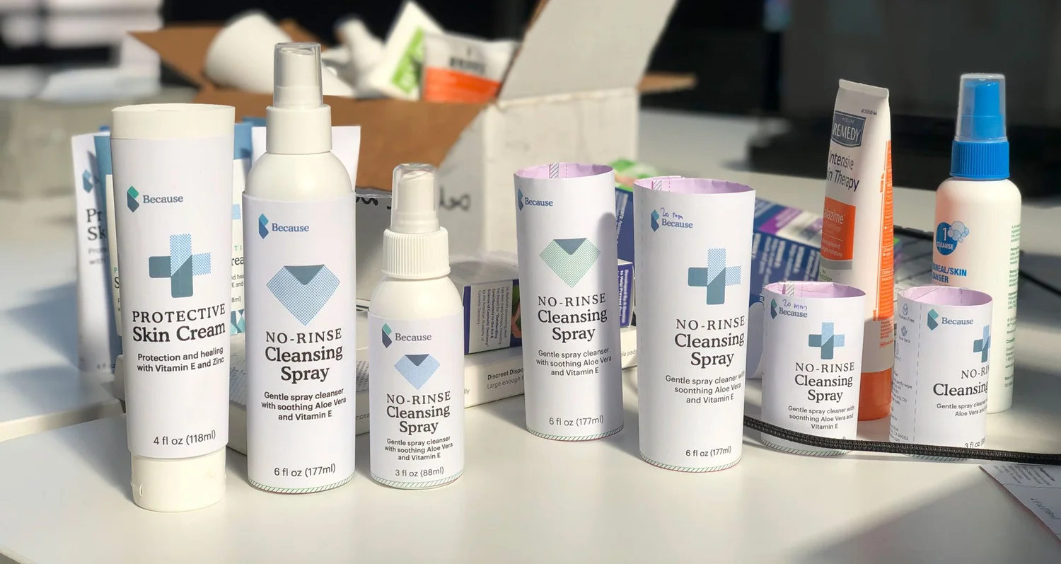
Paper mockups
A product family can look right on screen and wrong when the pieces sit together.
I created paper mockups in the office to help the team visualize how the product family would come together before proceeding with manufacturers.
Problems with proportion, hierarchy, and labels are cheapest to catch at this stage.
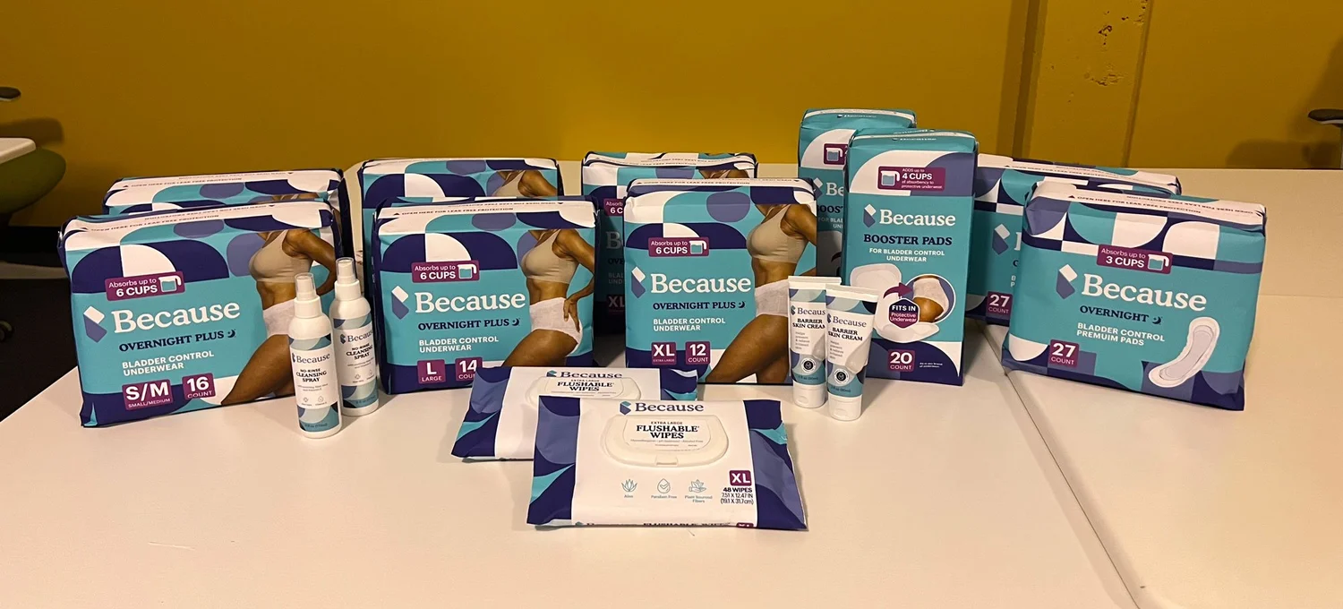
The first breakthrough into retail
Retail buyers need to understand a product concept quickly. A physical sample shows scale, finish, and the full line at once.
The first breakthrough into retail was an office-made paper mockup designed for retail buyers, prepared and shipped to help communicate the product concept.
It let the concept speak for itself while changes were still easy.
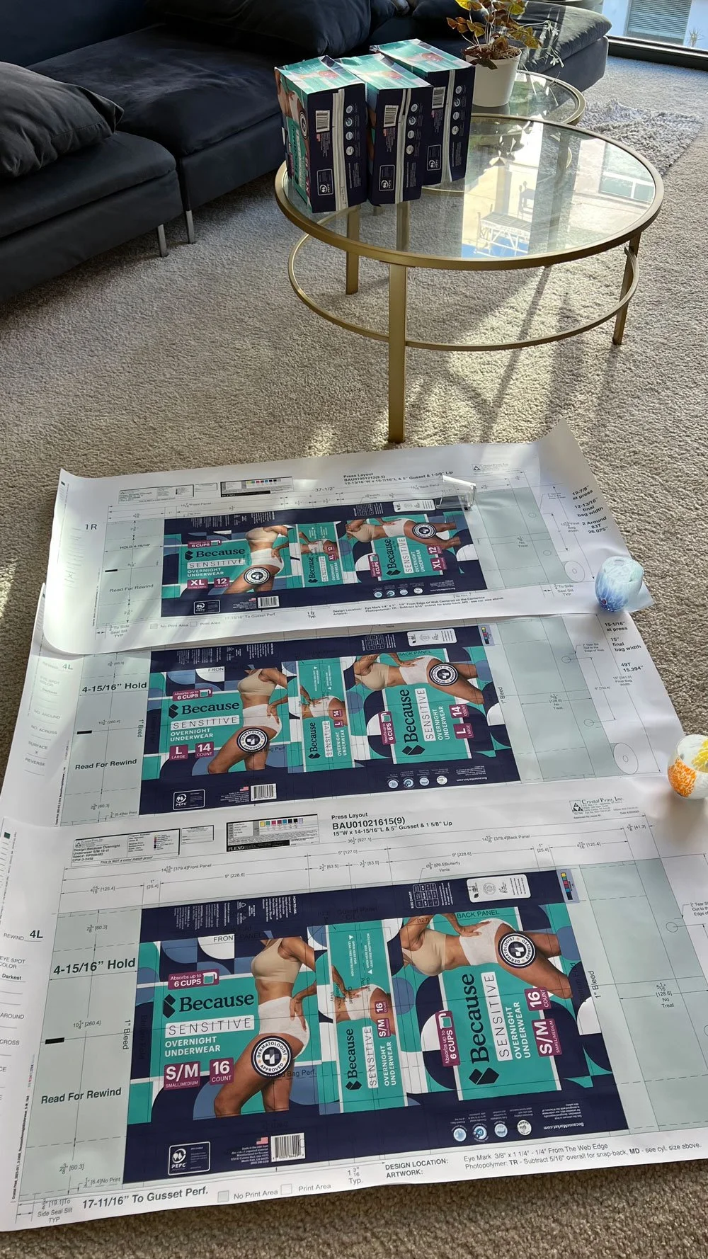
Proof review
A screen is not a printed package. Color shifts and content errors often show up only on the physical proof.
Following approval of the PDF proofs, I reviewed the hard copy proofs to ensure both color fidelity and content accuracy, signed them for approval, and shipped them back to the manufacturers to move into mass production.
Signing off on hard copies meant errors were caught on paper, not after a production run.
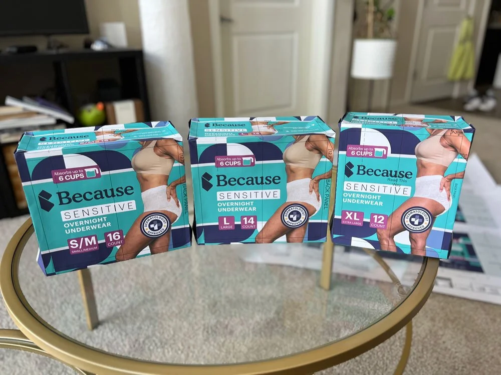
Package prototypes
A family of packs has to read as one system as sizes, counts, and variants change.
To ensure accuracy and consistency, I created paper package prototypes and placed them side by side to evaluate and review the system.
Side-by-side review checks that the system holds together across every size.
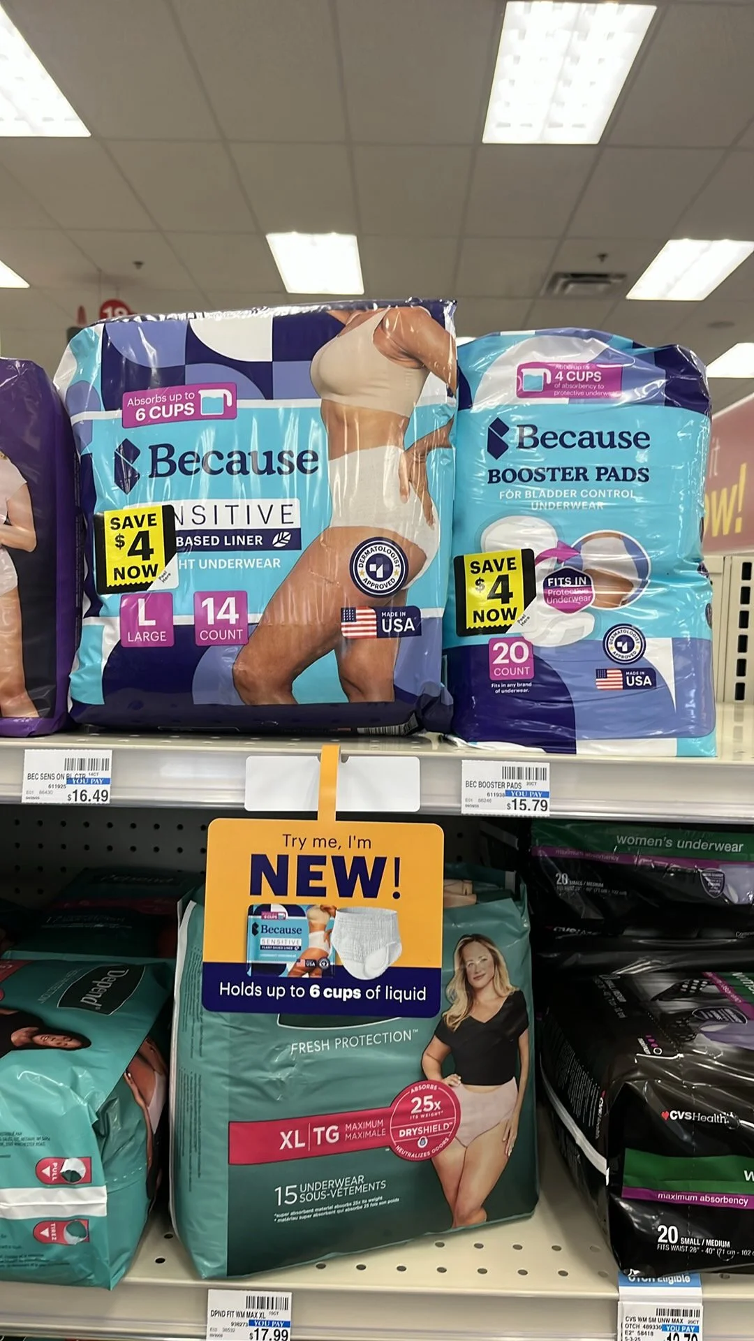
On the shelf.
Same system, from a paper mockup in the office to a national retail shelf.
Three things I took with me.
Test before you polish.
The work that performed best was not always the work I expected. Testing early kept the team from polishing the wrong idea.
A system is faster than a one-off.
Modular pages and a shared visual system made each new ad, email, and pack quicker to produce and easier to keep consistent.
Check the real thing.
Screens hide problems that paper shows. Mockups and hard copy proofs caught issues while they were still cheap to fix.
Interested in working together?
I build brands that work from the first click to the shelf. Let’s talk.