Sole designer. From an 8-person startup to a P&G shelf.
As the only designer, I built the packaging system that made an organic period care and condom brand stand out, then scaled it for national retail after Procter & Gamble acquired the company.
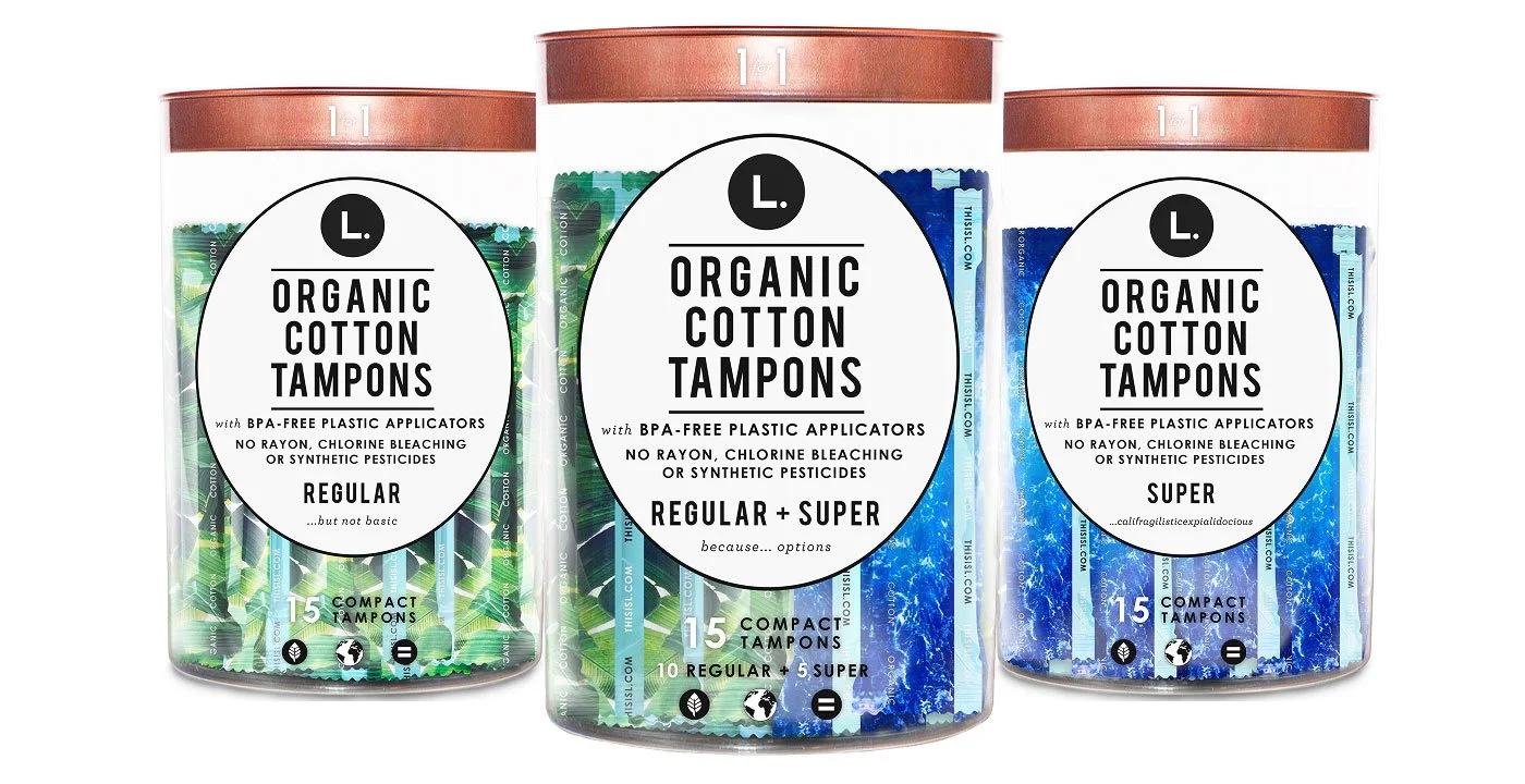
Clear Tampon Tube
Clear, not opaque, so the product is visible and color signals absorbency.
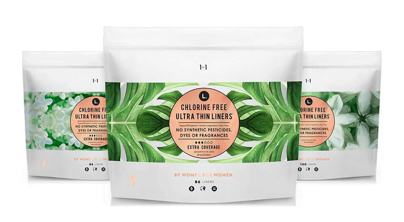
Resealable Pad Pouch
A soft resealable pouch, not a cardboard box, with room for bold botanical pattern.
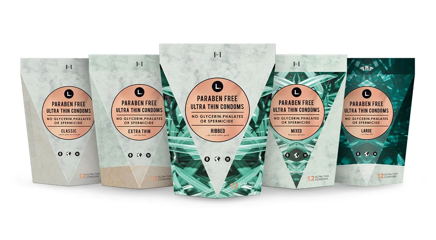
Triangular Condom Box
A triangular shape, not a flat box, recognizable from across the store.
U.S. stores carrying L. at the time of the acquisition
Products distributed worldwide through L.’s one-for-one model
Reported deal value. Terms were not disclosed.
Acquired by Procter & Gamble in February
Company results, from P&G’s announcement and press coverage (TechCrunch, Marketing Dive, Drug Store News), February 2019. The deal value is a press estimate. My contribution was the design work shown on this page.
Stand out in a category where every brand looked the same, then keep that edge inside one of the world’s largest consumer goods companies.
The packaging system: a clear tampon tube, a resealable pad pouch, a paper refill box, and a triangular condom box.
Acquired by Procter & Gamble, then extended to new products and resized for CVS, Walgreens, Walmart, and Target.
Two stages of growth.
My role covered two stages of growth:
Disrupting as a startup
On an 8-person team in San Francisco, the goal was to break the category’s rules and get noticed on the shelf.
Scaling with P&G
After the acquisition, the goal changed: extend the product family and fit every major retailer, without changing what made the brand different.
Different goals. Different rules.
How do you break a category’s rules as a startup, then keep that edge at enterprise scale?
Feminine care packaging used to look apologetic. We wanted to change that.
When I joined This Is L., it was an 8-person team with a clear ambition: to challenge the norms of traditional feminine care. Most packaging in the category used the same pastel colors and clinical language, and it hid the product.
We didn’t follow category conventions. We broke them on purpose. The result was a distinctive, modern brand that stood apart in a commoditized aisle.
| The category | This Is L. |
|---|---|
| Soft pastel colors, meant to look discreet | Bold botanical prints in strong color |
| Clinical, indirect language | Direct, clear product language |
| Opaque packaging that hides the product | Clear packaging that shows the product |
| Brands that look almost the same on the shelf | A shape you can recognize from across the store |
One label, the same on every pack
The brand’s purpose is one line: making beautifully-designed, organic products accessible to people everywhere. I did not design the logo or the illustration of three women. My job was to build the packaging system around them, and to write it down with the founder so it could grow.

Type
- Bebas Neue
- Product name and variant
- Century Gothic Bold
- Ingredient claims
- Archer Book Italic
- The small aside, like “…but not basic”
- Verlag
- Count, tagline, website, and marketing
Color
- Black#000000
- White#FFFFFF
- Forest Green#006F62
- Bright Mint#CAEFDA
- Muted Mint#DFECE2
- CopperPantone 876C
Pattern
One botanical style, recolored for each product. Copper appears on the tube lids and on the bags.
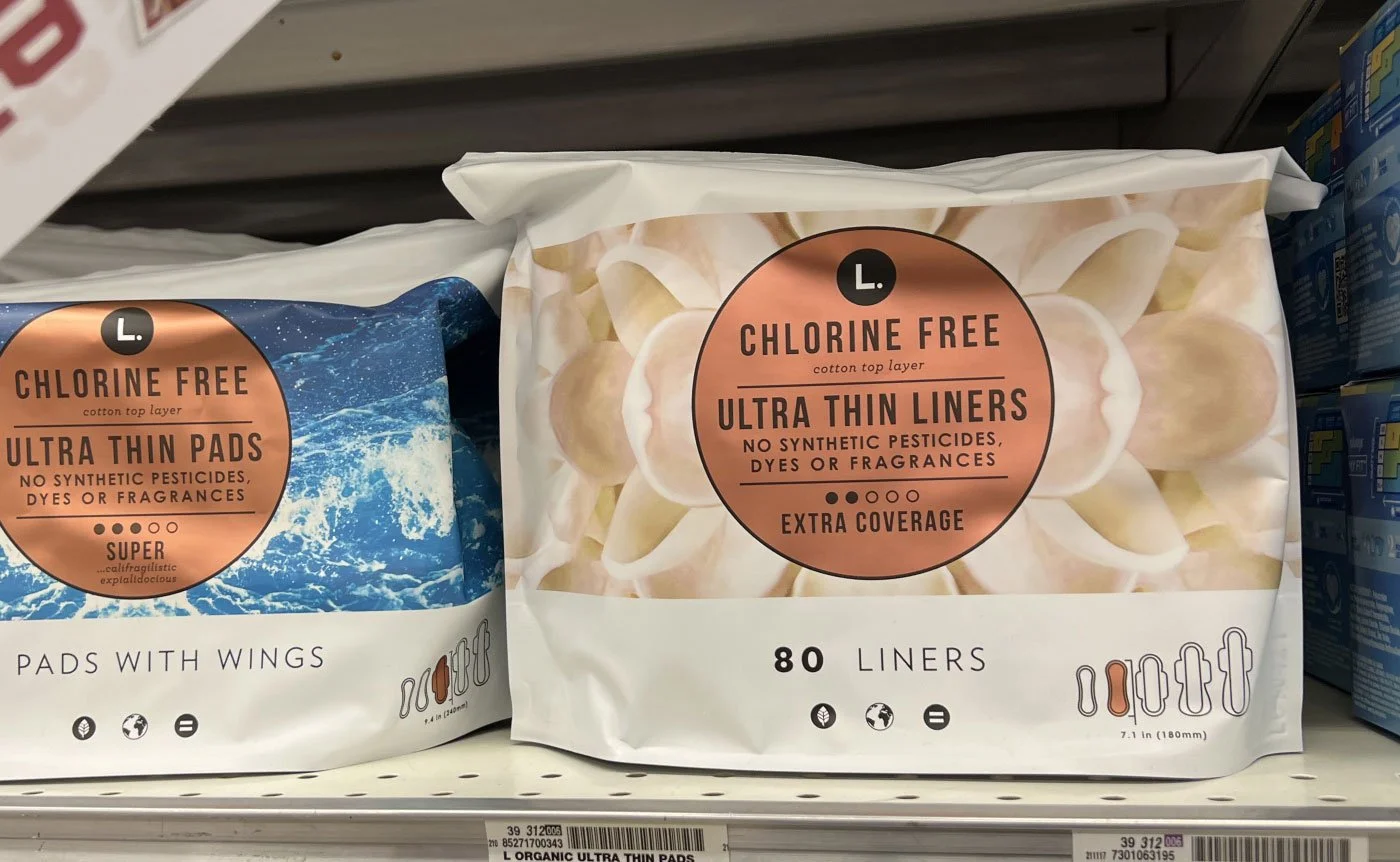
A resealable pouch instead of a cardboard box
Most brands used a stiff box. A soft, resealable pouch gave us more room for bold pattern and clear messaging.
- Botanical patterns and cleaner color palettes
- A more human, approachable tone in place of clinical cues
- A strong, recognizable brand presence
Designed for instant recognition, not subtlety.

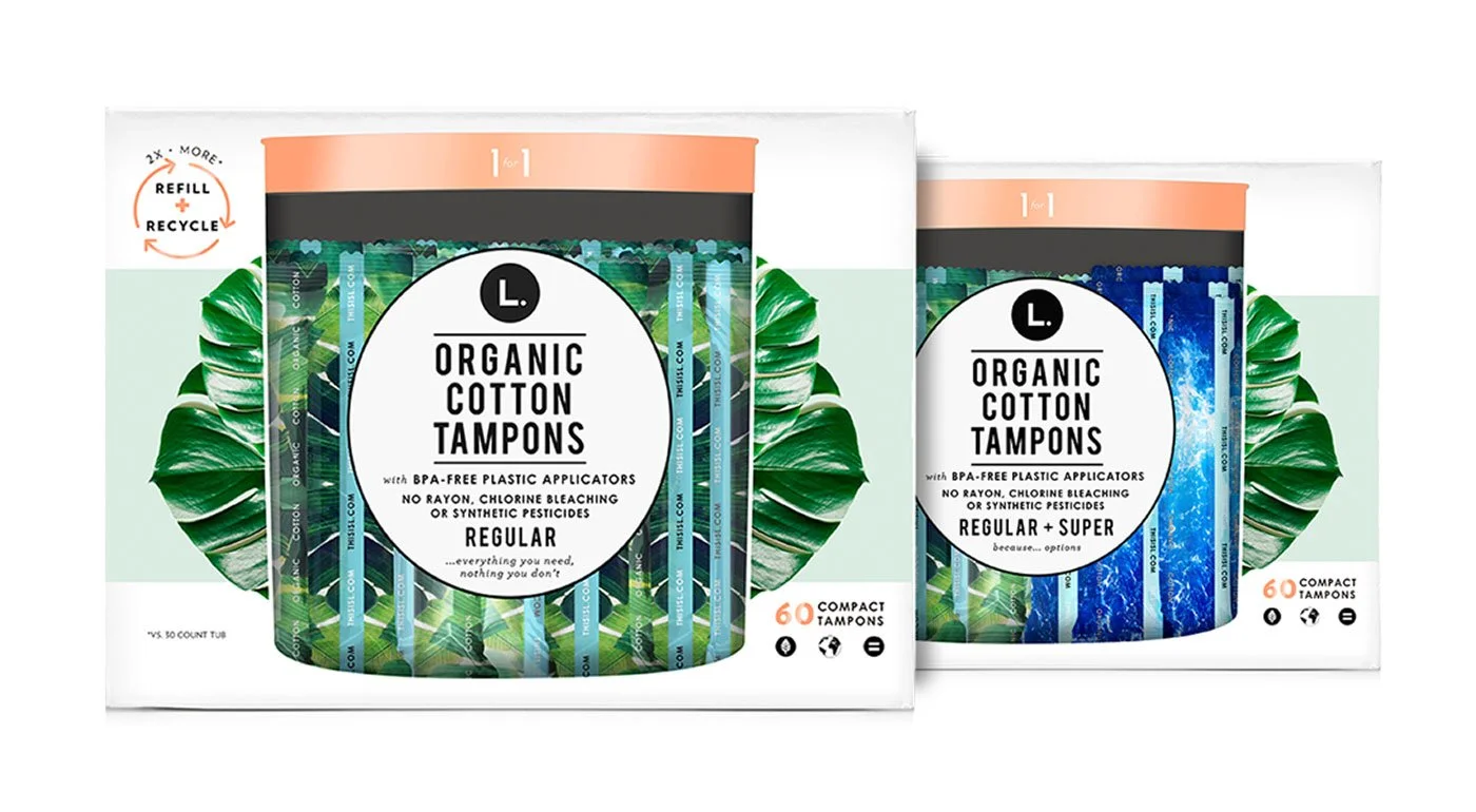
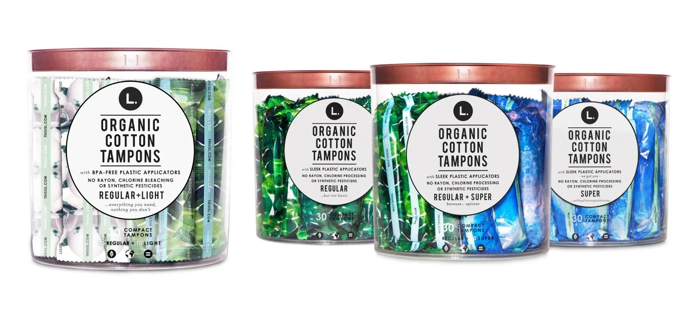
A clear tube that shows the product
A radical departure from traditional opaque packaging. We made the tube clear, so the product is visible and color shows the absorbency.
- Clear tubes show the product, which removes stigma and builds trust
- Minimal, modern labeling emphasizes transparency
- A hidden product became something displayed with confidence
It changed how the product is seen: honest, clean, and approachable.
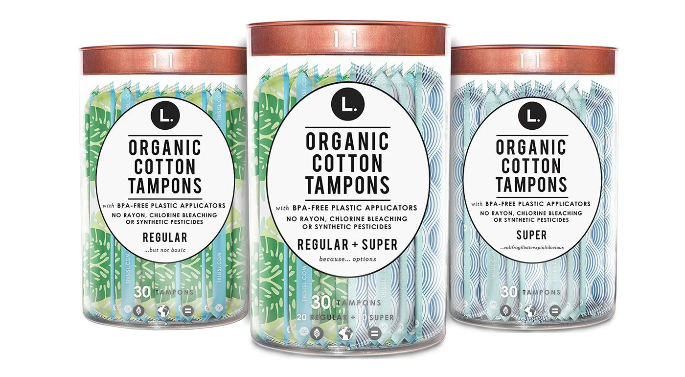
A recyclable paper refill box
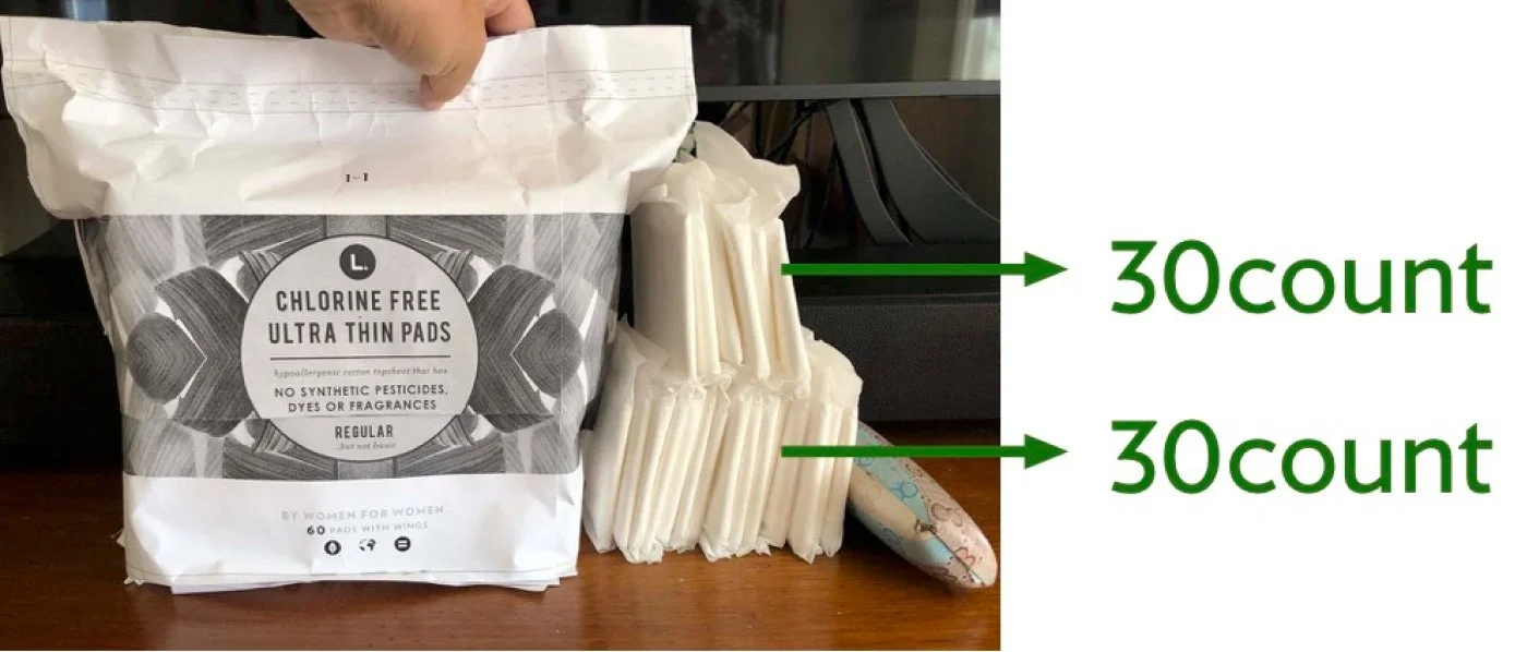
A 60-count paper box that refills the 30-count tube, designed for sustainability and system thinking.
- Less plastic through refill-based packaging
- Visual consistency across formats
- Moved the brand in a more eco-conscious direction
It connected the product experience with long-term brand values.
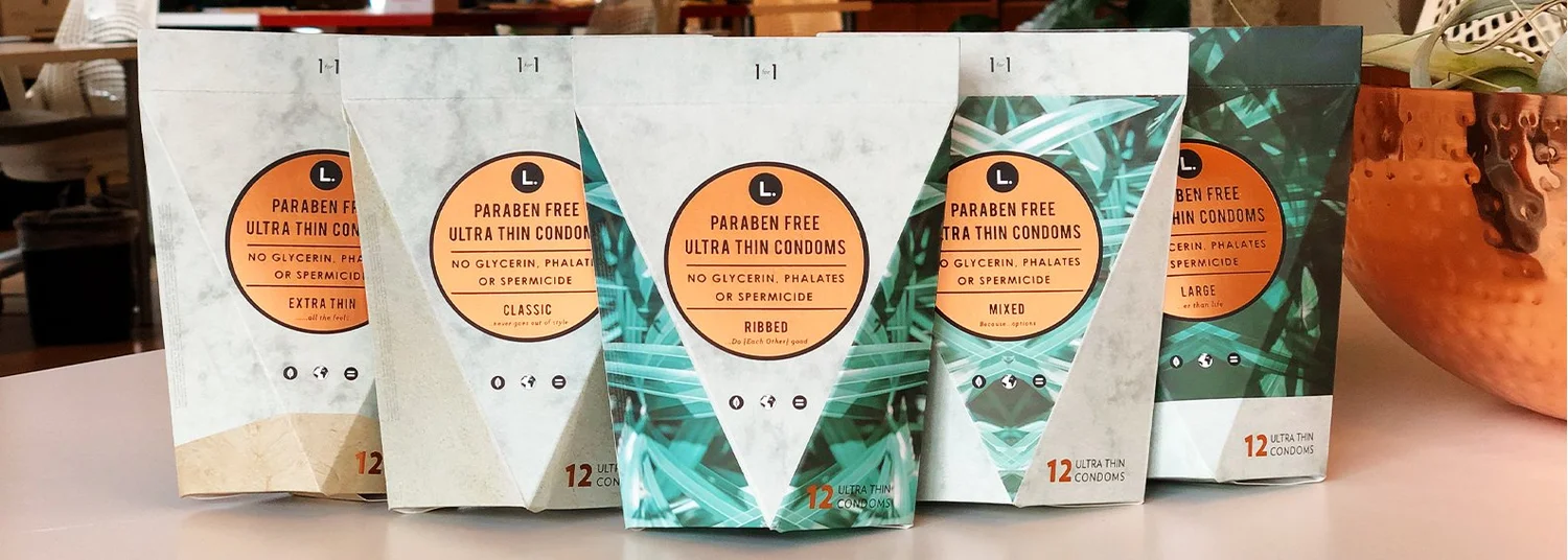
A triangular box you can spot from across the store
A bold structural decision to break shelf uniformity.
- The triangular form broke the predictable retail pattern
- Instantly recognizable from a distance
- Strong visual blocking on the shelf
Not just packaging. This was retail strategy through form.

From prototype to production
From early prototypes to final production, I worked closely with the manufacturers on structure, materials, and print.
Mark up
Marked up the first samples for structural adjustments.
Iterate
Iterated on form, color, and material constraints.
Deliver
Delivered production-ready packaging for mass retail.
Procter & Gamble acquires This Is L.
By then, L. was in more than 5,000 U.S. stores. The packaging system built by an 8-person startup now had to work at enterprise scale.
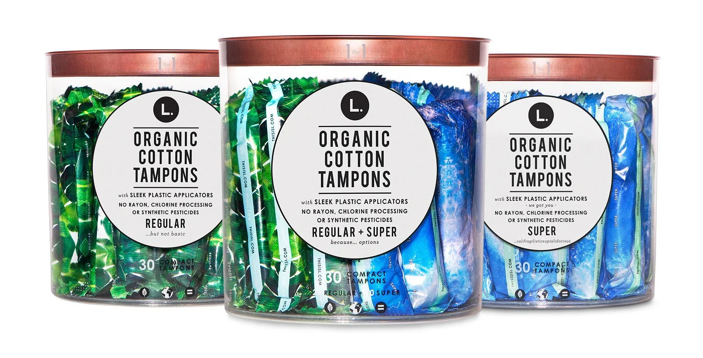
Clear tube: expanding the family
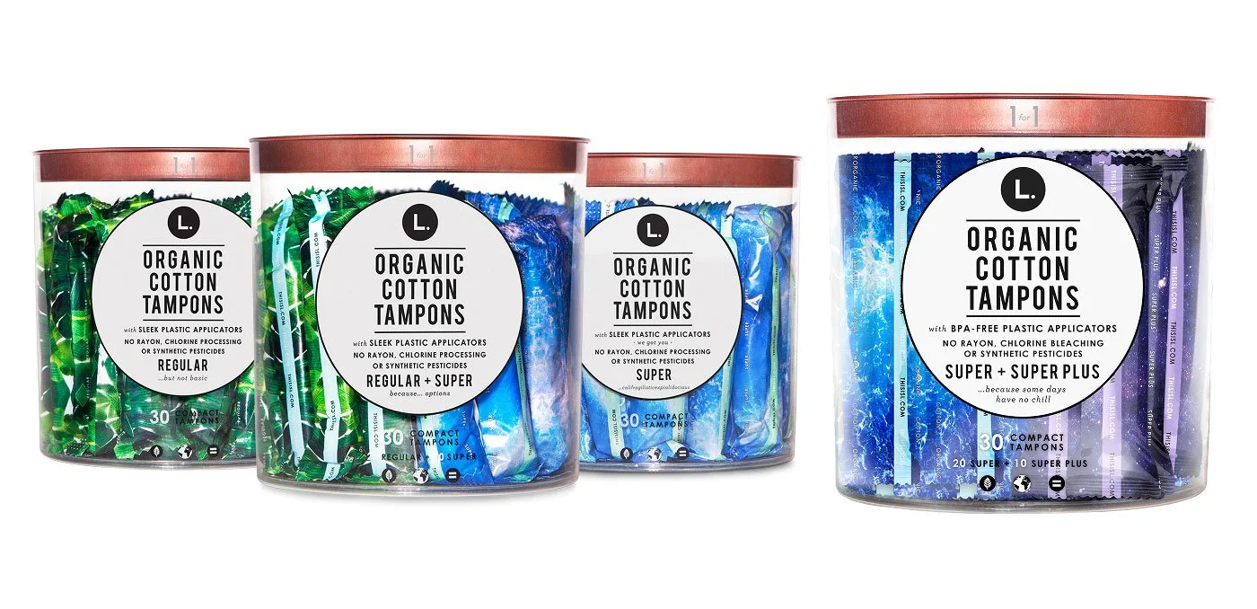
We began with three tube options: Regular, Super, and Mixed. Then we introduced new items, including Light and Super Plus.
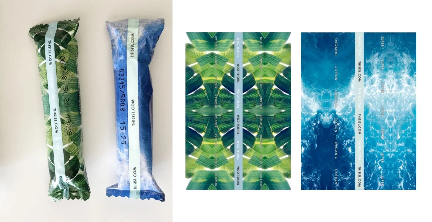
Color shows function
We use color coding to show what each product does: white for Light, green for Regular, blue for Super, and dark purple for Super Plus.

Light
White flower

Regular
Green leaves

Super
Blue ocean

Super Plus
Purple night sky
Four products, down to the wrapper
We expanded the range to four products. Shoppers can tell them apart before they read a word, even on a single wrapper.
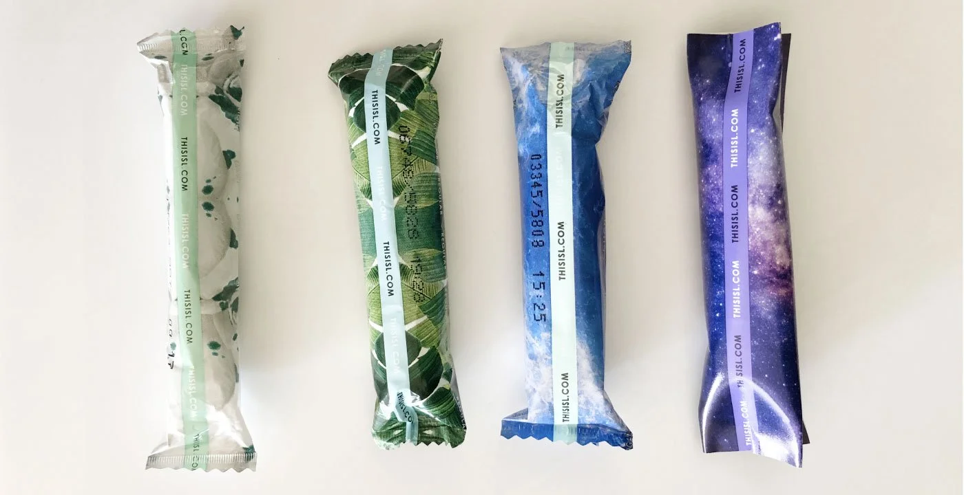
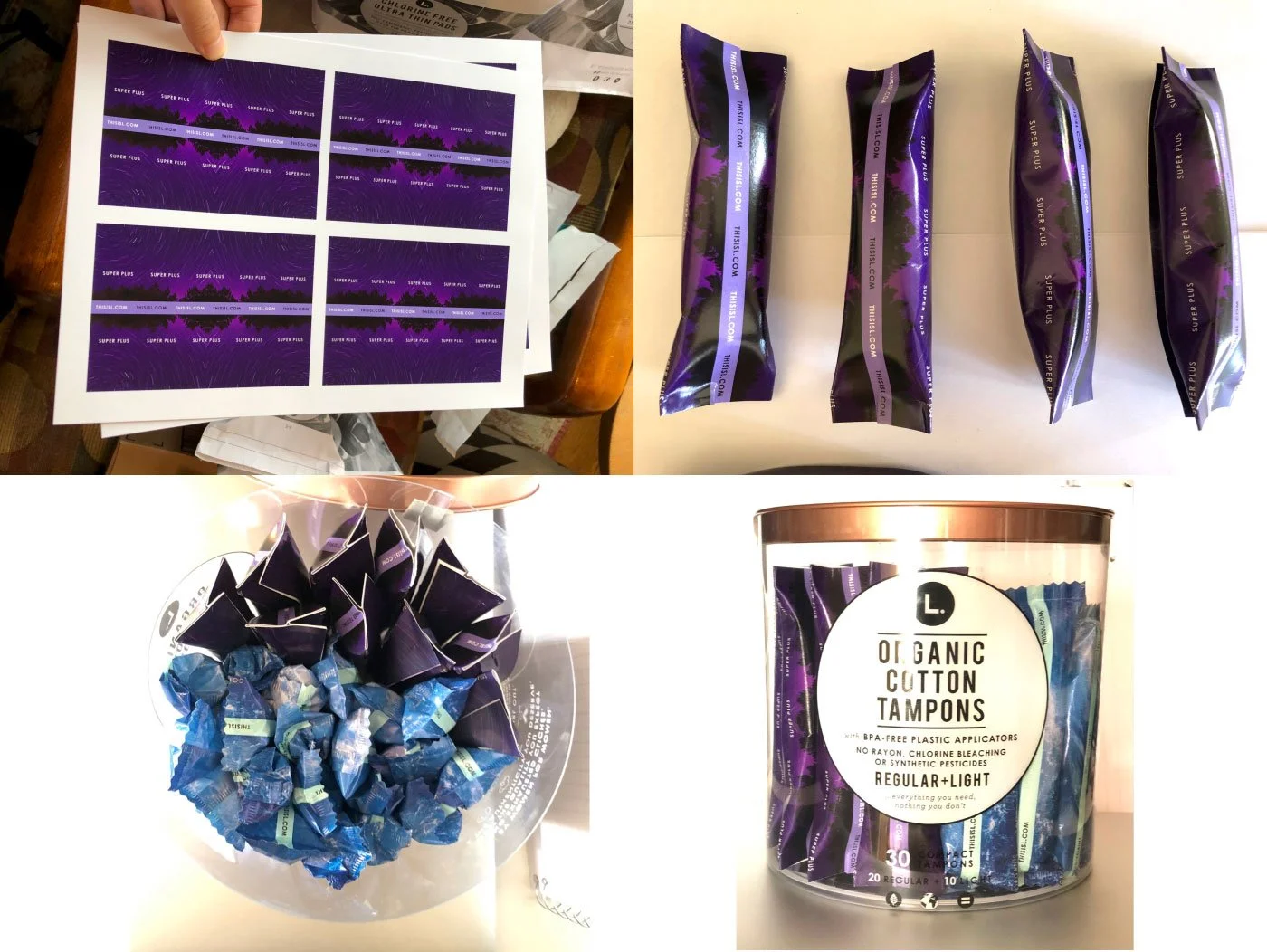
Finding the right purple
Using Super Plus as an example, we explored different purple directions, from night forests to purple flowers, before landing on the night purple sky.
My process starts by selecting possible concepts, printing them at a print shop, and building prototypes at home. Then I present everything to the team for discussion and next steps.
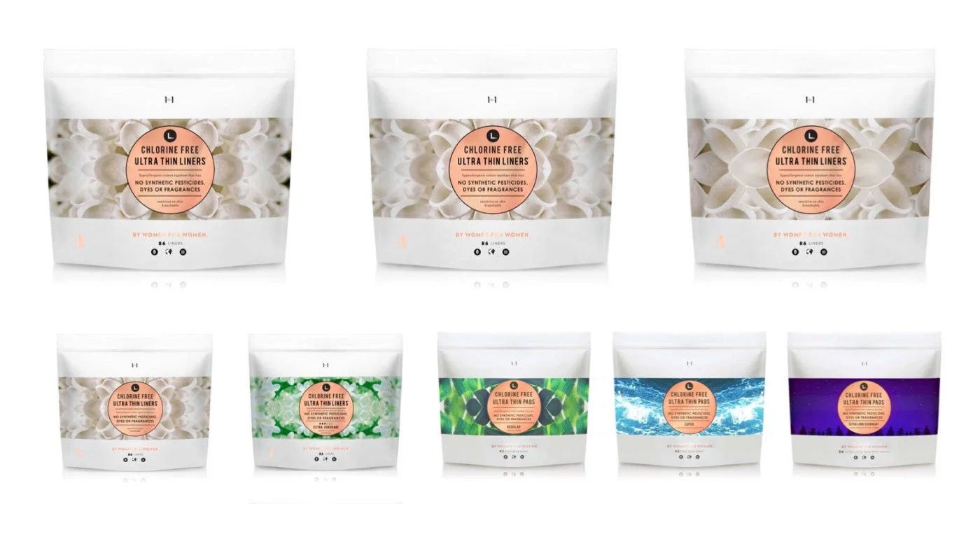
Pouch: expanding the family
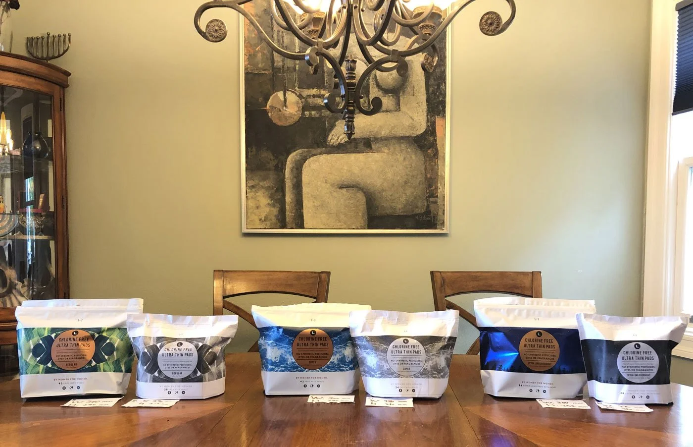
We introduced new items and used color coding to create an “L. universe” inspired by nature: from flowers to leaves, ocean, and sky.
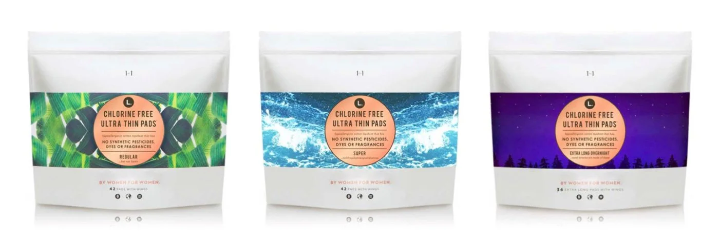
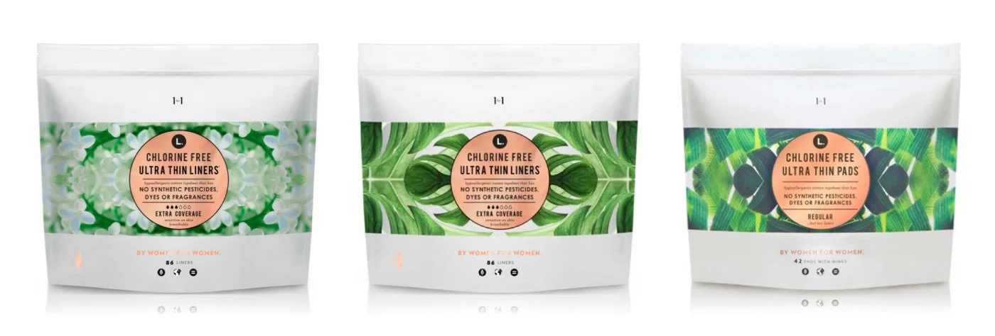
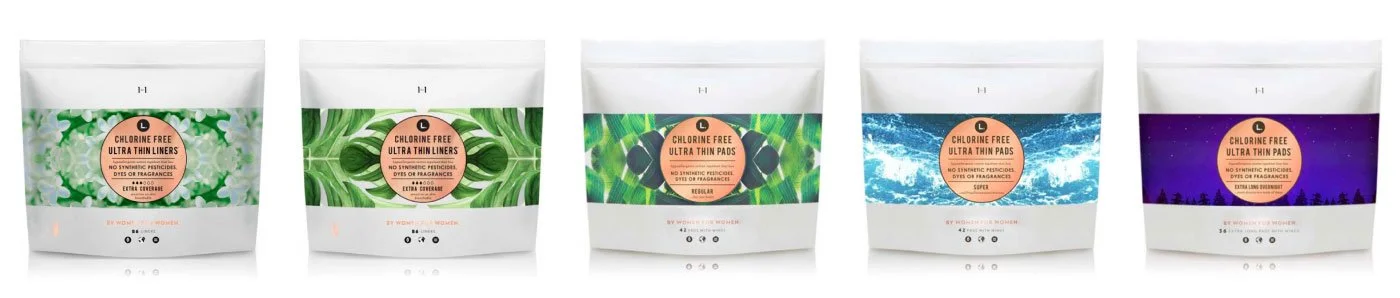
A direction we also explored
As an alternative, we explored a direction that uses large white flower petals to show function.
Clear tube: scaling for retail
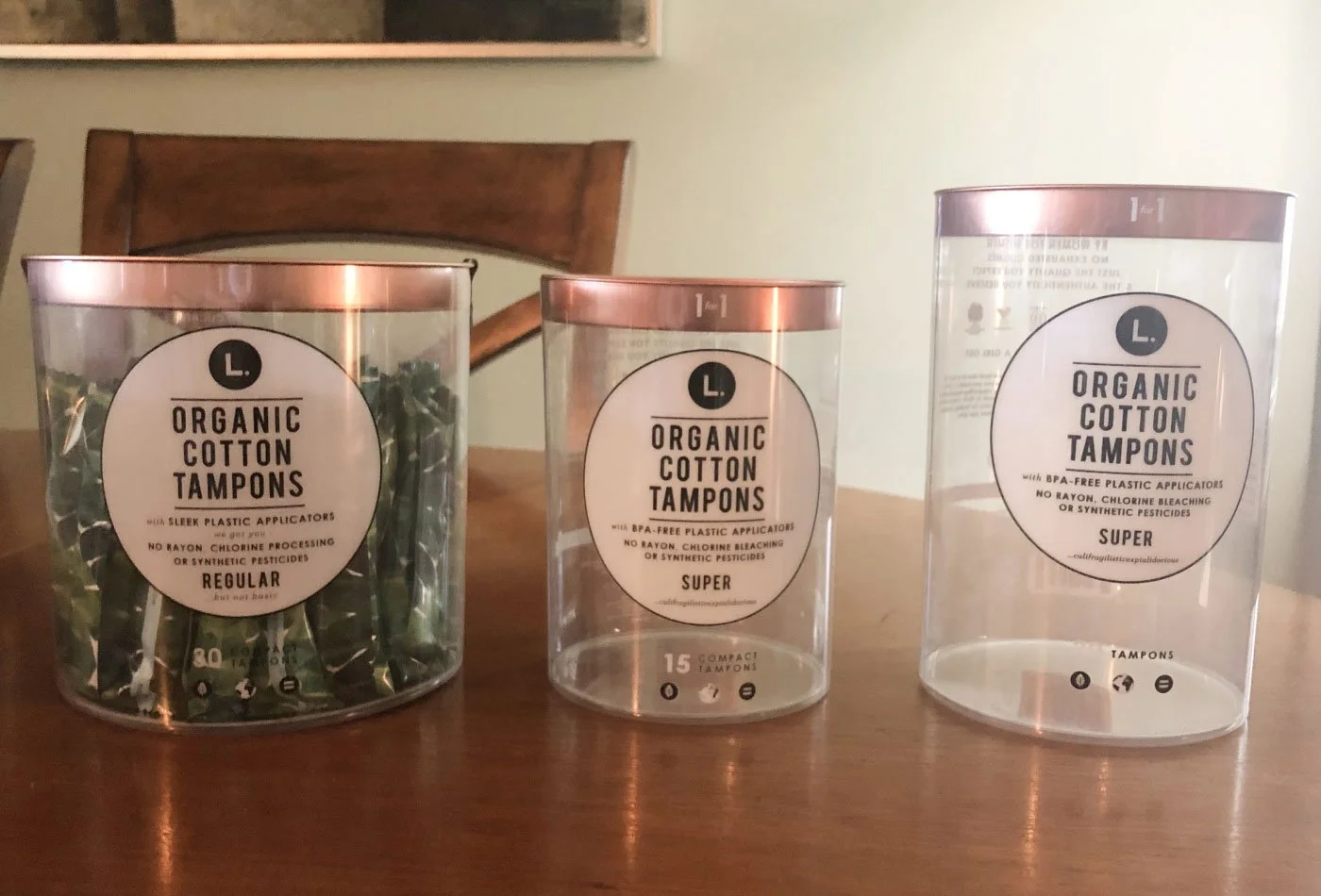
We scale products up or down to fit different retail environments, such as CVS, Target, and nationwide distribution, so key items work in each store format. Our most popular item, the 30-count tube, was the foundation.
-
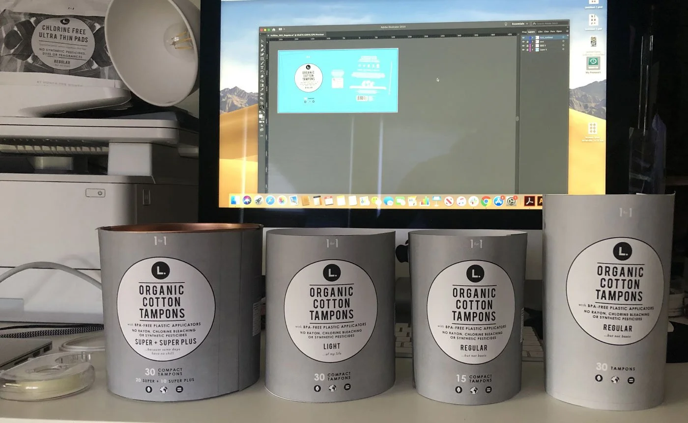
Paper first
I built unprinted paper prototypes of each size before anything was produced.
-
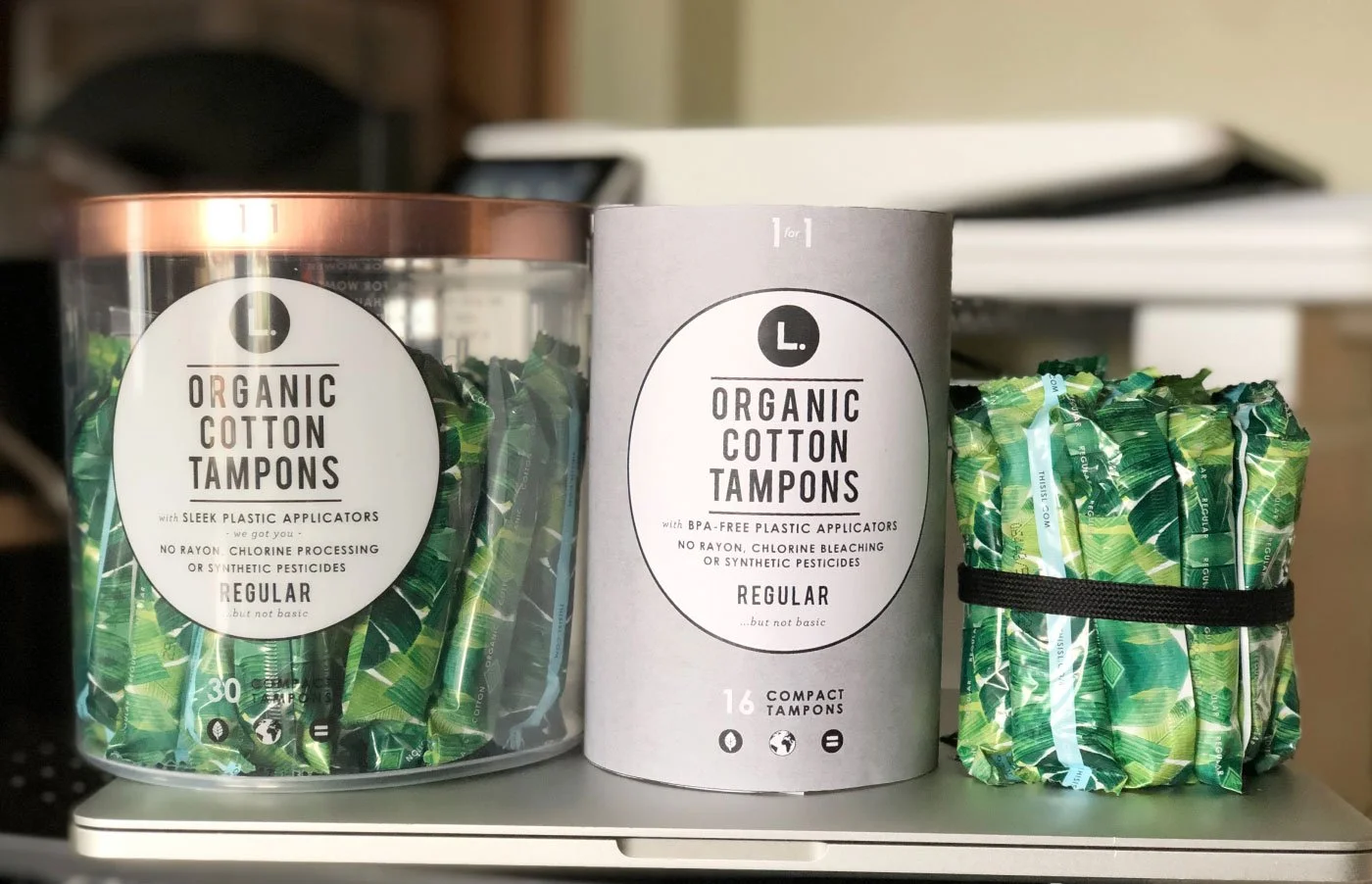
Test next to the original
Testing smaller tubes for CVS and Walgreens.
-
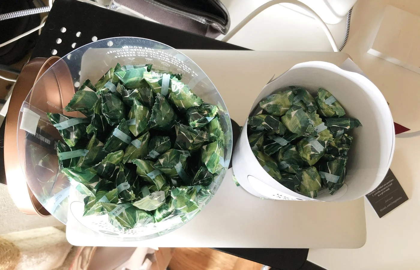
Size by count
Tube sizes were designed around the number of tampons inside.
-
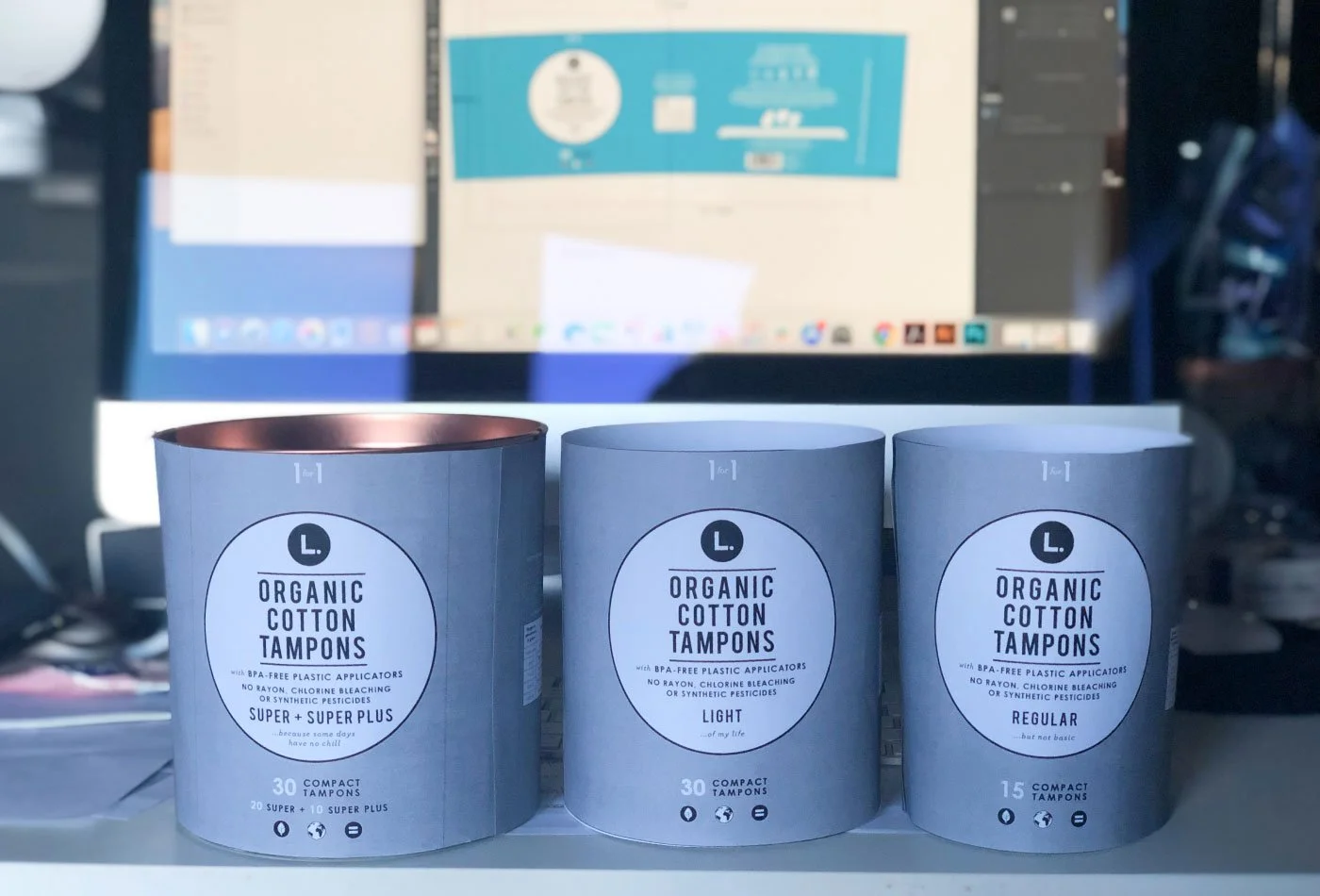
Refine the dieline
We refined the dieline size and made paper prototypes to test form and structure.
-
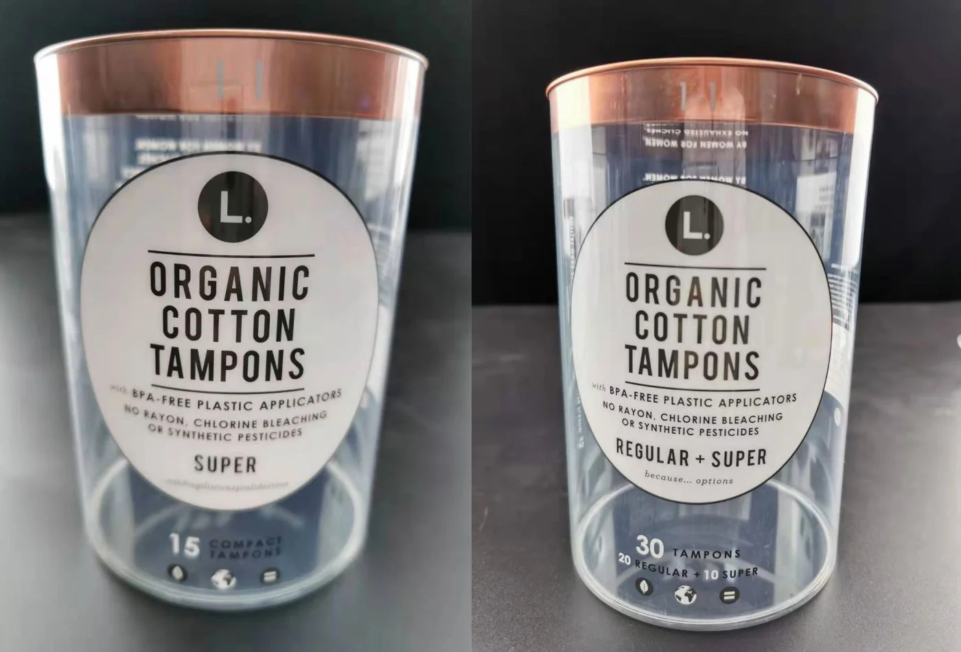
Review production samples
We received production samples from the manufacturer for review and testing.
-
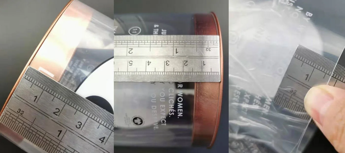
Check the specs
We discussed specifications with the manufacturer to get tube and lid sizing and alignment right.
Pouch: scaling for retail
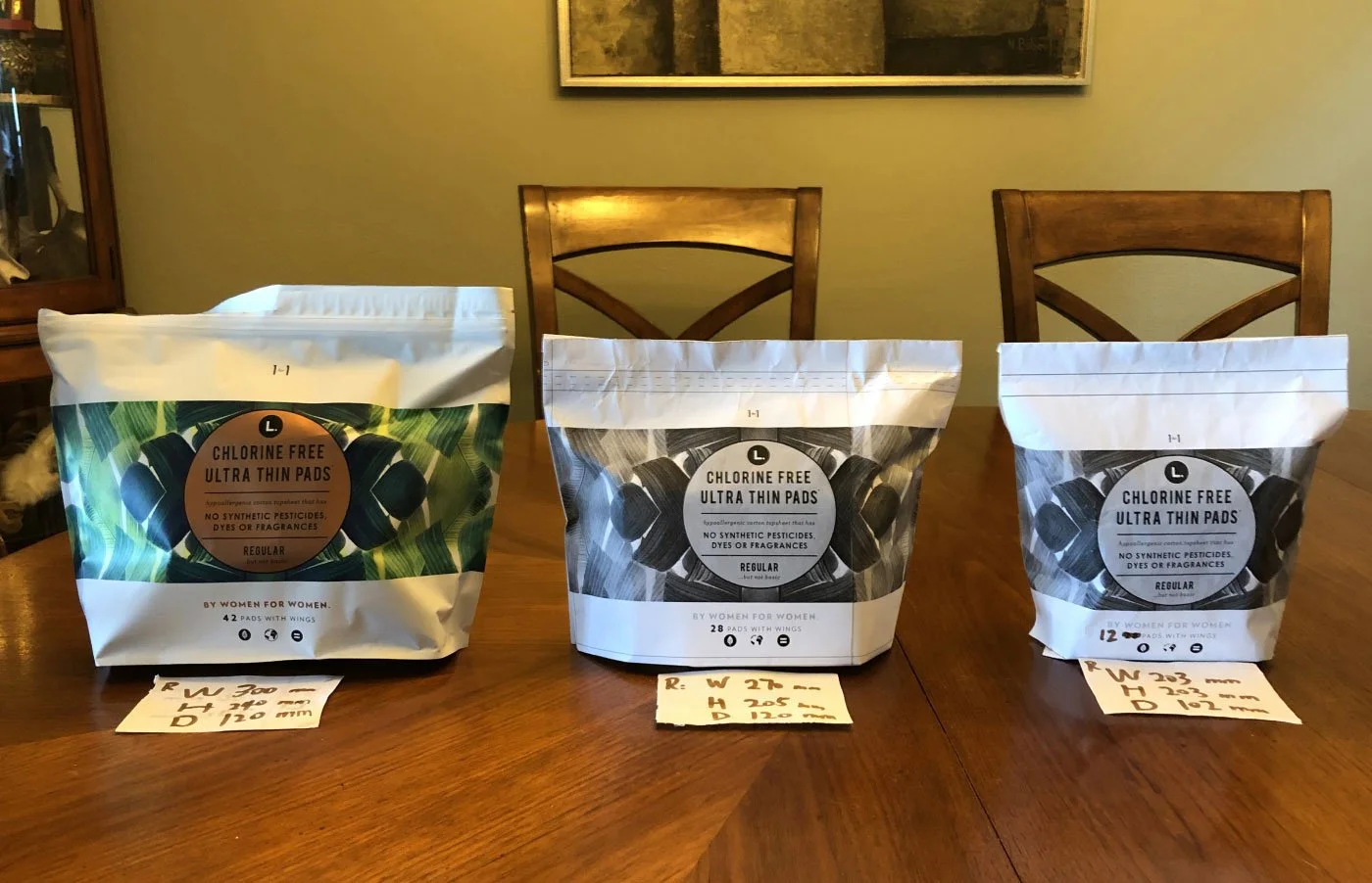
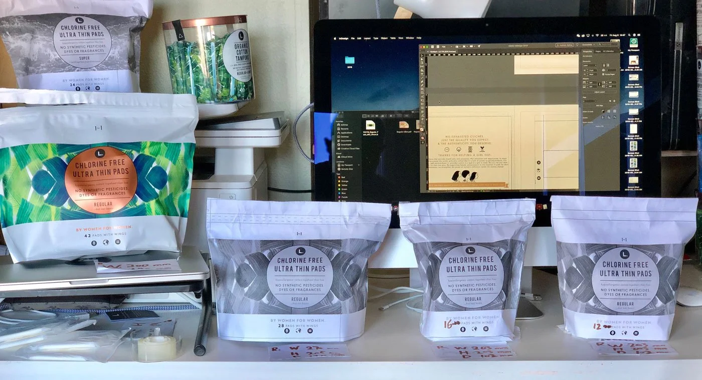
The same work on the pouches: we scaled key items up or down for each store format, using our most popular item as the example.
One designer, one home studio
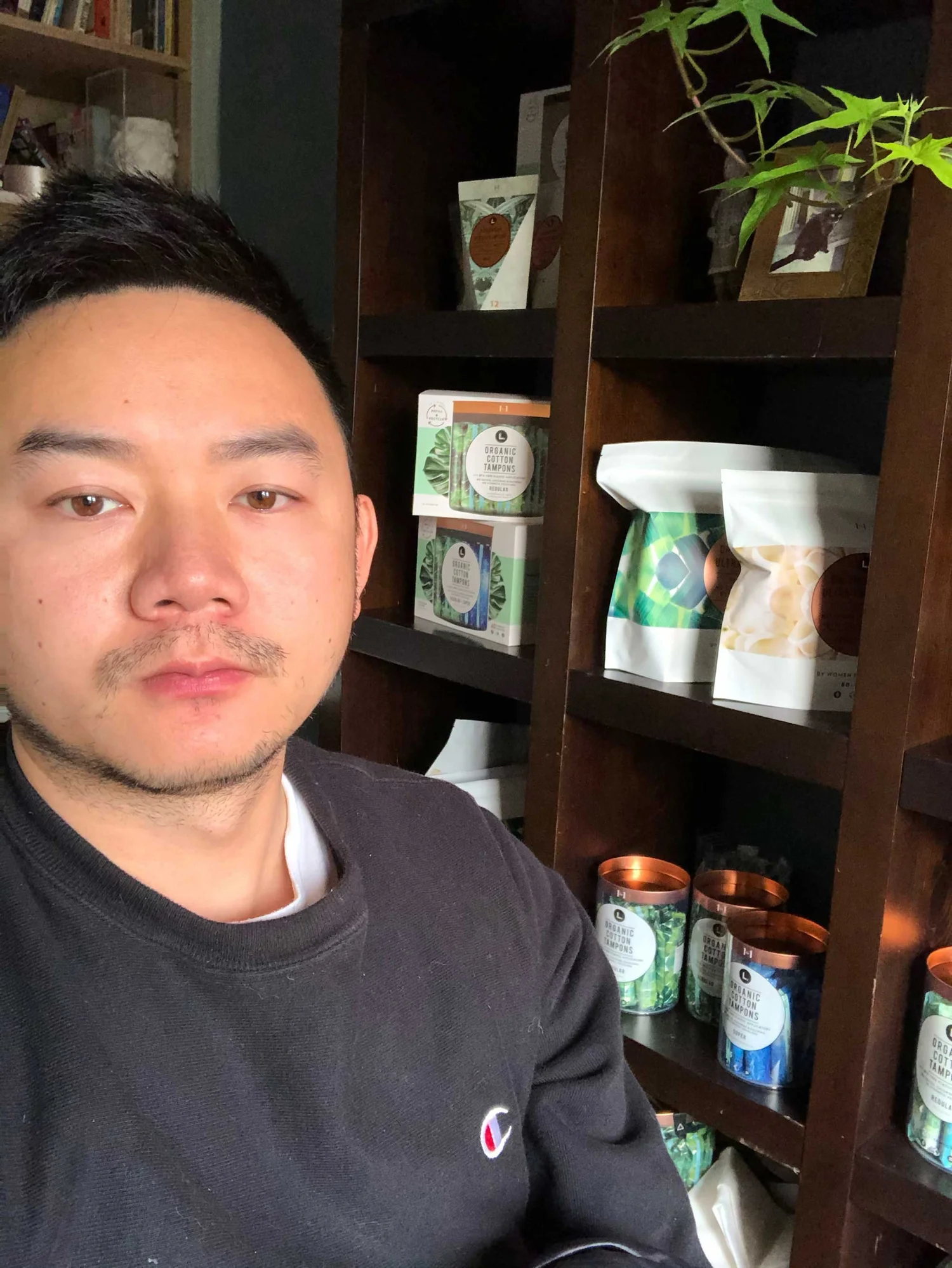
After the acquisition I worked remotely from my home studio, with trips to P&G headquarters in Cincinnati. The prototypes in part two were built here, and every process photo in part two was taken here.
One guide for packaging, website, and advertising
The founder and I created the brand guidelines together. The working version runs 76 pages: color, type, every package with its dimensions, and the type and color specs for the website and ads.
As the product line and the team grew, everyone had one reference.


A design system is only tested when other people have to use it.
First a manufacturer, then retail buyers, then a bigger team after the acquisition. Each one used the system without me in the room.
Interested in working together?
I build brands that work from the first sketch to the shelf. Let’s talk.