Sale Funnel Redesign
A sale funnel offers a free starter box with monthly subscriptions.
B2C, End-to-End project, E-commerce platform Mobile Web & Desktop
Project Overview
Because Market sale funnel offers Free Starter Box with a monthly subscription which contains underwear and personal care products to senior (50+) people.
Goal: Optimize the Free Trial Funnel experience to increase the conversion rate, help users make decisions without obstacles, and acquire more new users/customers.
Target users
50+ people in the U.S.
Duration
Five weeks
(March. 2022 - April 2022)
My role
Design Lead (Research, Interaction Design, Visual)
Teammate
PM, Engineers, Data Analyst
Outcome
🎉Conversion Rate increases 33%
From 6% to 7%.
Read this project
in 1 minute
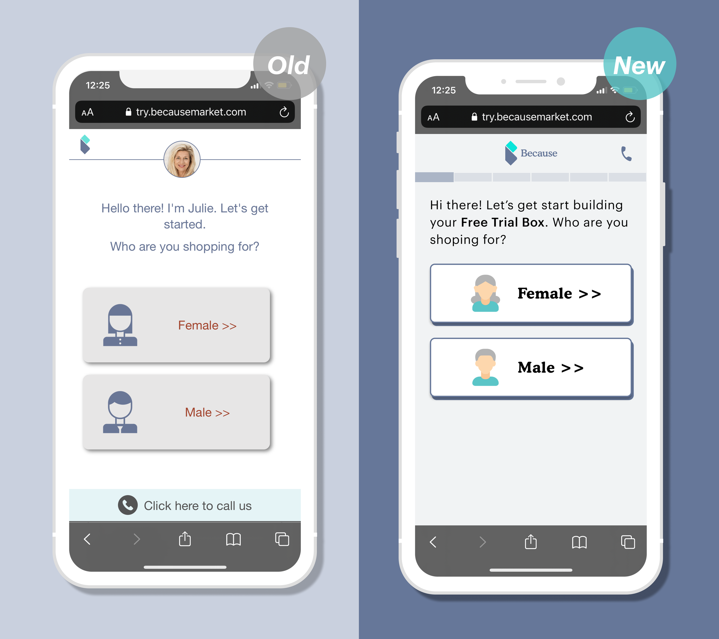
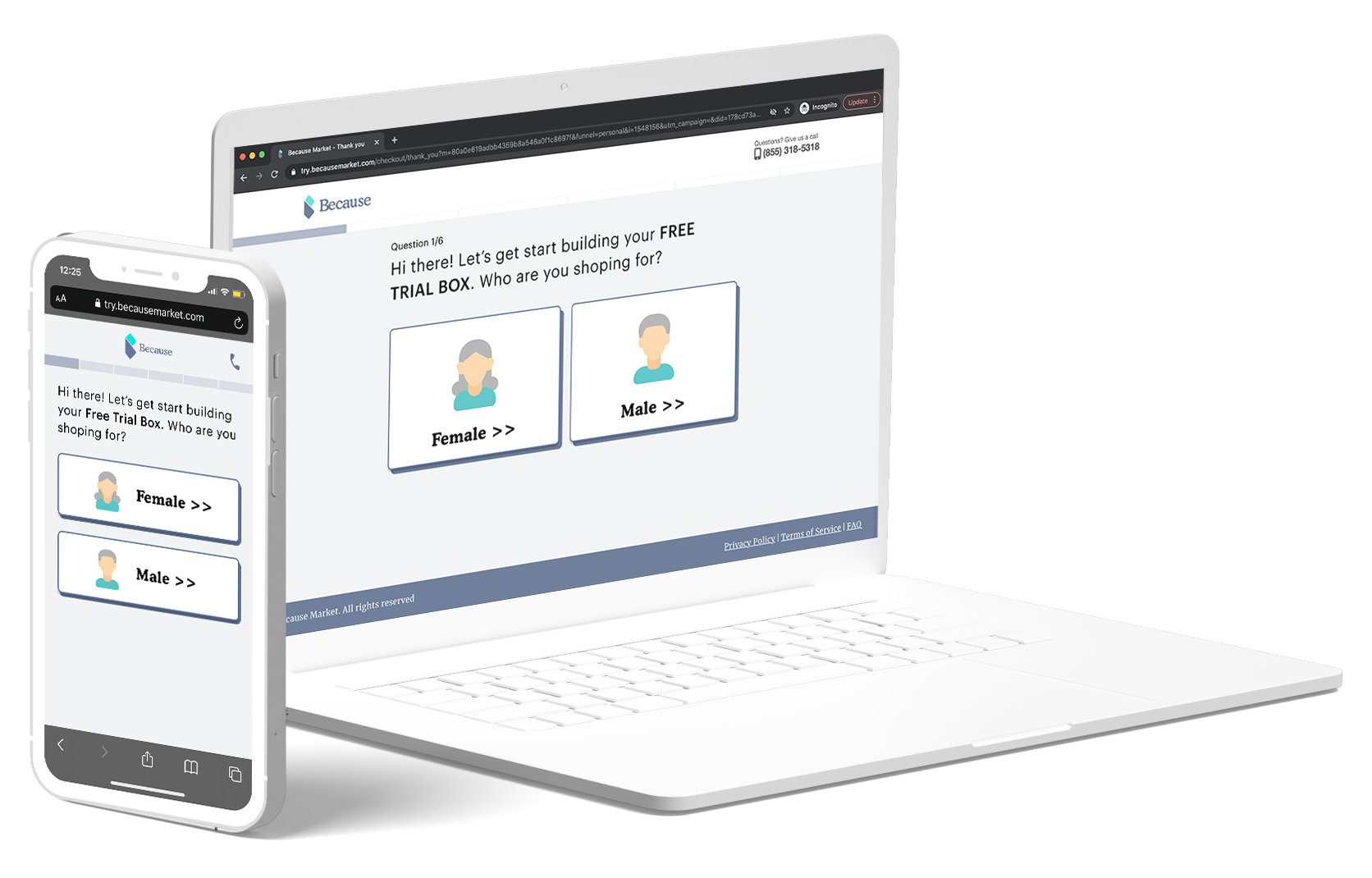
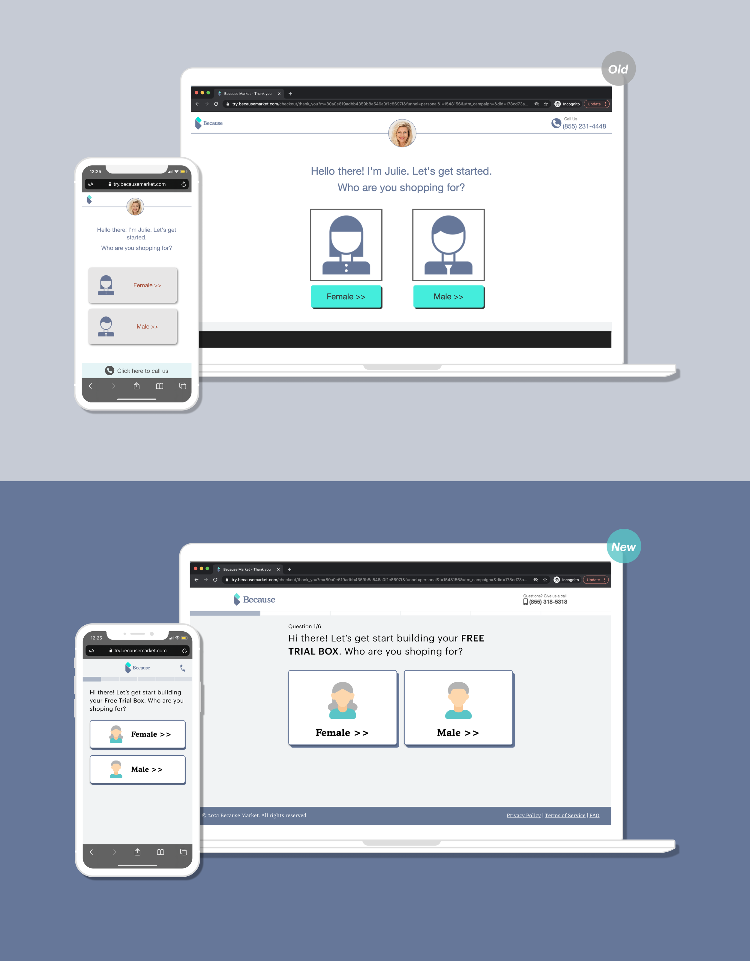
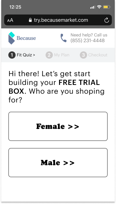
Landing page
Design consideration: The accessibility is a vital part of our user demographic, so we revamped typography (the font size increasing) and color contrast to ensure the hierarchy and readability.
Problems
Huge drop off rate here
No reference that is a Free Starter Pack.
The bottom “call us” bar is confusing
Gray button looks like disabled
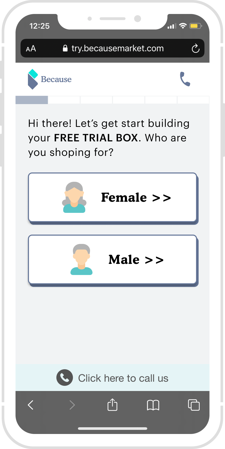
Solution
Add Progress bar - inform user form an estimated time
Add “Free Trial Box“ - encourage the user to try it
Remove the Call Us Bar -
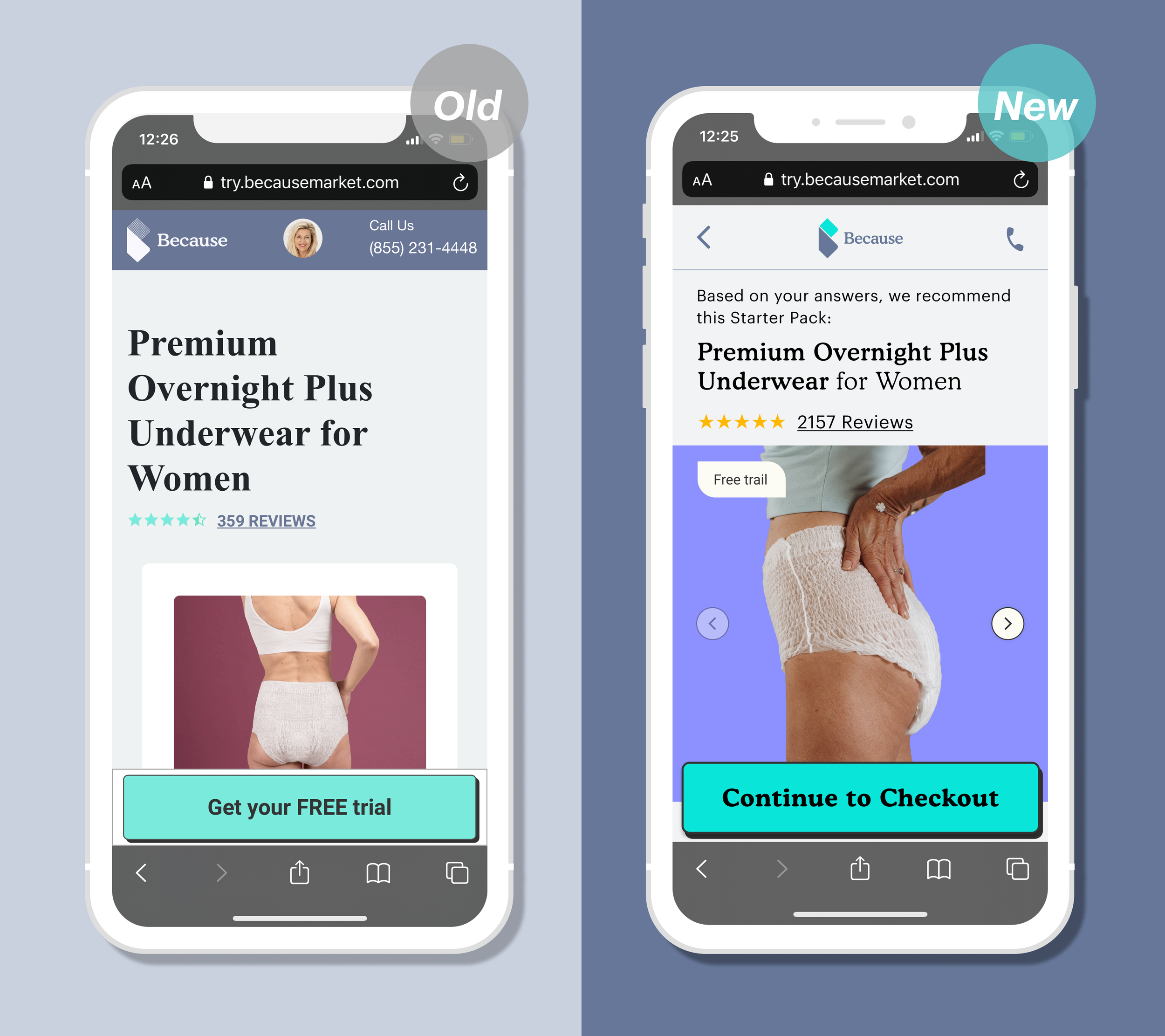
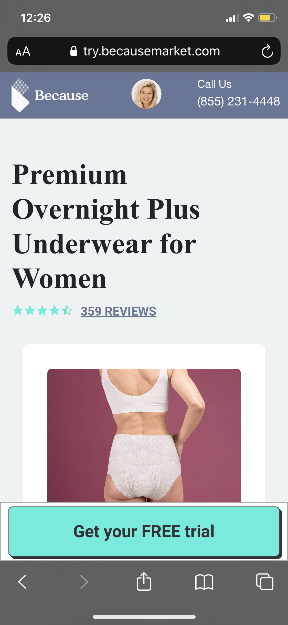
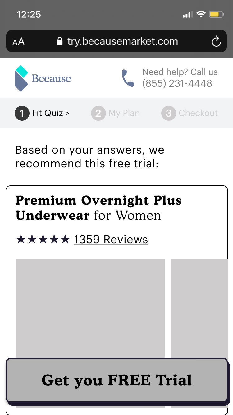
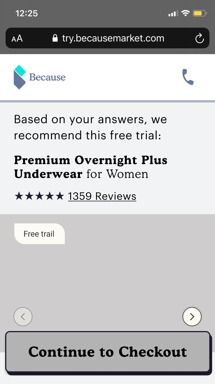
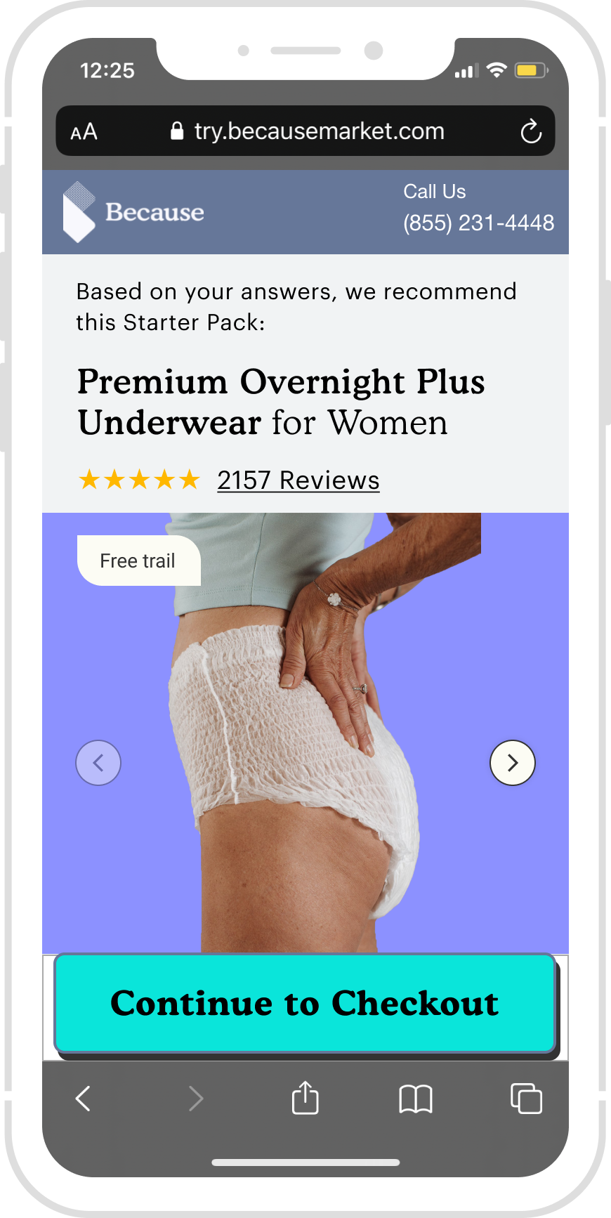
Product Description
Problems
Huge drop off rate here
No way to go back
The header is inconsistent
Solution
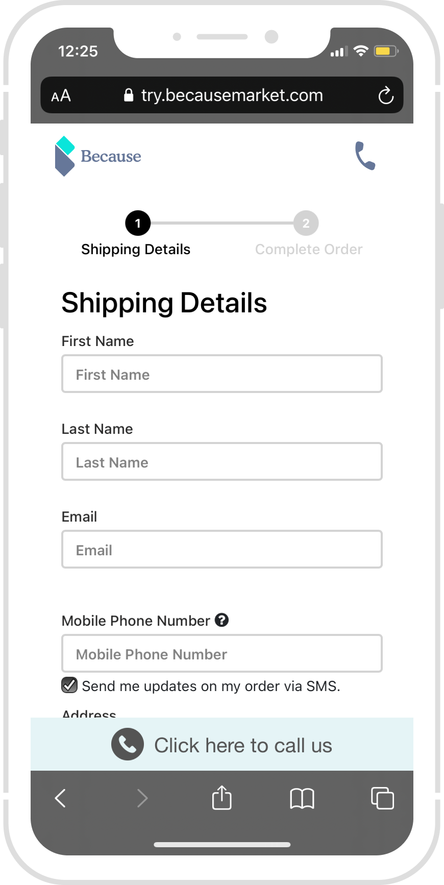
Add a go back icon - let the user in control
New Mobile-friendly product images - help users to navigate/view the images
Emphasis on free trial - encourage the user to try it
Add a transitional language - Show ”based on your answers; we recommend…” on top of the page. With increased reliance on recommendations to direct users to items relevant to them, presenting recommended content clearly, in a way that encourages continued interaction, driving engagement and user loyalty.
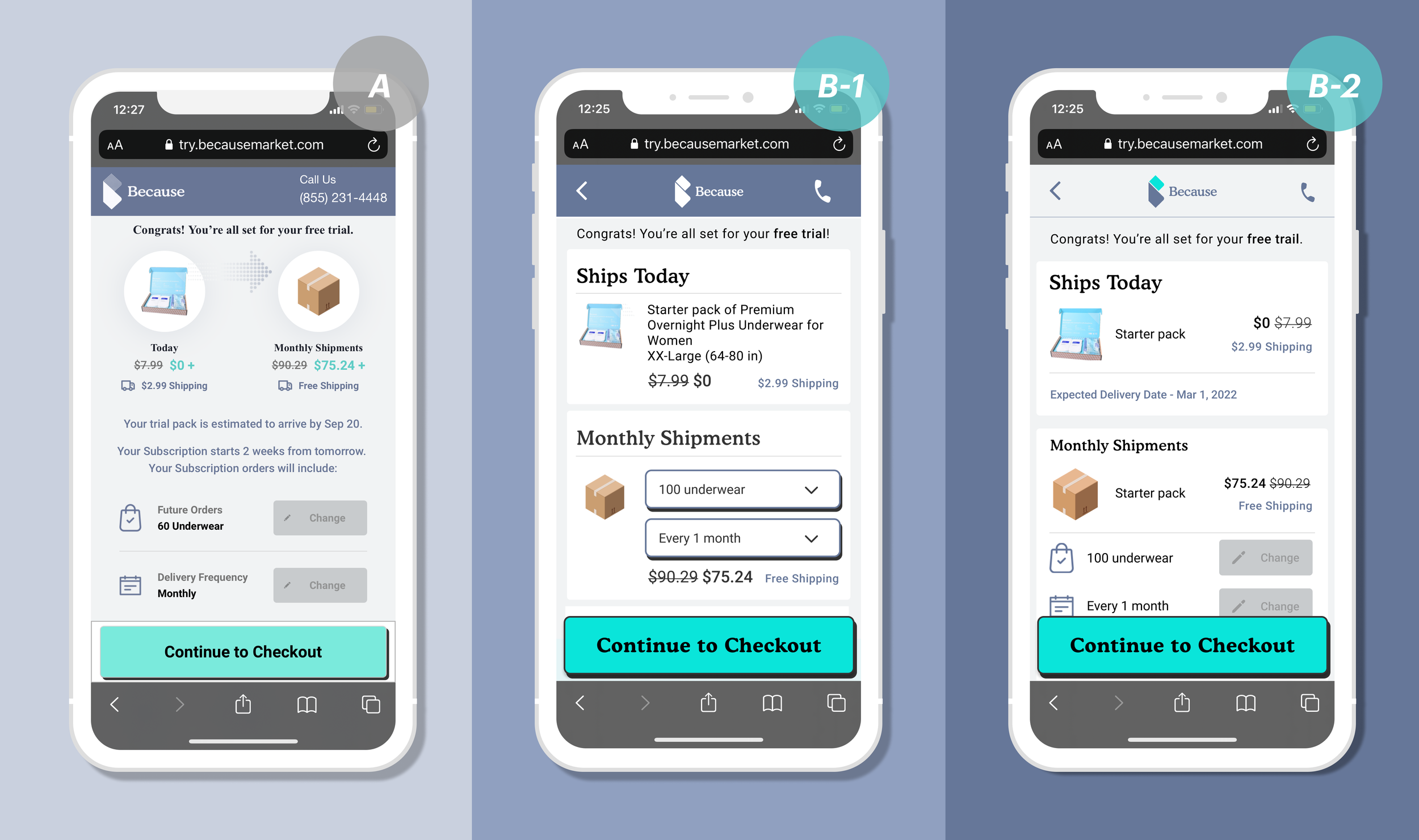
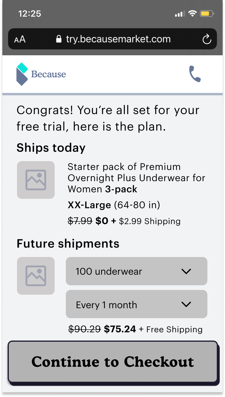
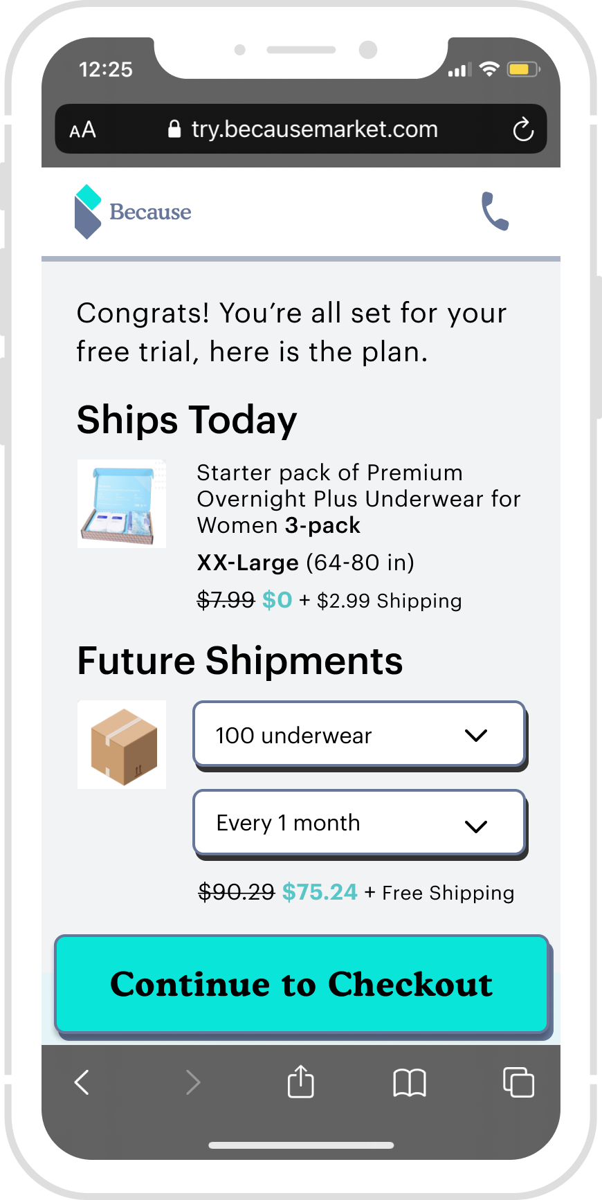
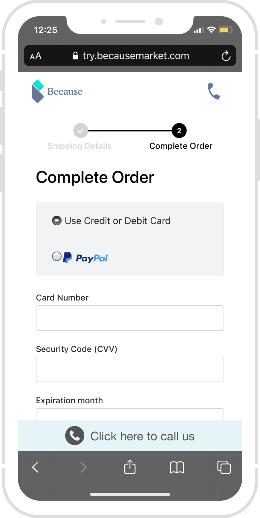
Product confirmation
Design consideration: How to show the free and subscription and let users trust us.
Problems
Huge drop off rate here
No hierarchy, inconsistent UI
The Today and Monthly are not clear
Solution
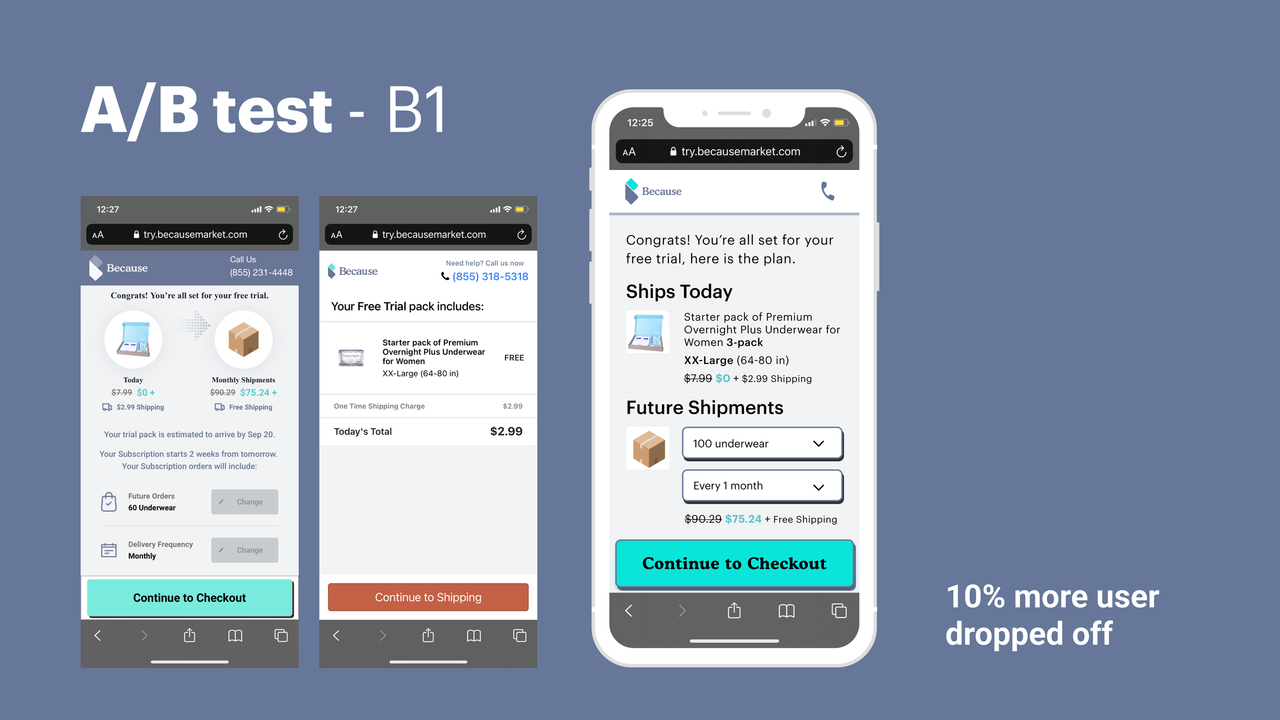
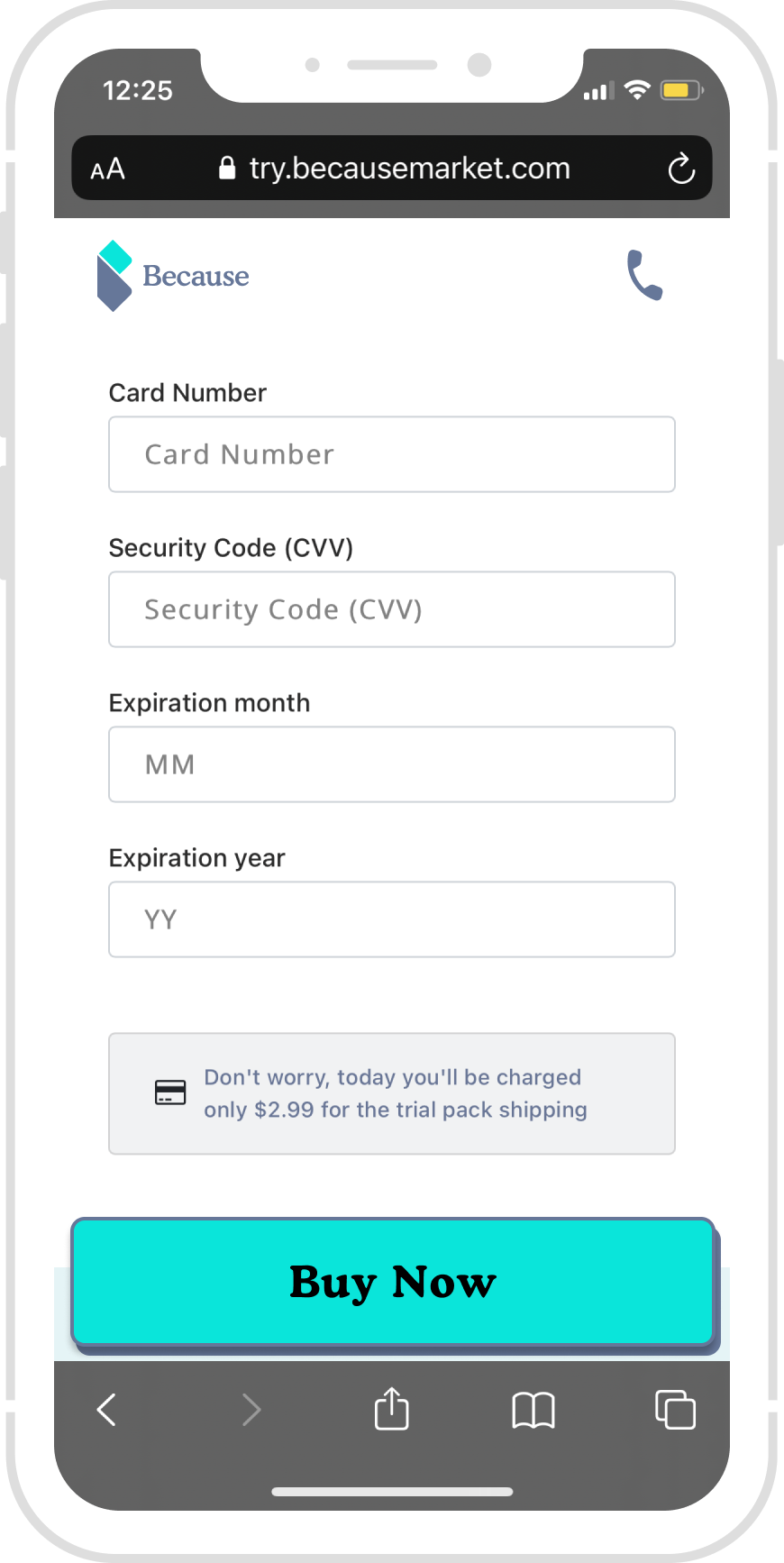
B-1 - two sections, show the free pack and subscription clearly
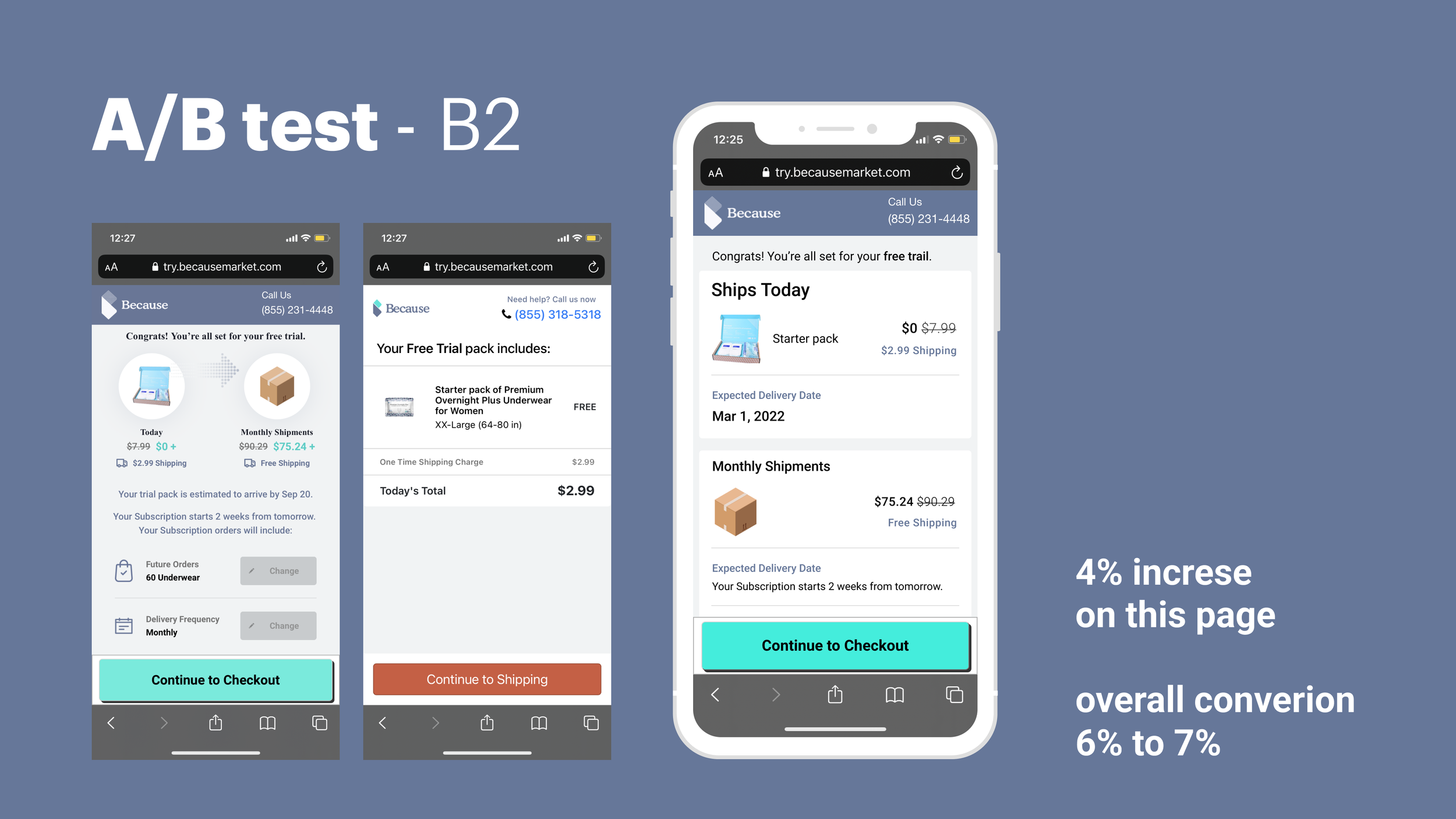
B-2 - Prioritize Today, encourage the user to try it
A/B test results
A vs. B1: Additional 10% drop off rate😭, Monthly shipment is too prominent also, the two buttons are distracting,
A vs. B2: 5% conversation rate up😎, We de-prioritize the monthly shipment because this page aims to encourage users to try this free pack.
Responsive Design - Mobile web & desktop
Problems
Not responsive
Solution
Design consideration: accessibility is a vital part of our user demographic, so we revamped typography (the font size increasing) and color contrast to ensure the hierarchy and readability.
Read the full project
B A C K G R O U D
Problem statement
We see a massive drop-off rate on several pages in the funnel on Mixpanel. Inconsistent UI, accessibility is weak.
Goal
For users: Find the right product; try this product for free, potentially subscription.
For business: Higher Conversion rate, engaging with more target users.
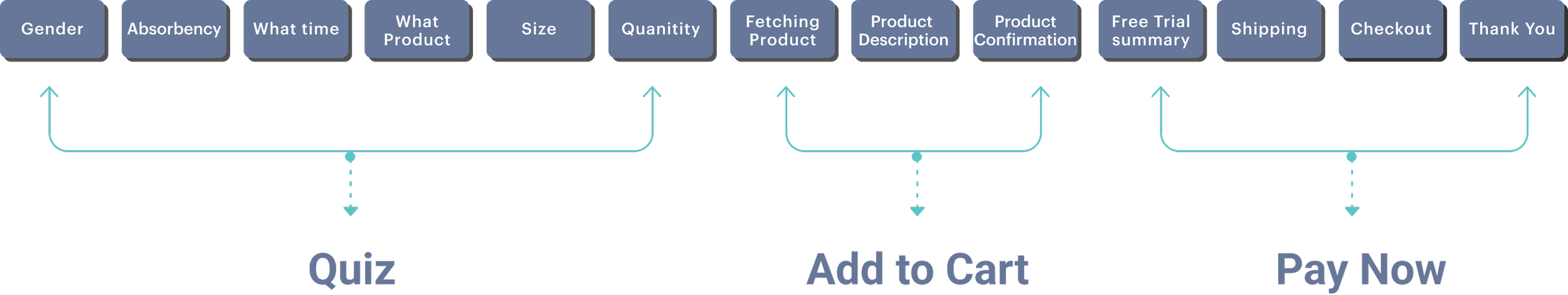
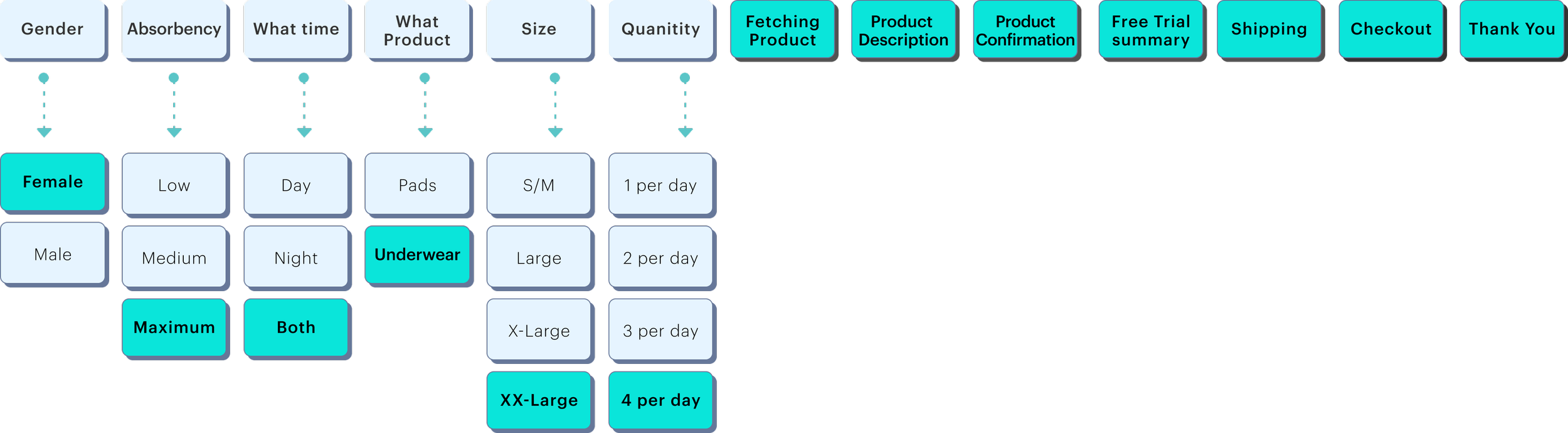
We went through the whole experience page to page; then, I mapped out the information architecture; there are 13 pages in the funnel.
Information Architecture
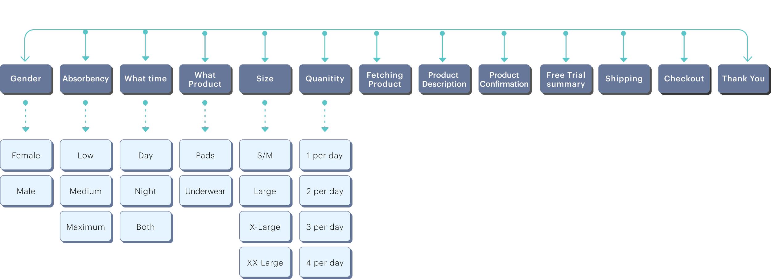
To narrow down the problems
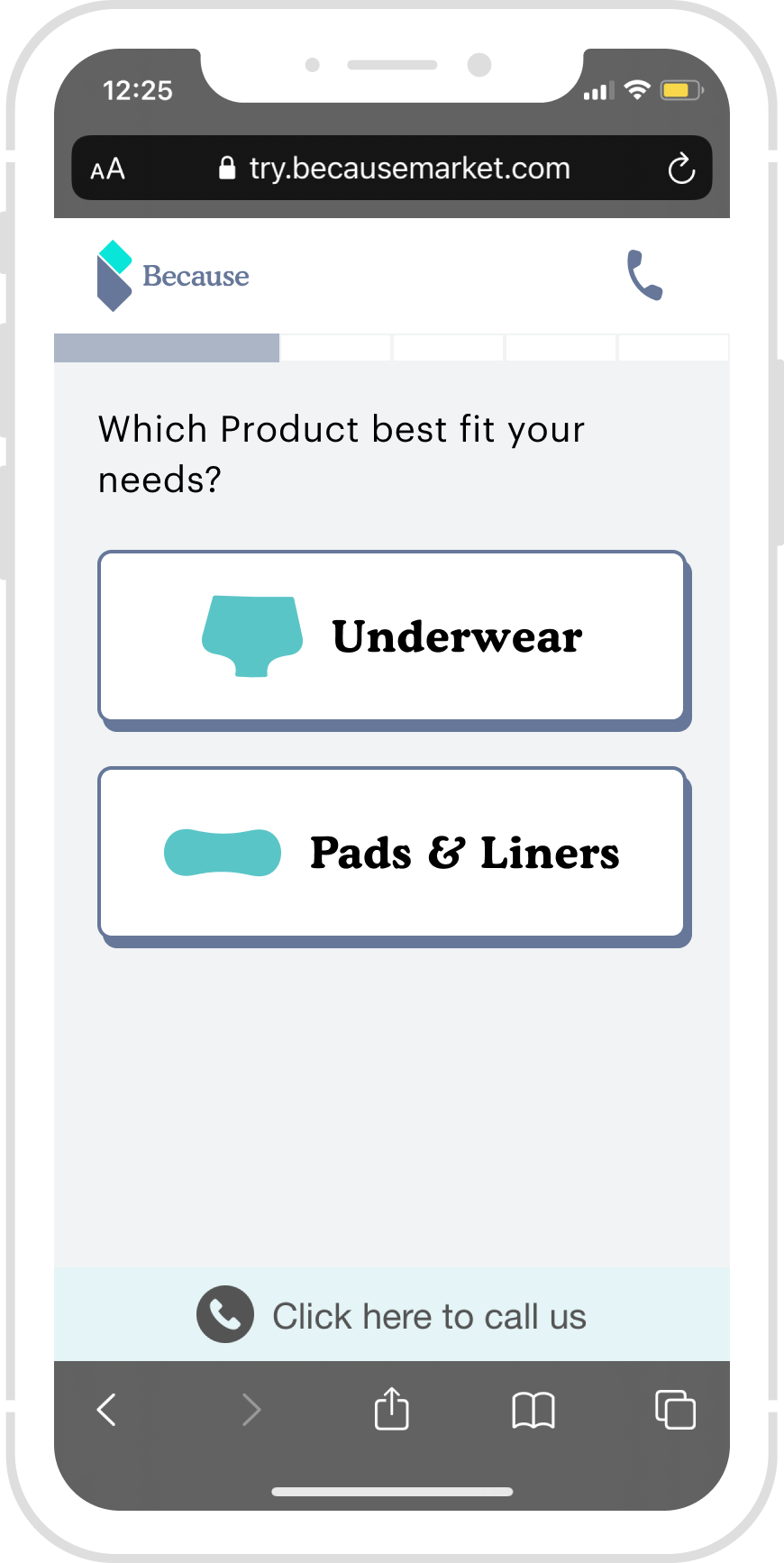
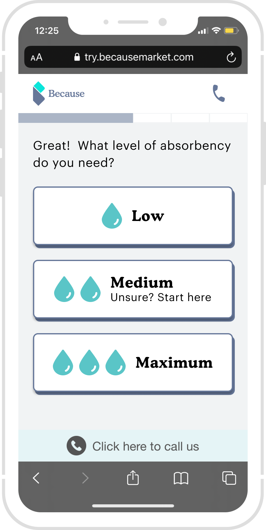
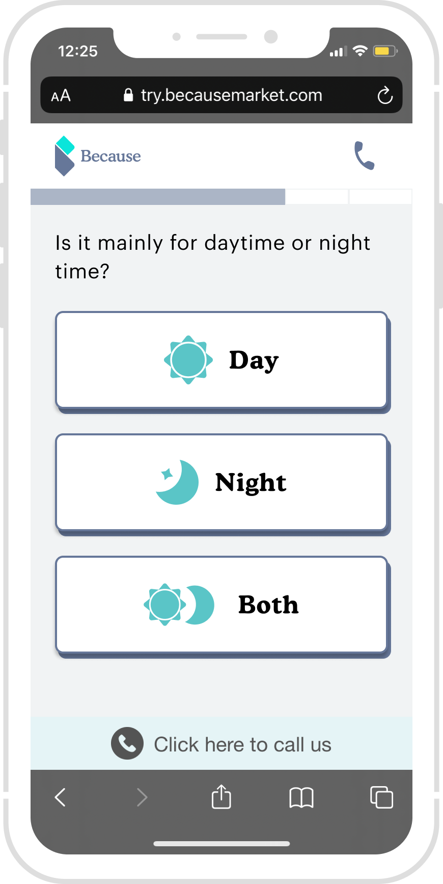
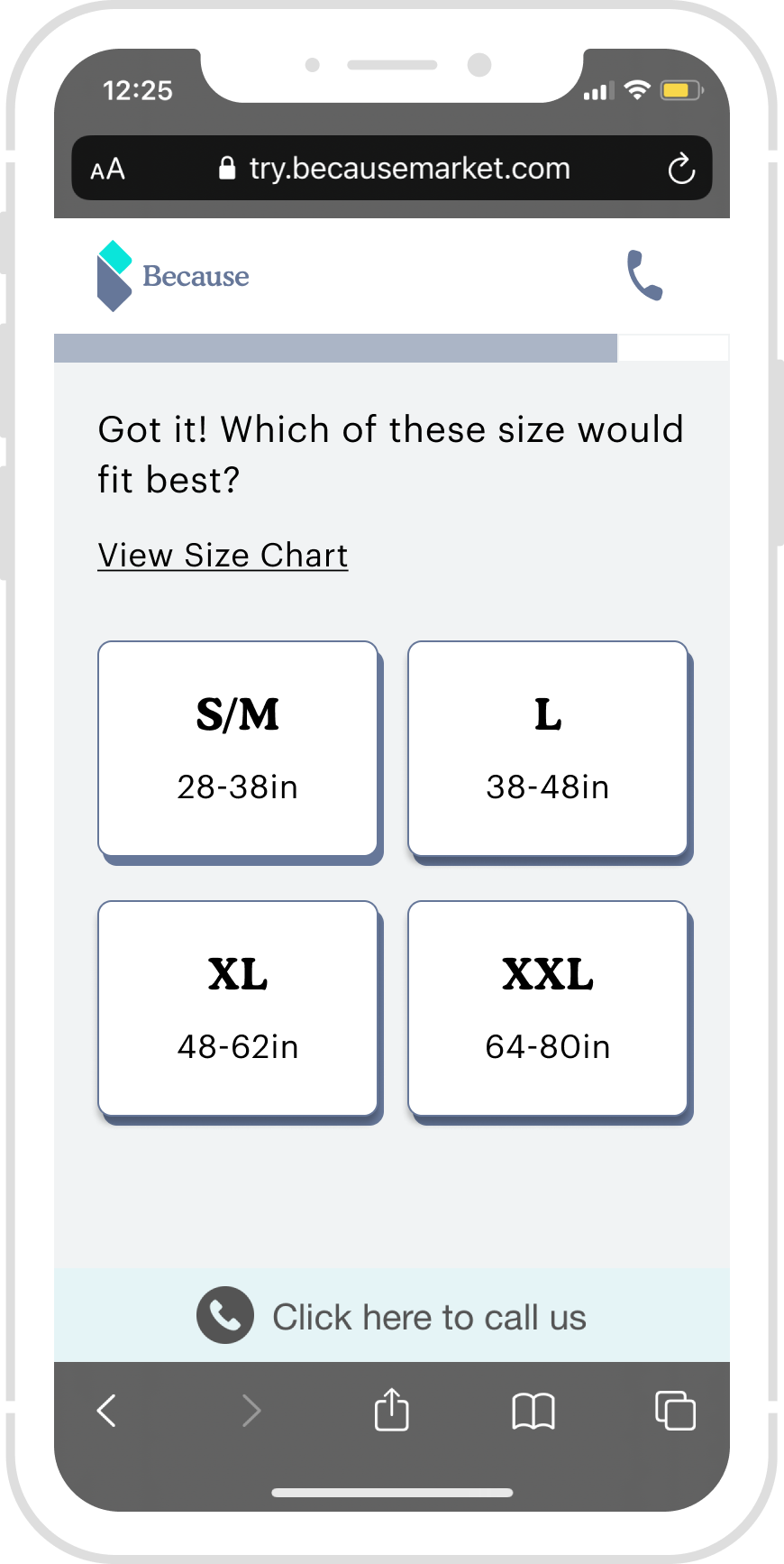
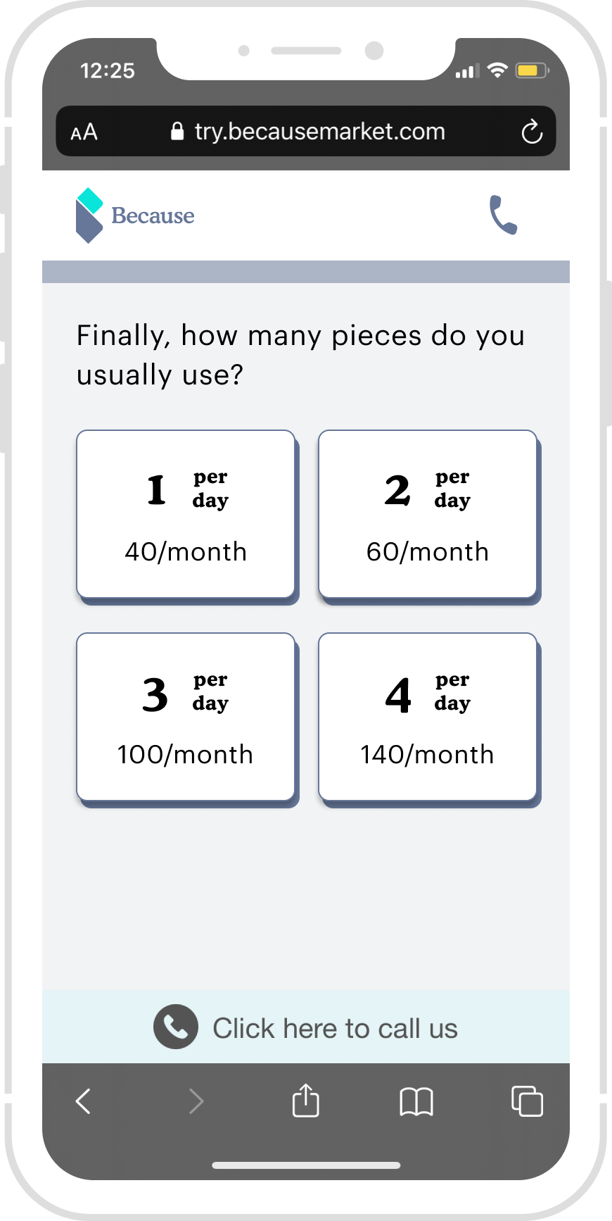
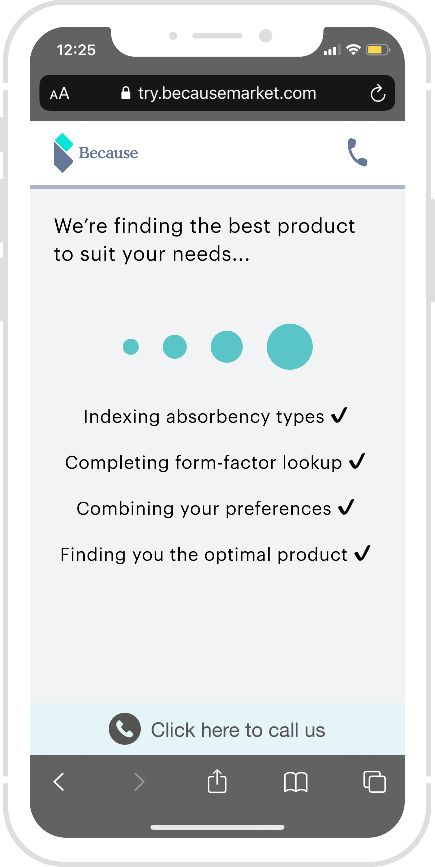
We break down the free trial experience into three sections: QUIZ. ADD TO CART. PAY NOW.
Simplified site map
Current Flow Analysis
Key finding on Mixpanel and User interview -??? new user flow chart
We started by deep diving into the current flow, and below is the end-to-end experience for customer onboarding and Purchasing.
Previous User flow with Mixpanel findings and user interview outcomes - 分成三张图,字拿出来
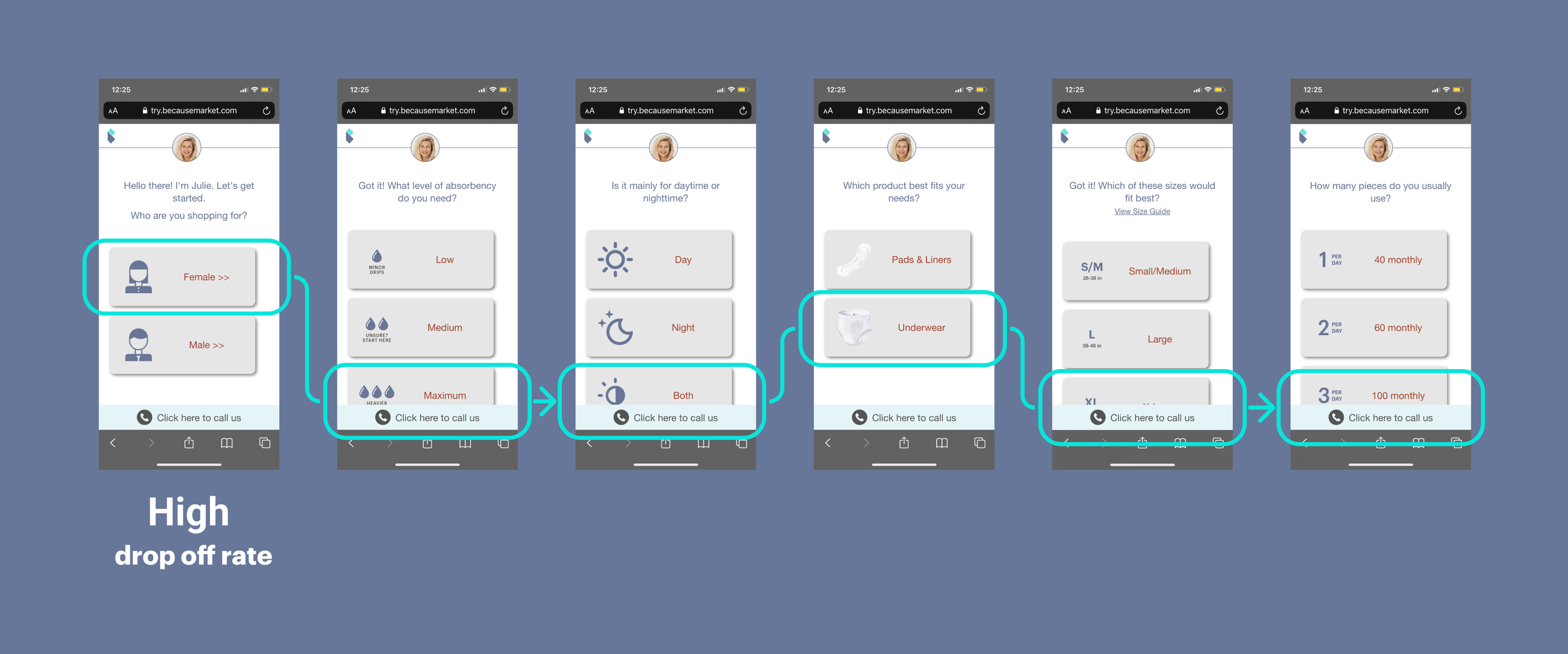
Onboarding - Quiz ⬆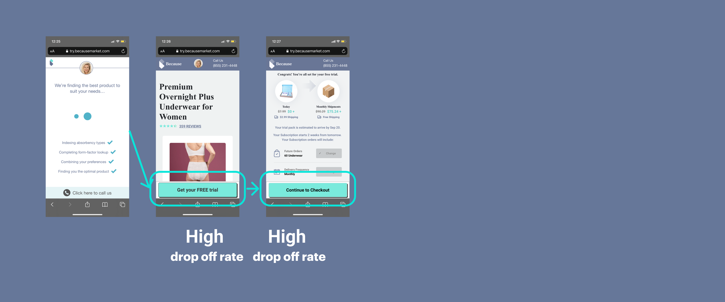
Considering - Add to Card ⬆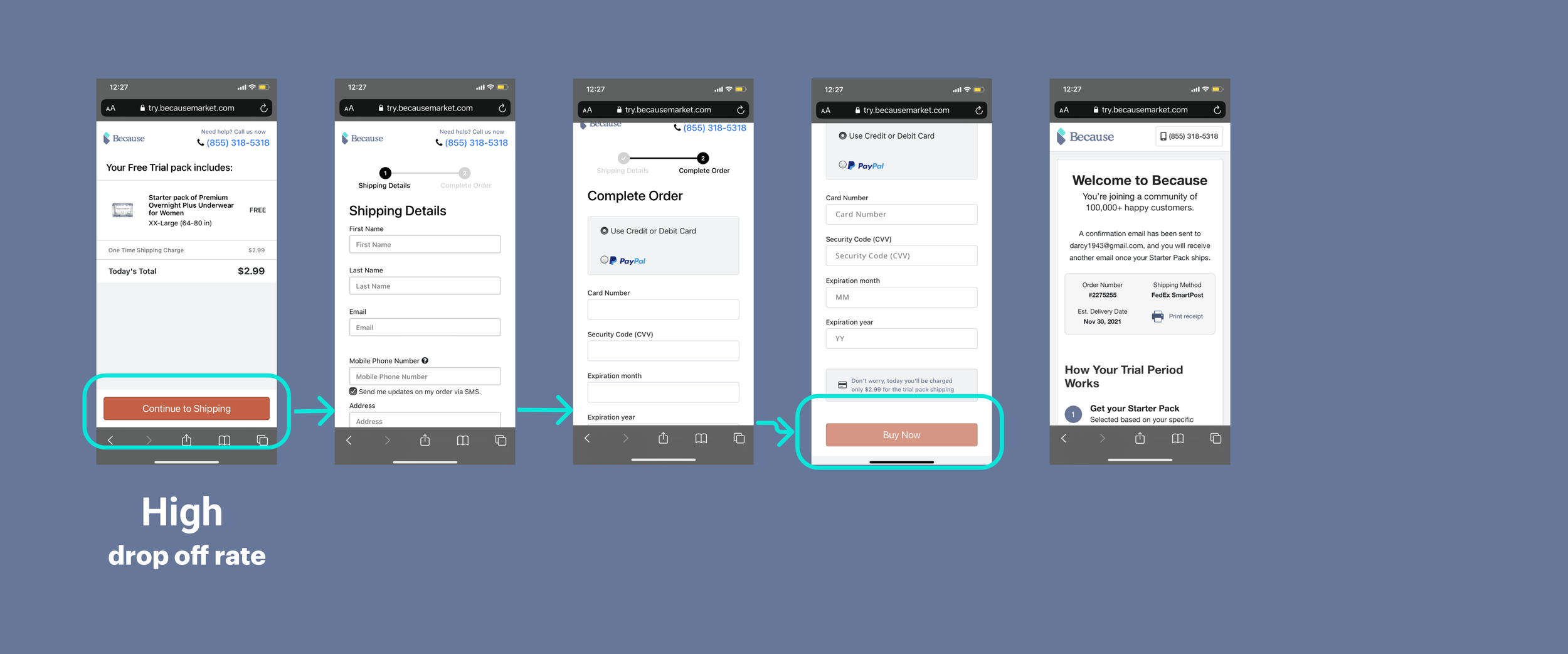
Purchasing - Buy now ⬆Major Insights
In drilling process from “Onboarding“ to “Purchasing“ consists of:
Onboarding (Customizing products): This step of “Onboarding“ in the drilling process isn’t clear about this funnel.
Considering (Whether to buy and how much to pay): the free trial and the monthly subscription aren’t clear; this could be a blocker for the purchase action.
Purchasing
Acceptance Criteria
1. As a user, I should be able to find the products that I need without any blockers.
2. As a user, I should be able to understand the free trial and subscription - future delivery, and without confusion. I trust this subscription and can cancel it any time.
Success Metrics
Conversion rate: from landing page to check out page.
For single pages, the convention rate increased by over 5%. The overall rate is around 6%.
Time to make the decision: how long does it take for a user to place an order during the whole process.
Design principle
Accessibility: A clear hierarchy, Typography- increasing the overall font size and color contrast.
User needs 1: find the right product
2: understand the free trial & subscription
3: you can cancel or change the product quickly.
4: emotional: shame
Value props: Design with personality -
Aging gracefully
Aging is a privilege
Design
Here are three key screens, from Wireframe to final design.
Landing Page
Current landing page:
We see a massive drop-off rate here; after the user interview, we found there is no reference for this “Free trial box“ builder.
Wireframe 1: assumption, trying to explain everything as straightforward as possible.
Add “Free Trial. “
Add stepper
Add a phone number
increase the button text size

Wireframe 2: Removing all the blockers to help users to navigate.
Simplified stepper
Add a phone icon
Increase the button text size
Decision:
remove obstacles to help users to navigate.
Previous Product page:
We see a massive drop-off rate here; after the user interview, we found there is no reference for this “result“ from the quiz.
Wireframe 1:
Add new language for the transition
Add a Phone icon and phone number
Wireframe 2:
Add new language for the transition
Add a Phone icon
New image section
New button language

Previous Product Confirmation page:
We see a massive drop-off rate here; after the user interview, we found there are no Visual hierarchy, different colors, fonts, and sizes.

Wireframe 1:
Language: Ships today, Future shipments
more details of the product boxes
Wireframe 2:
stack on each other to prioritize the “Ships today. “
Add a reminder that: they can cancel any time, provide a Free starter box, and free shipping when they subscribe.
Decision:
Use simple language
user is in control.
Final Design - Flow -1, Quiz - Onboarding


Retros
Prioritized Platform and Design Guidelines
From the user composition chart above, we can see that around 70% Because market users are operating on iOS devices, Apple’s human interface design guidelines are prioritized, and then Android devices will be compatible.
Design QA: Responsiveness
As Because Market’s users operating on small screens (320px, i.e., iPhone SE/5S) are extremely rare, the design starts from 375px as the standard screen size and scales up to the larger device. For better communication with the engineers regarding my design intent, I did create specific responsive guidelines on multiple screen sizes and annotated special callouts.
Result & Metrics.
4% Conversion rate increased on the Product Confirmation page
the overall conversion rate is increased from 6% - to 7%
Next Steps
Cross Sale & Up sale
Able to let users add more cross-sale products.
Value Props
Convey a pleasant shopping experience - Aging gracefully and Aging is a privilege.
Next Project
Cross Sale & Up sale
Able to let users add more cross-sale products.
Value Props
Convey a pleasant shopping experience - Aging gracefully and Aging is a privilege.