Sale Funnel Redesign
Overview
Because Market is a sale funnel to sale underwear and personal care product to senior (50+) people.
Goal: Optimize the Free Trial Funnel experience to increase the conversion rate and help user make decision faster.
Project Type
B2C, End-to-End project E-commerce platform Desktop & Mobile
My role
Design Lead (Research, Interaction Design, Visual)
Duration
5 weeks
(April 2020 - May 2020)
Target users
50+ people in the U.S.
Teammate
PM, Engineers, Data Analyst
Outcome
🎉Conversion Rate increases 300%
From 2% to 6% conversion rate.
What’s new?
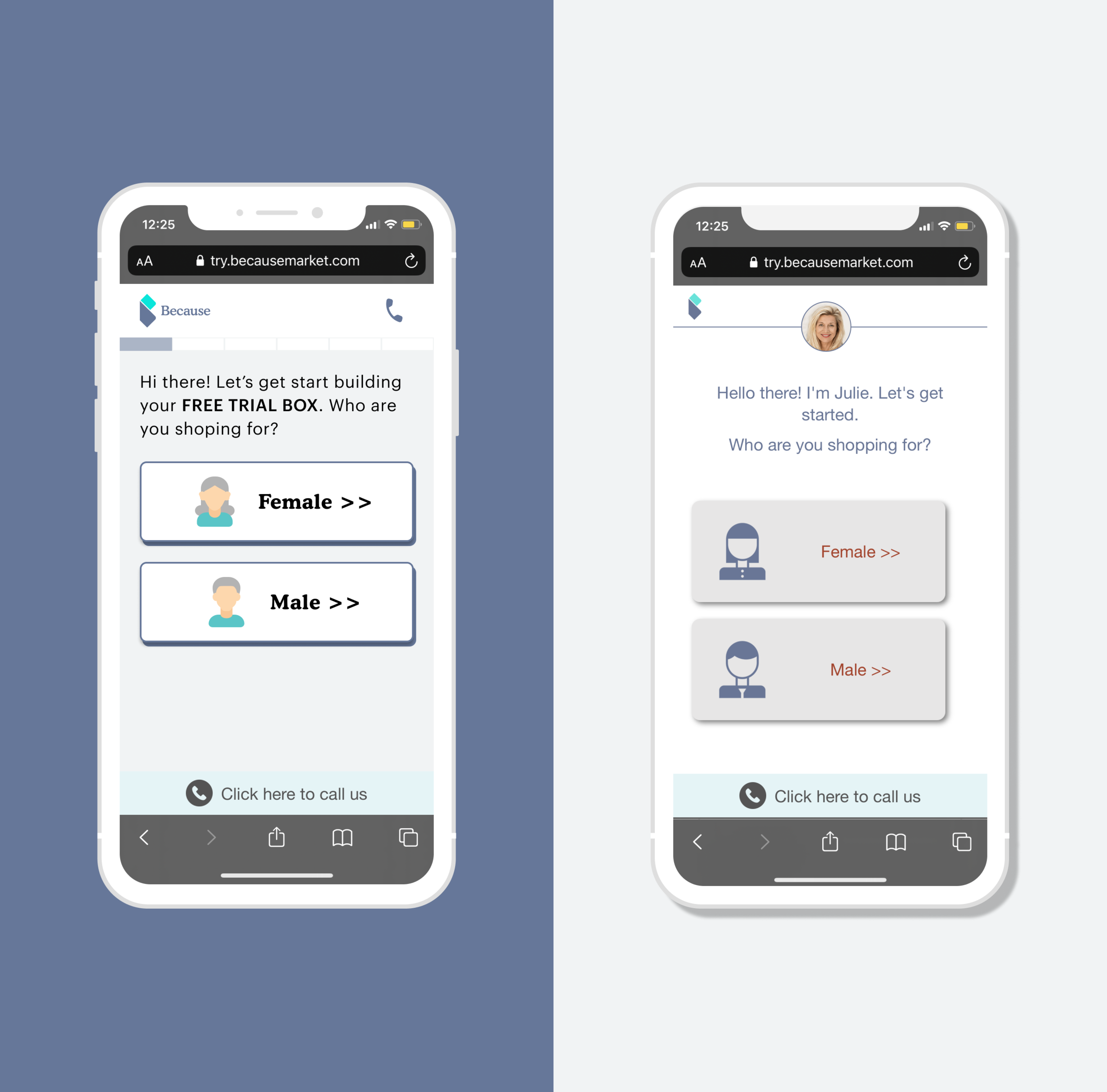
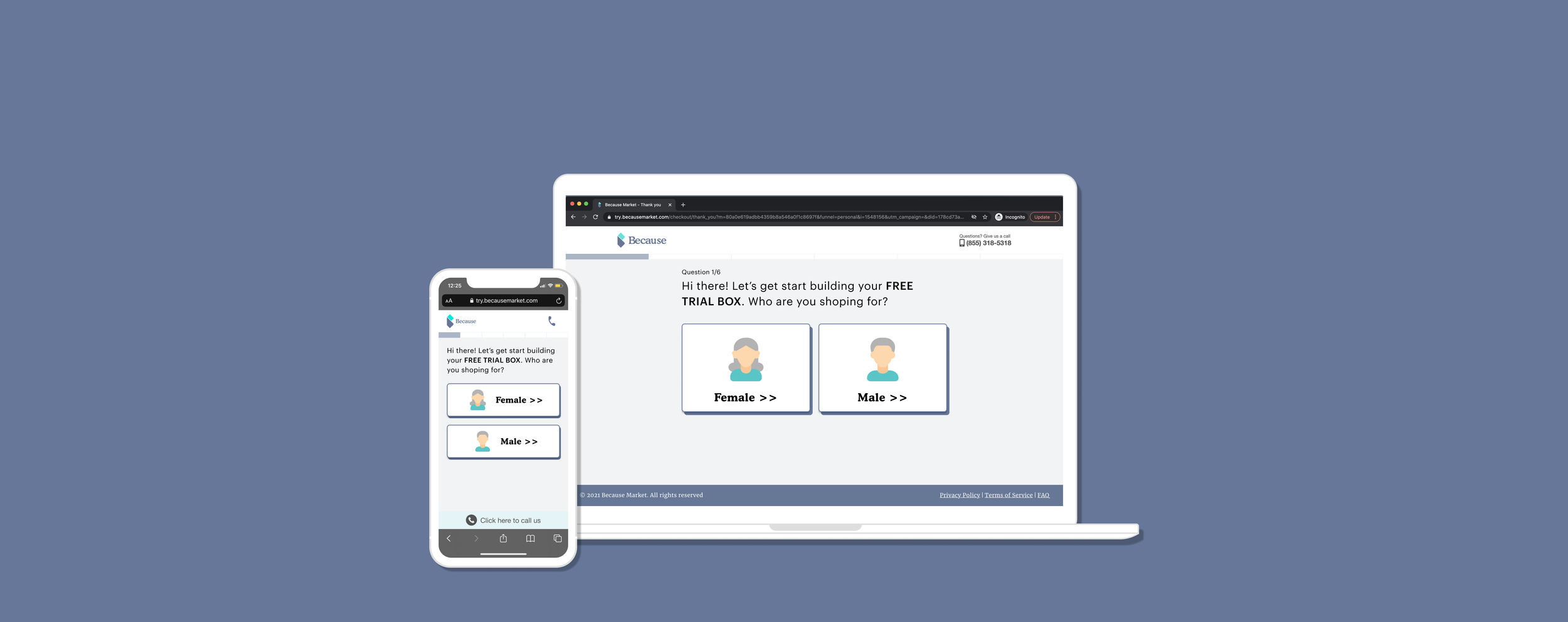
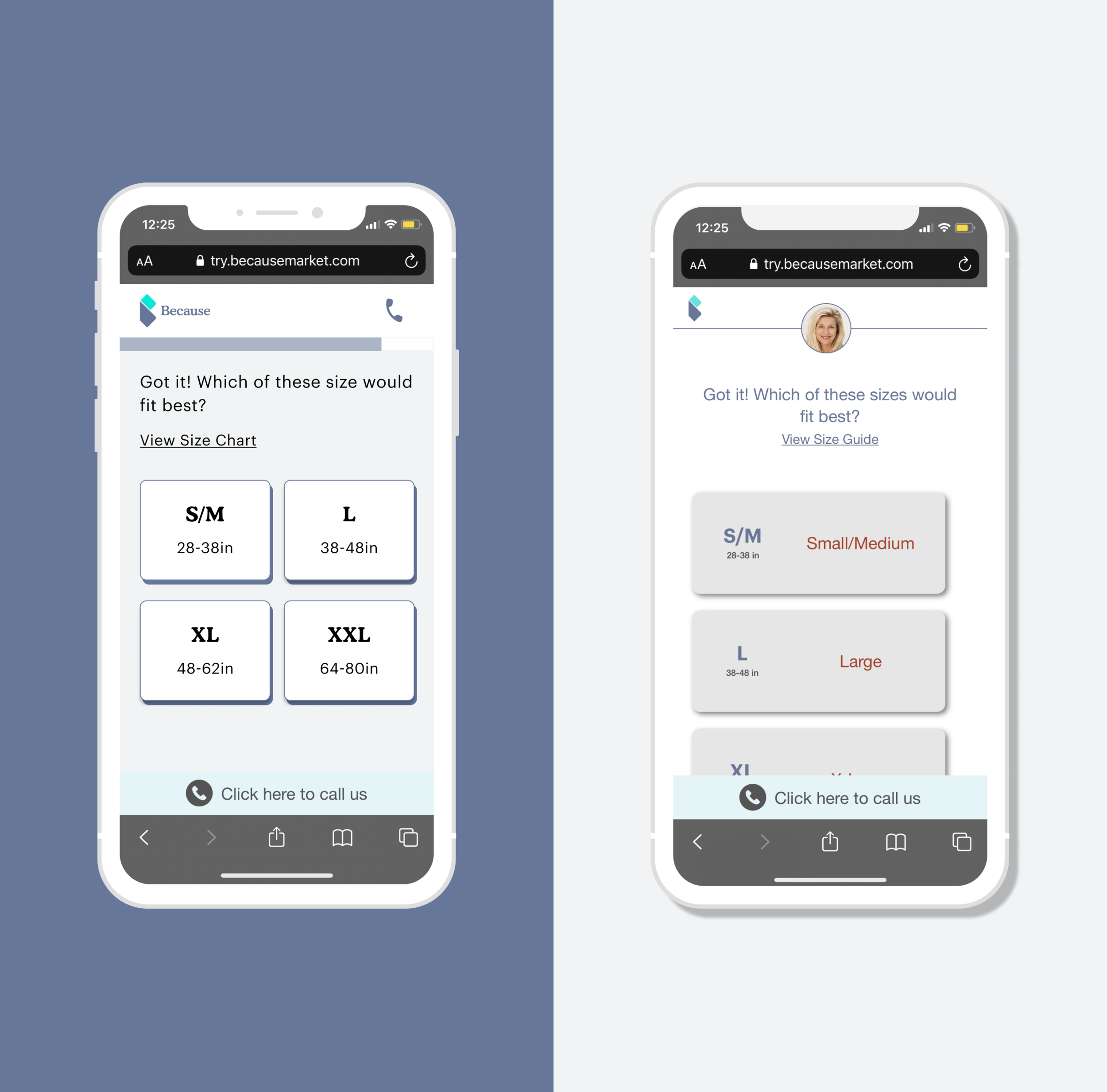
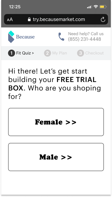
Landing page
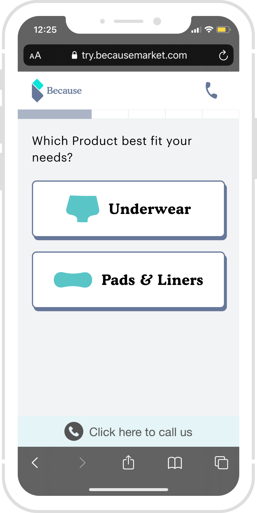
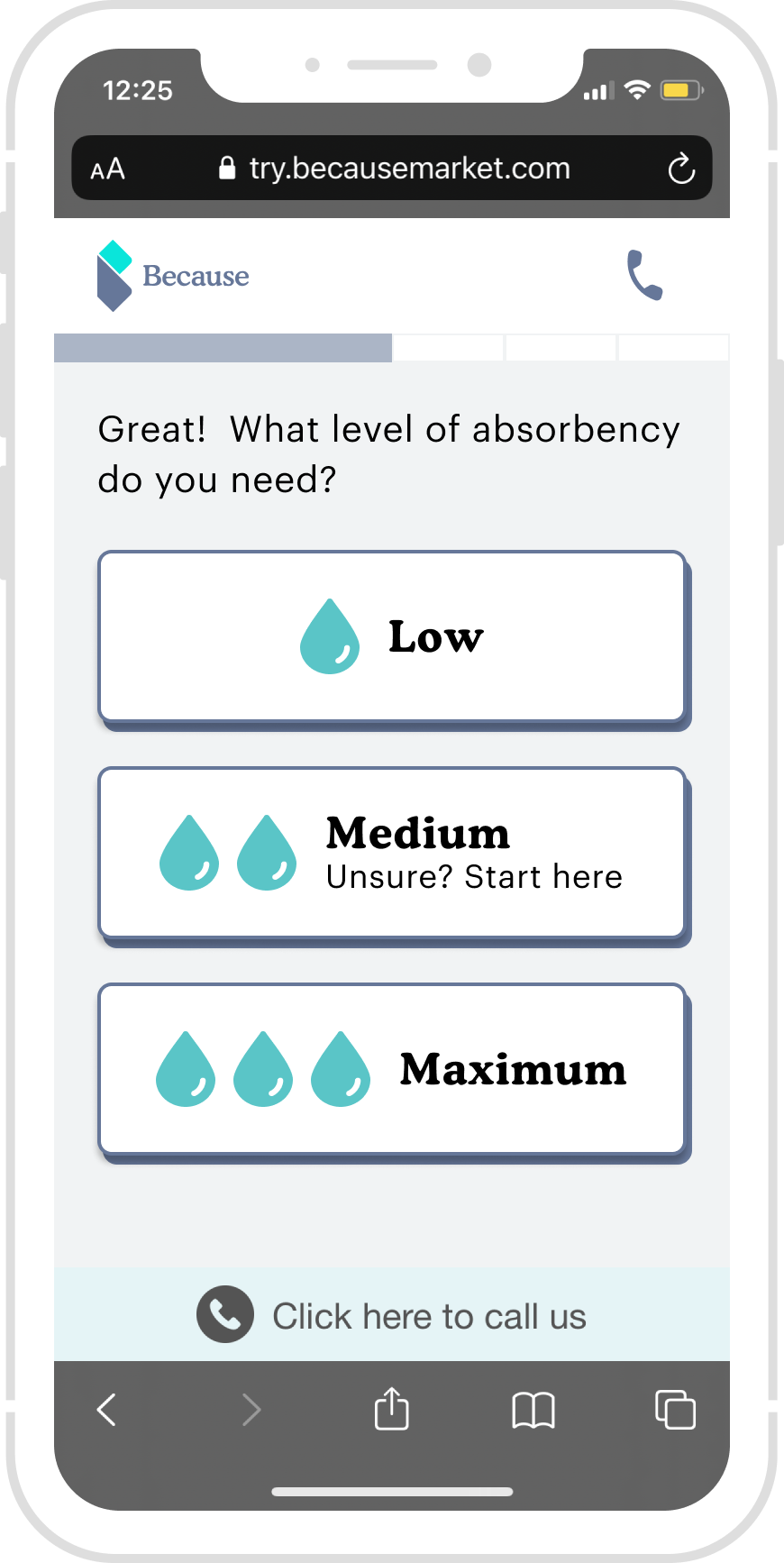
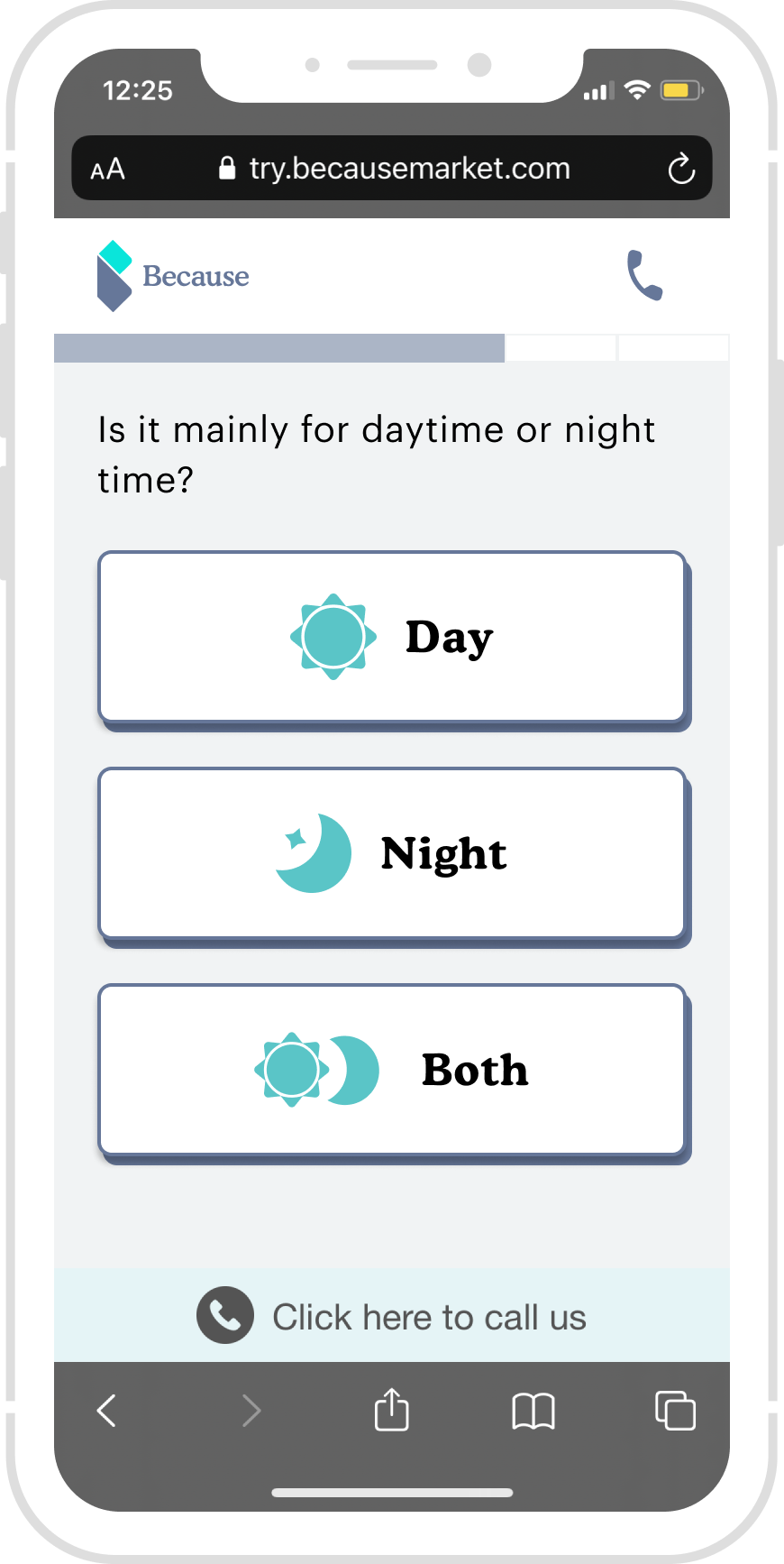
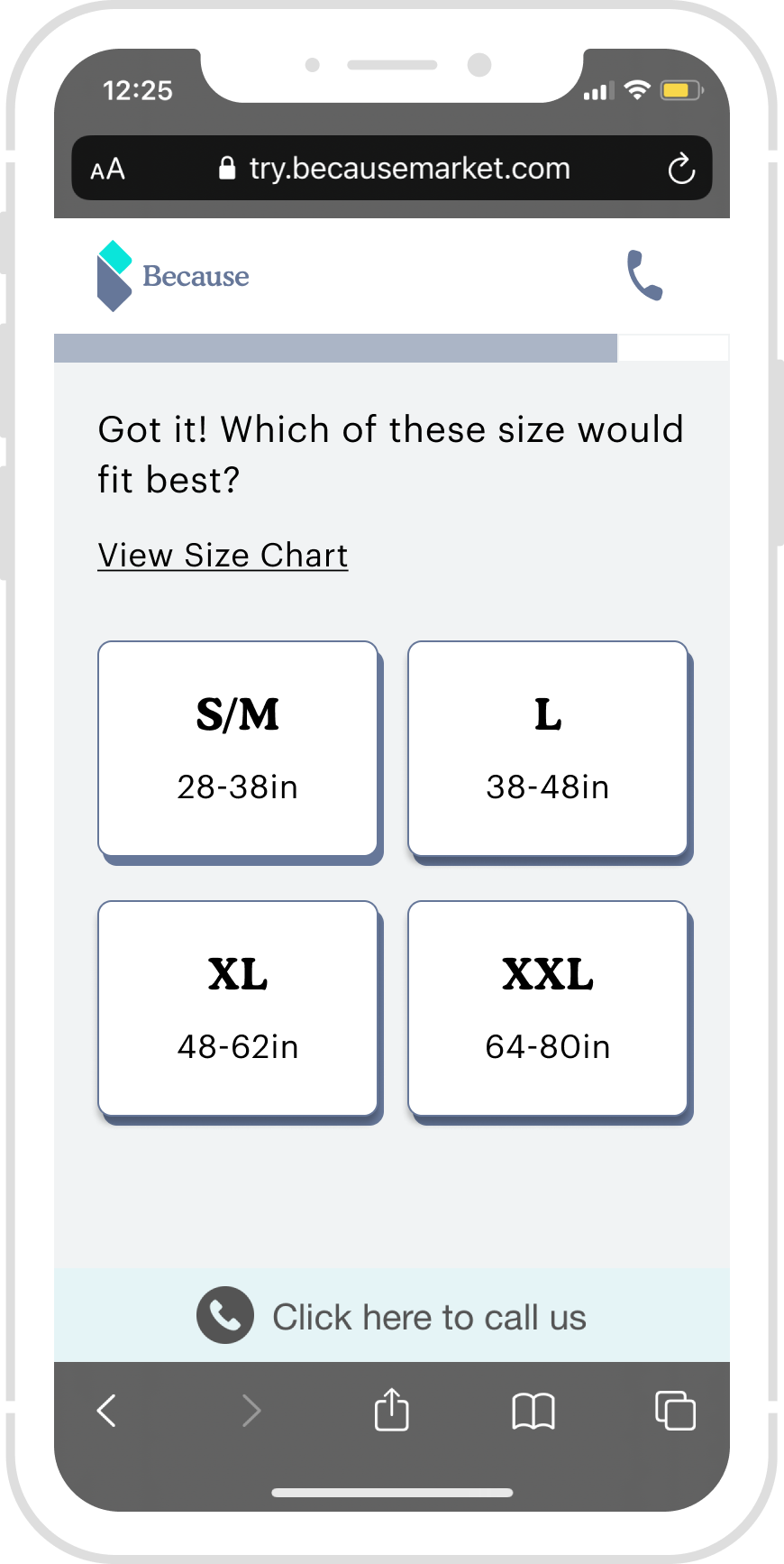
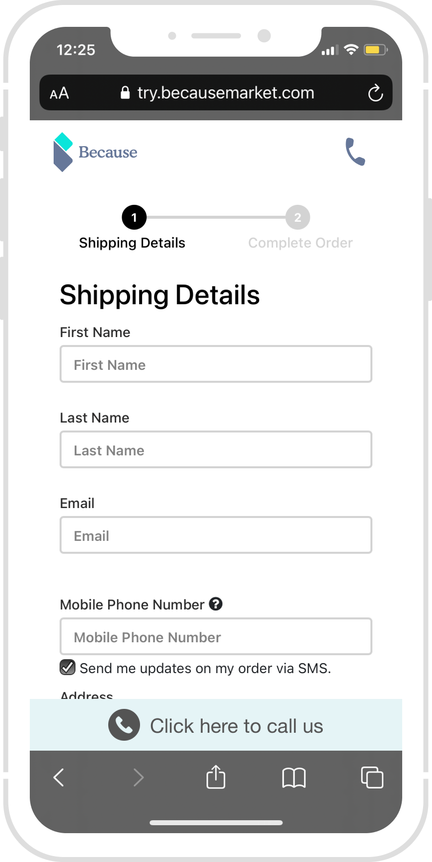
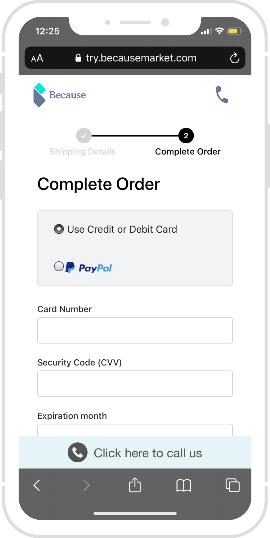
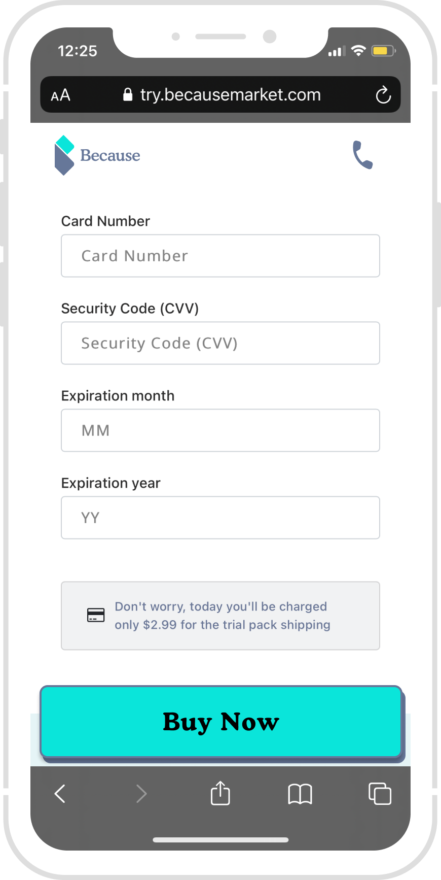
1: Add Progress bar / Stepper
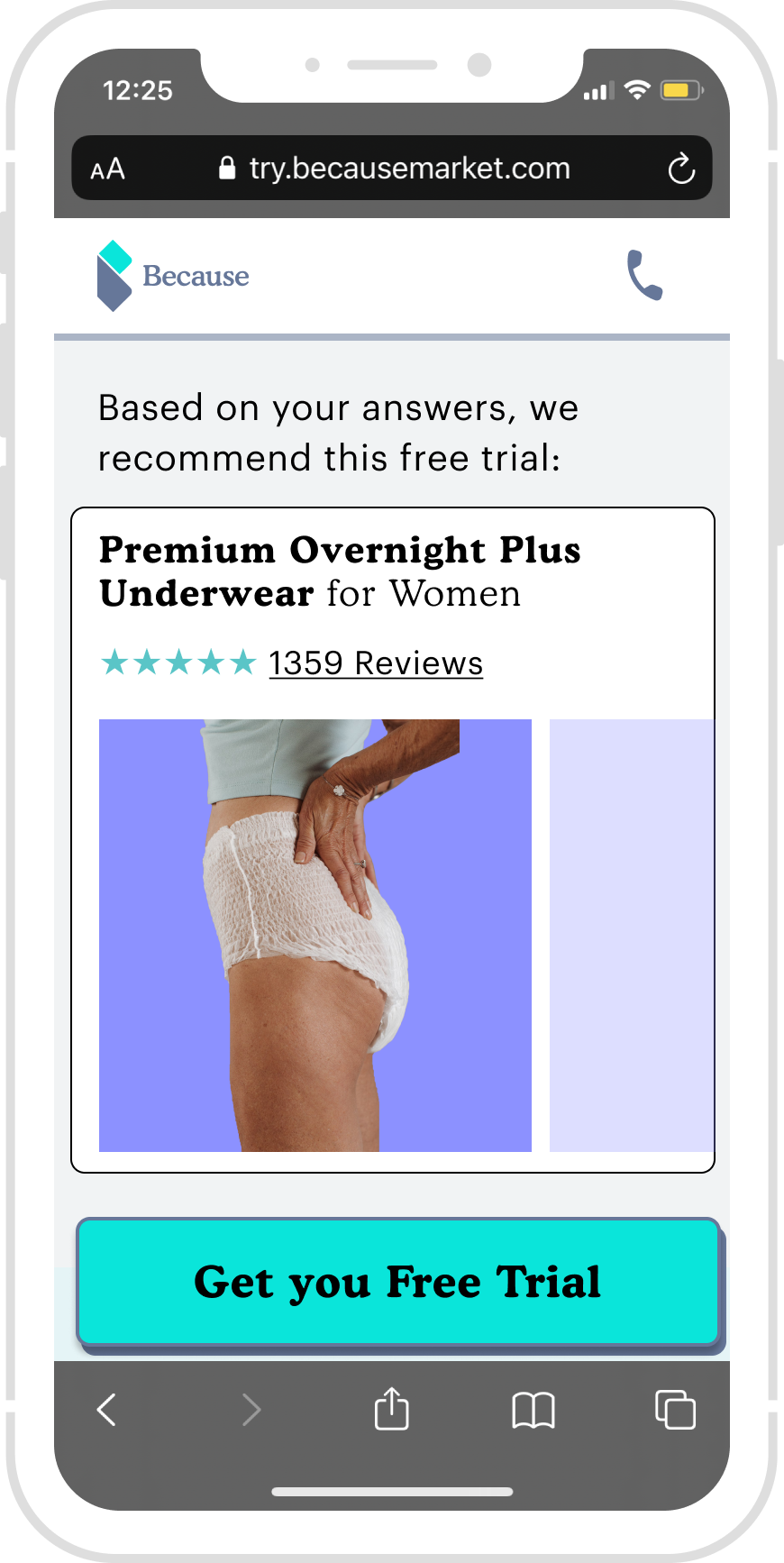
2: Add “FREE TRIAL BOX“
3: Enlarge the Size of fonts on the button.
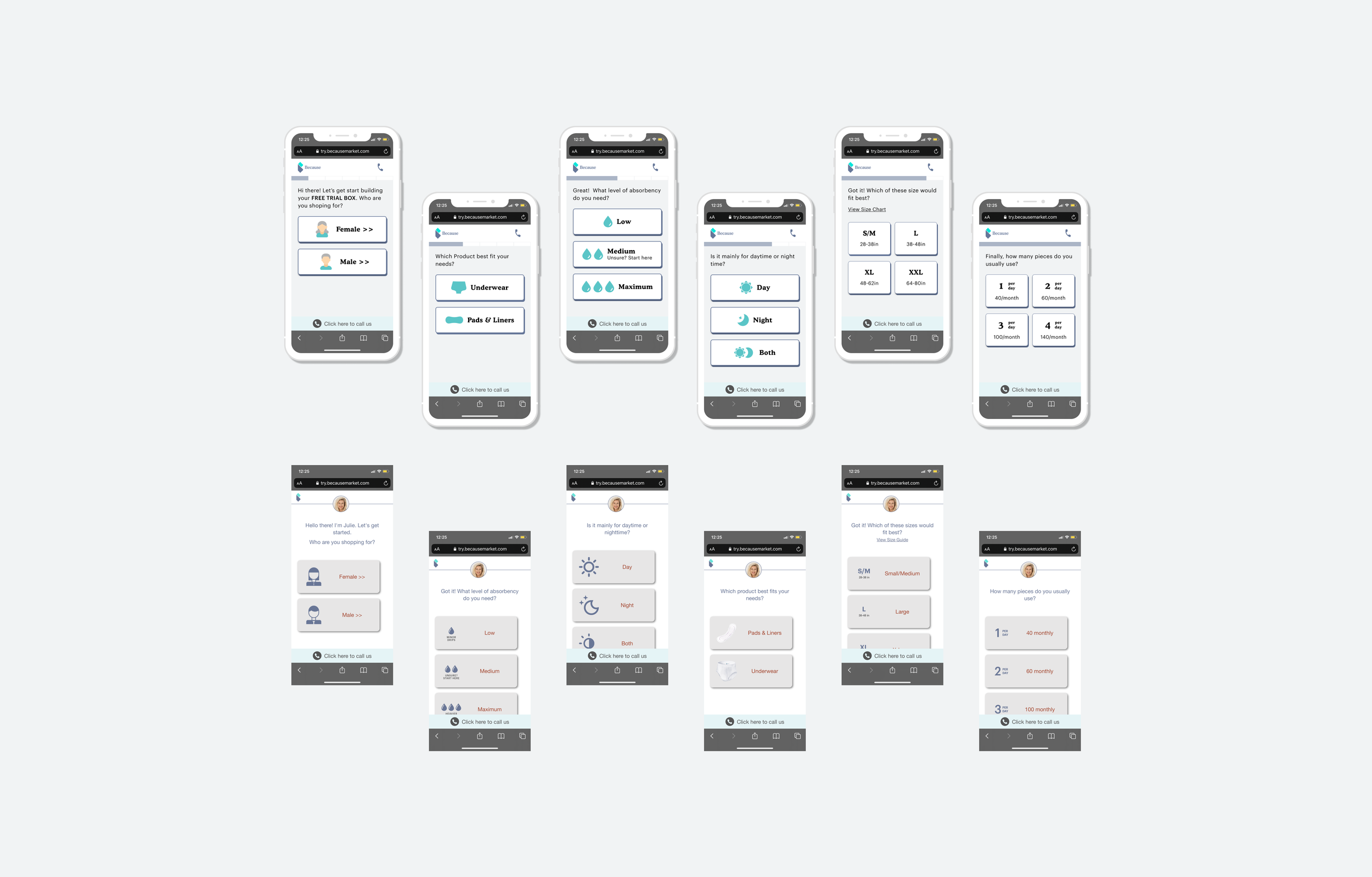
Compact buttons
Users need to screw down to see and select the button on the previous version.
The new version is more compact.
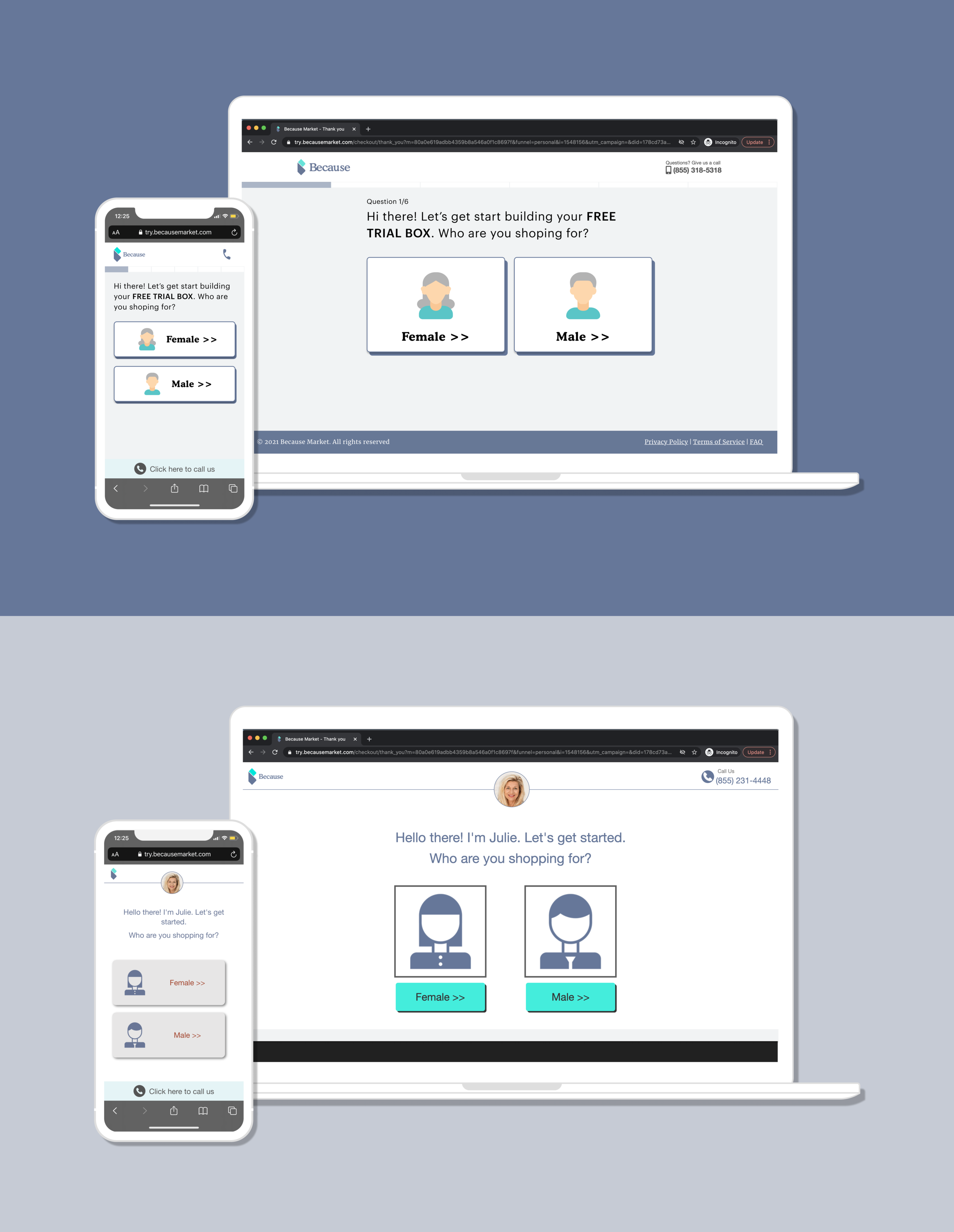
Responsive Design & Consistency
The new version is Mobile & Desktop responsive design.
The previous mobile version has red color text, and the previous desktop version has turquoise button.
The process.
B A C K G R O U D
Overview
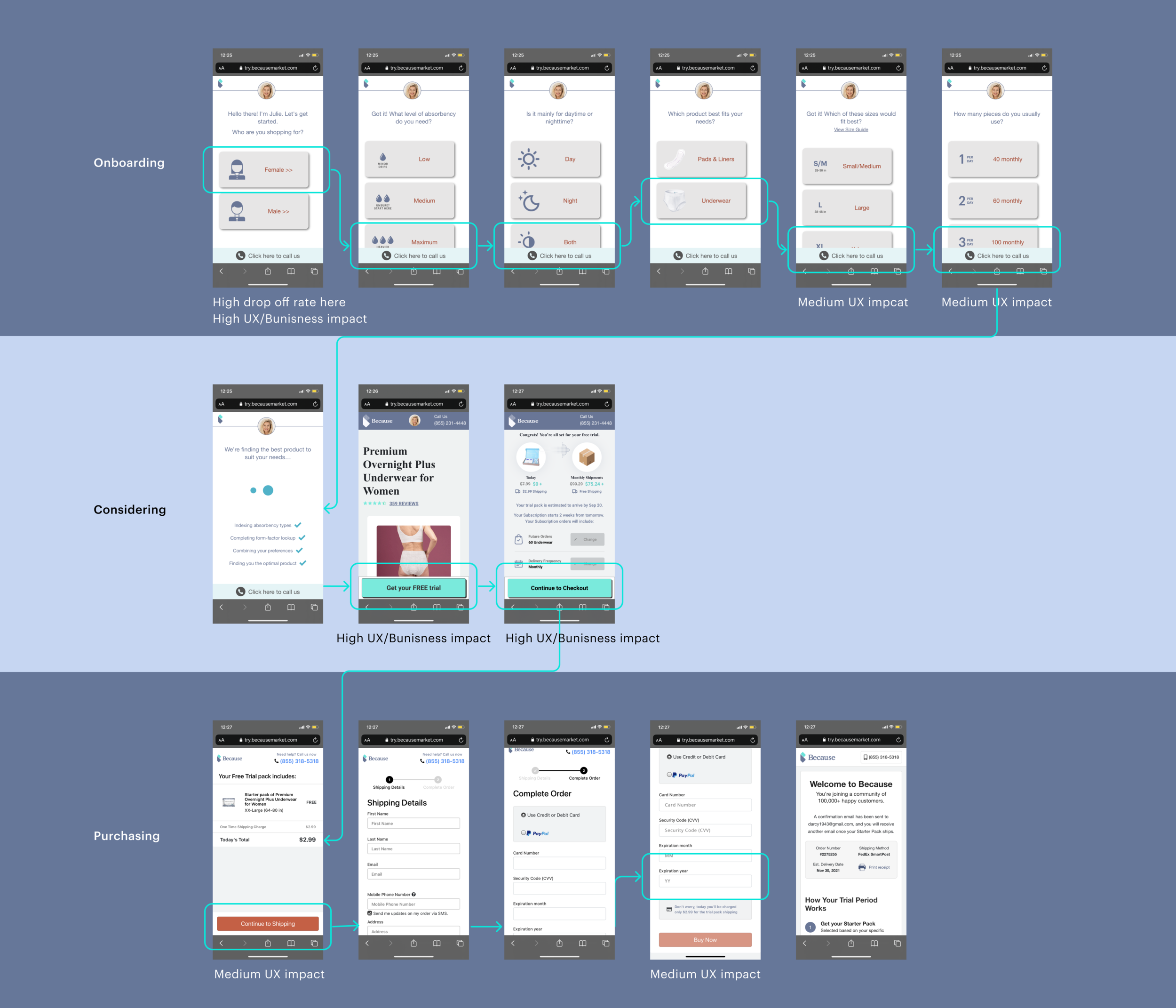
We started by deep diving into the current flow, and below is the end-to-end experience for customer onboarding.
Problem statement
Low conversion rate, current is 2%. we see a huge drop off rate in the Quiz section.
Goal
For users: Try this product for free, potentially subscription.
For business: Higher Conversion rate, engaging with more target users.
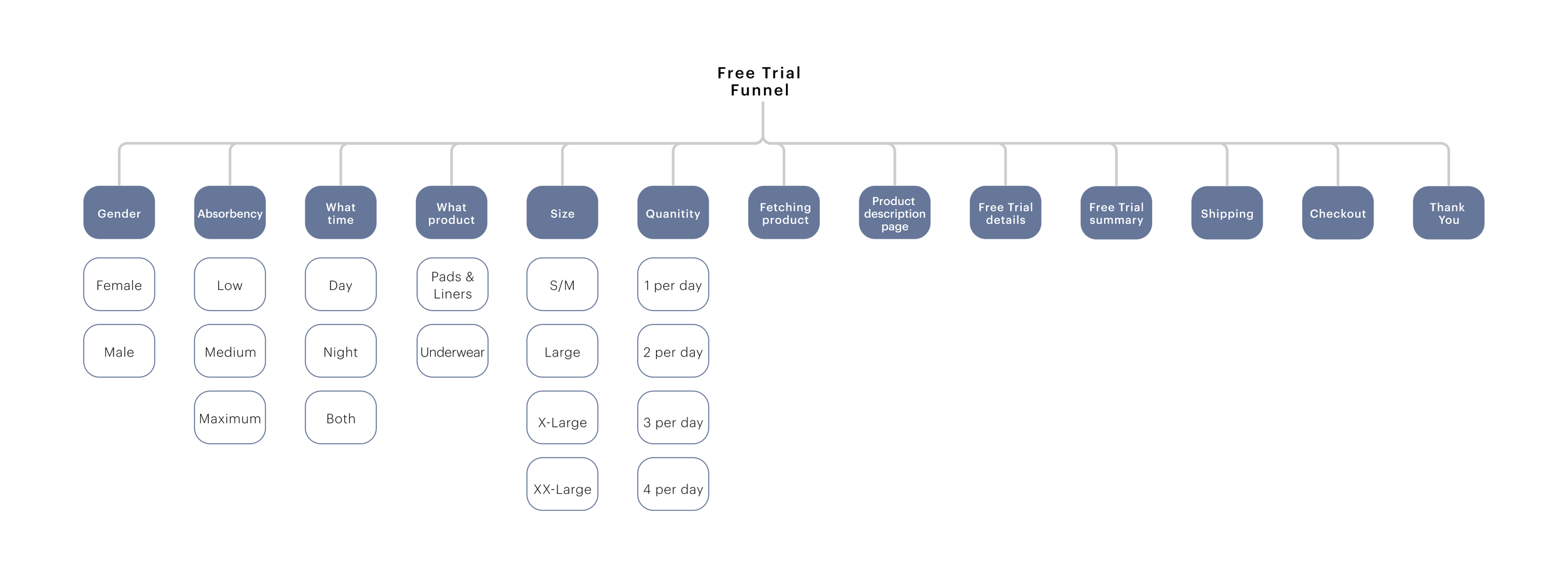
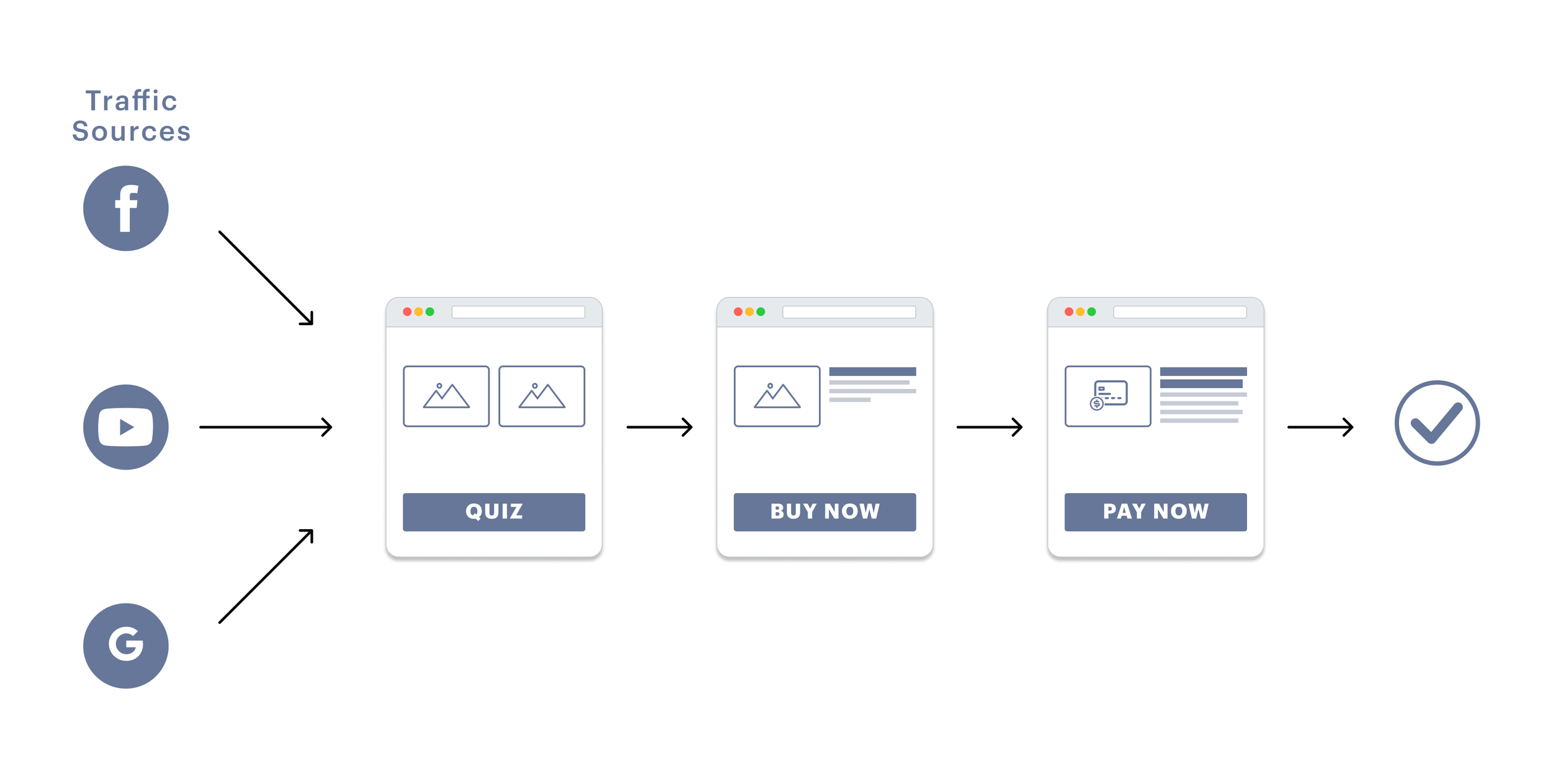
To narrow down the problems, we breakdown the whole Free trial experience to 3 sections: QUIZ. BUY NOW. PAY NOW.
D E F I N I N G T H E P R O B L E M
Current Flow Analysis
We started by deep diving into the current flow, and below is the end-to-end experience for customer onboarding.
Key finding on Mixpanel, we saw 74% drop off on the Quiz part, so we spend more time on Quiz to see what’s not working and what could be improve.
After User interview, we list high medium and low UX/business impact.
Major Insights
In drilling process from “Onboarding“ to “Purchasing“ consists of:
Onboarding (Customizing products): This step of “Onboarding“ in the drilling process isn’t clear about what is this funnel for.
Considering (Whether to buy and how much to pay): the free trial and the monthly subscription isn’t clear, this could be a blocker for the purchase action.
Purchasing
Objectives
By clearly showing what the funnel is, and optimizing the customizing product process, the conversion rate will be increased. We believed this revamping experience will also help user to make the decision faster.
Acceptance Criteria
1. As a user, I should be able to find the products that I need without any blockers.
2. As a user, I should be able to understand the free trail and subscription - future delivery, and without confusion. I trust this subscription and can cancel any time.
Success Metrics
Conversion rate:from landing page to check out page.
Time to make the decision: how long does it take for user to place an order during the whole process.
1. R E S E A R C H
Competitors
In addition to Key finding on Mixpanel and User interview, I started to see how competitors do and other subscription funnels.
D E F I N I N G T H E P R O B L E M
Design
Wireframe
In addition to Key finding on Mixpanel and User interview, I started to see how competitors do and other subscription funnels.
Prototype
In addition to Key finding on Mixpanel and User interview, I started to see how competitors do and other subscription funnels.

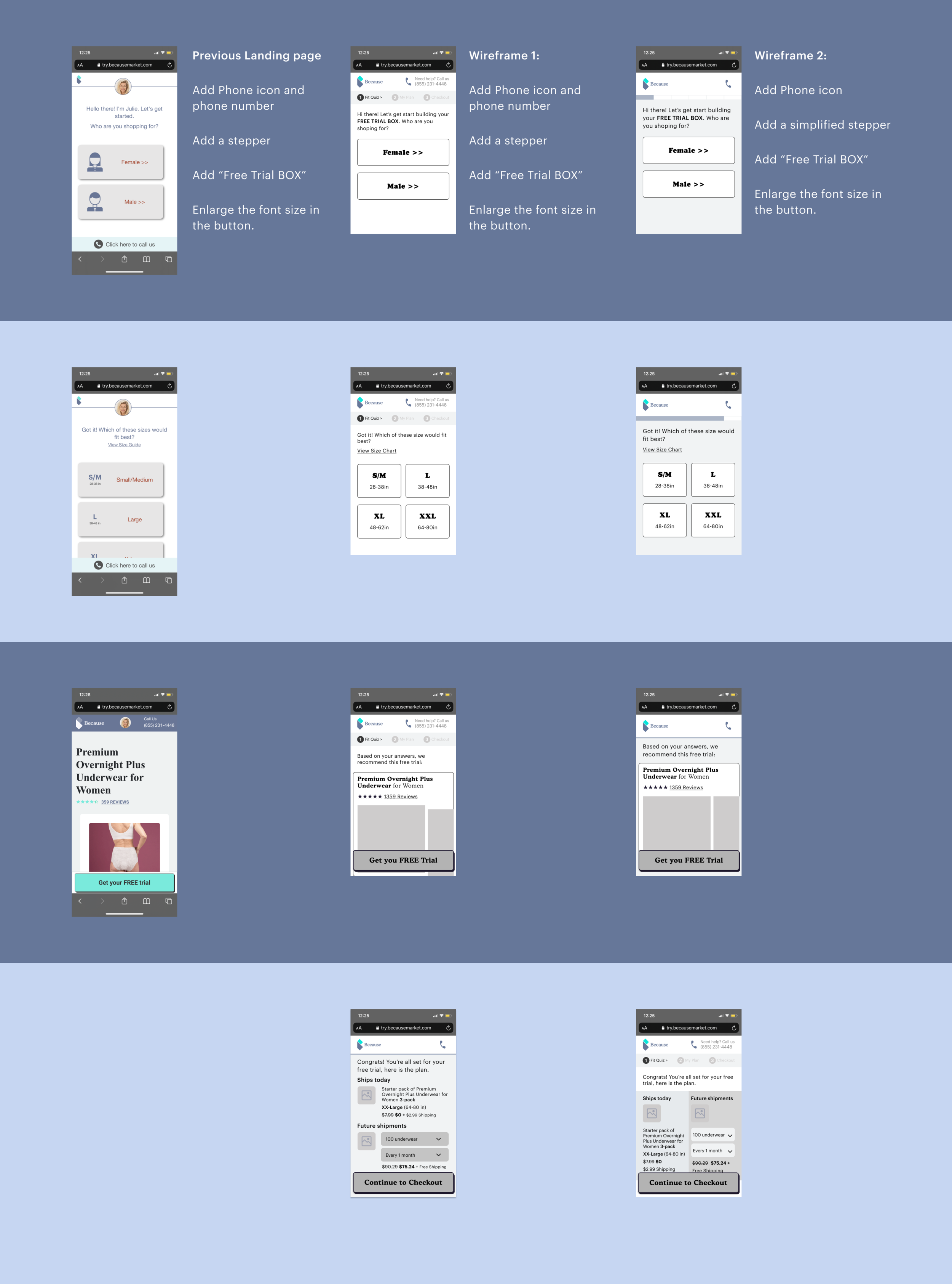
Previous landing page:
We see a huge drop off rate here, after user interview, we found there is no reference for this is “Free trial box“ builder.
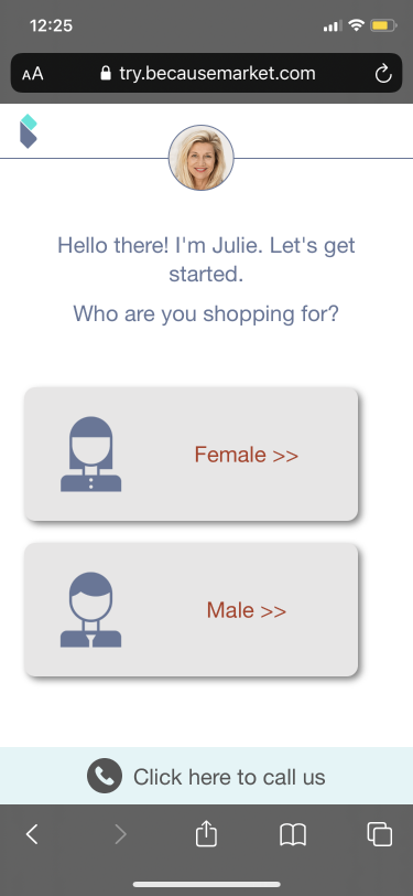
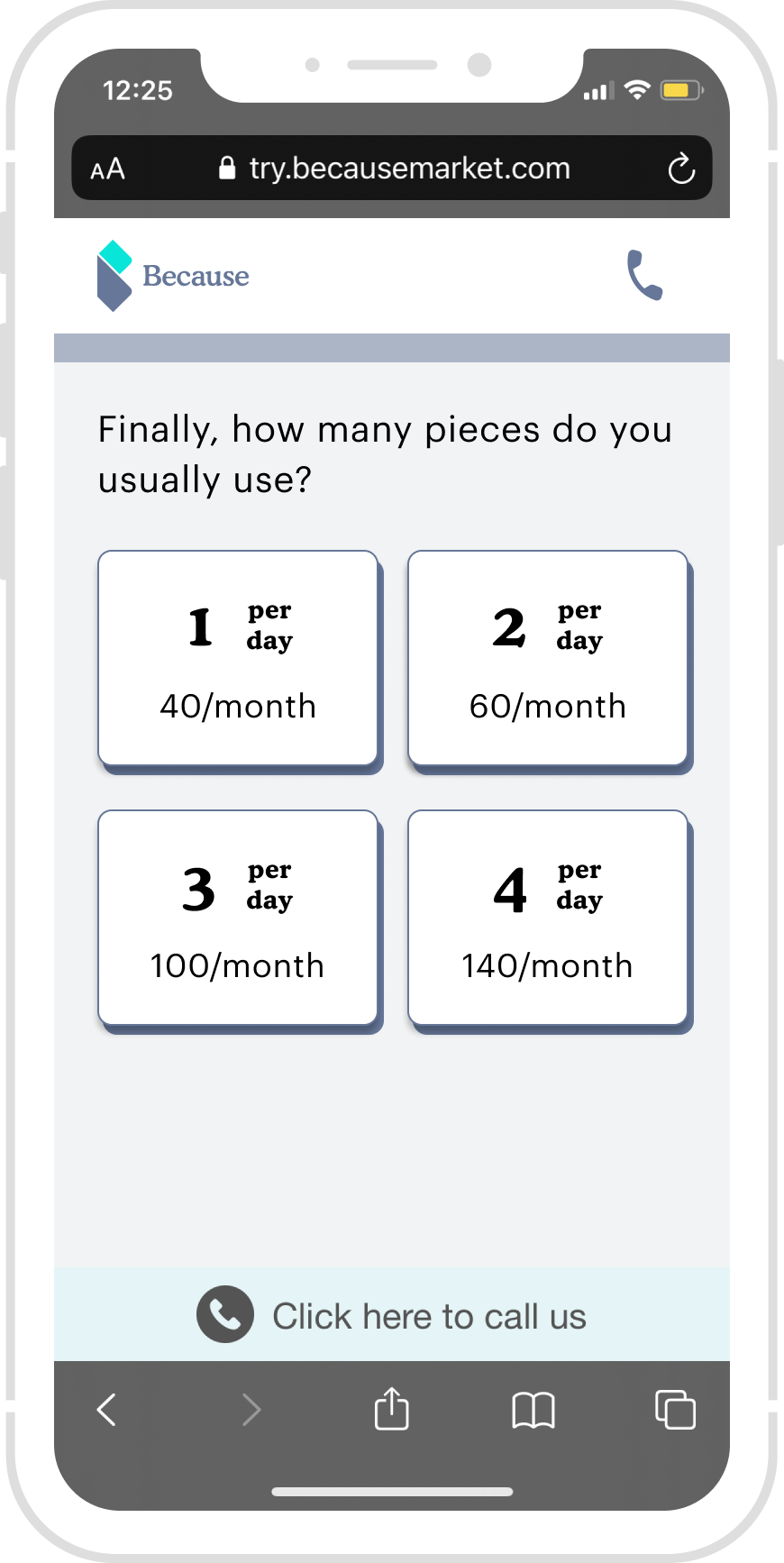
Wireframe 1:
Add “Free Trial“
Add stepper
Add phone number
increase the button text size

Wireframe 2:
Add “Free Trial“
Add simplified stepper
Add phone icon
Increase the button text size
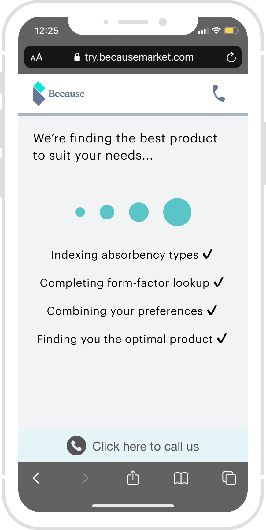
Final Design
In addition to Key finding on Mixpanel and User interview, I started to see how competitors do and other subscription funnels.
Add “Free Trial“
Add “Free Trial“
Add “Free Trial“
Add “Free Trial“
Add “Free Trial“
Add “Free Trial“
1. R E S E A R C H
Retros
Prioritized Platform and Design Guidelines
From the user composition chart above, we can see that around 70% Because market users are operating on iOS devices, so Apple’s human interface design guidelines are prioritized and then Android devices will be compatible.
Design QA: Responsiveness
As Because Market’s users operating on small screens (320px, i.e. iPhone SE/5S) are extremely rare, the design starts from 375px as the standard screen size and scale up to larger device. For better communication with the engineers regarding my design intent, I did create typical responsive guidelines on multiple screen sizes and annotate special callouts.
Result & Metrics.
300% Conversion rate increased
Don’t worry about sounding professional. Sound like you. There are over 1.5 billion websites out there, but your story is what’s going to separate this one from the rest. If you read the words back and don’t hear your own voice in your head, that’s a good sign you still have more work to do.
Be clear, be confident and don’t overthink it. The beauty of your story is that it’s going to continue to evolve and your site can evolve with it. Your goal should be to make it feel right for right now. Later will take care of itself. It always does.
1. R E S E A R C H
Next Steps
Future version for Because market’s sale funnel
From the user composition chart above, we can see that around 70% Because market users are operating on iOS devices, so Apple’s human interface design guidelines are prioritized and then Android devices will be compatible.
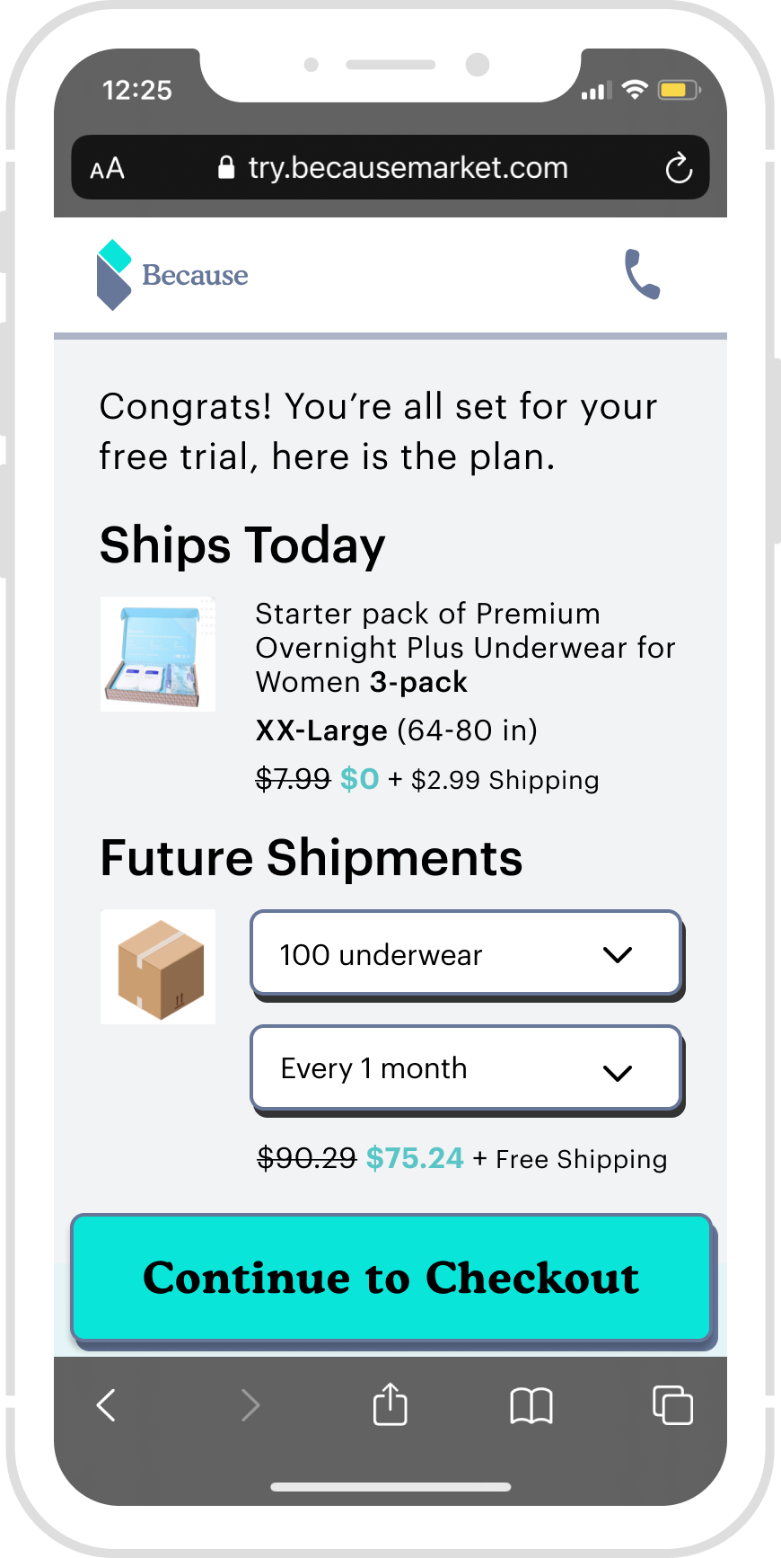
Overview
After users complete purchase, this page displays the specifics of the order, delivery date and length of trial period. This page explains next steps for this order.
My Role
Interaction design
Visual Design
Prototypes
Tools
Figma
Adobe illustrator